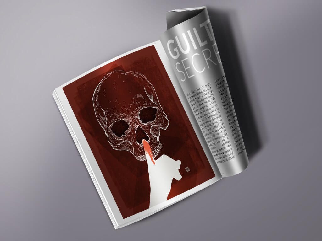
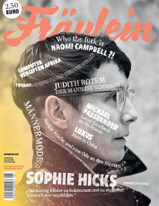
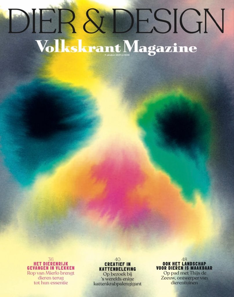
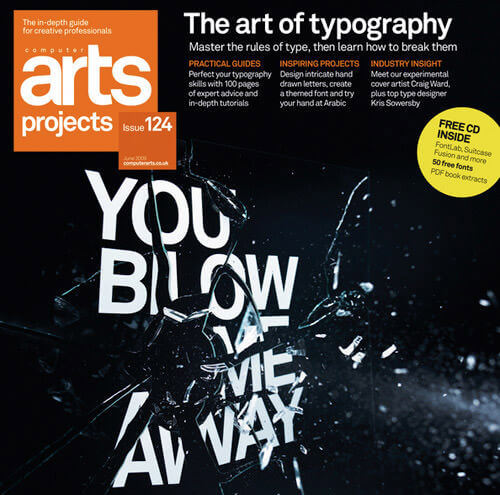
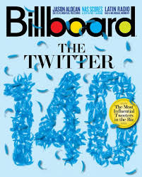
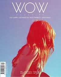
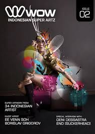
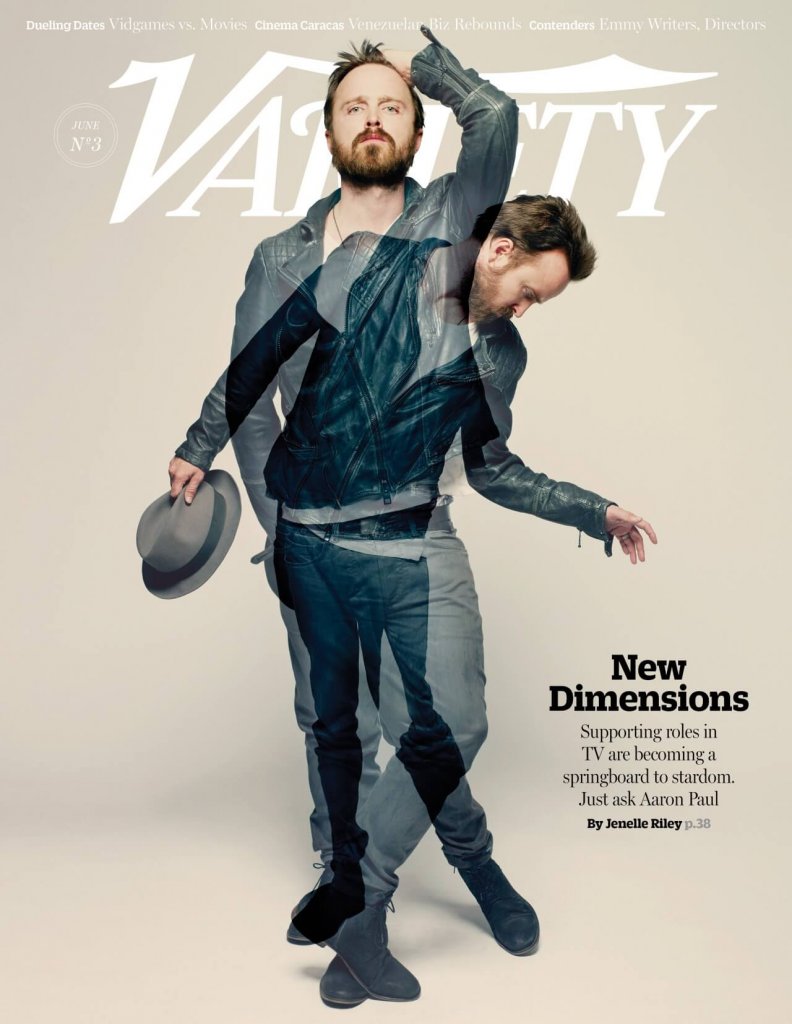
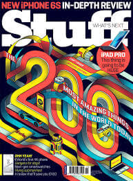
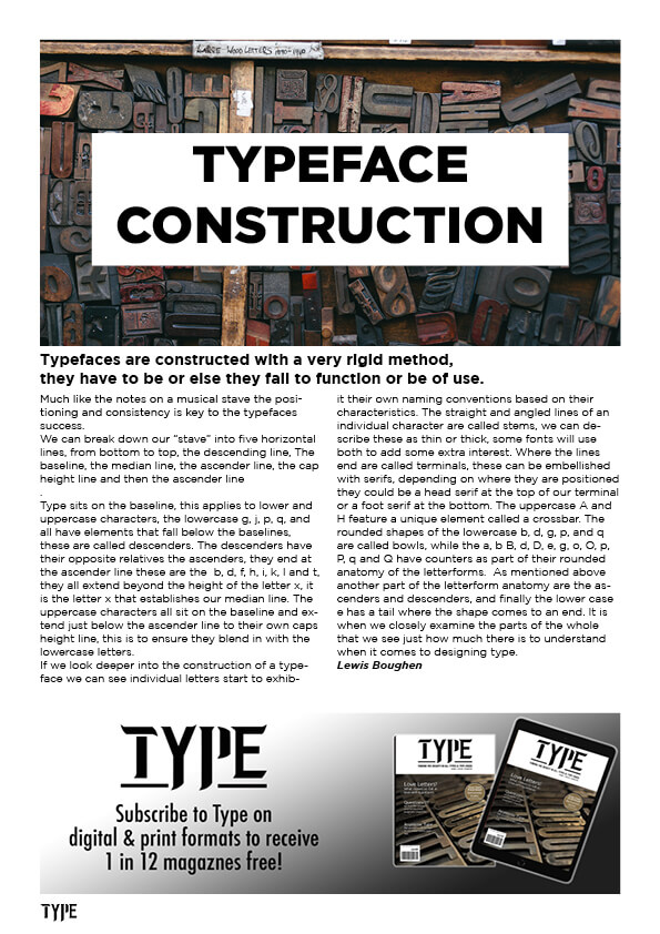
assignment 4 asked me to design. my own typeface for a magazine called TYPE, in addition I had to prepare three articles around what males a type face interesting, how a typeface is constructed and the question mark.
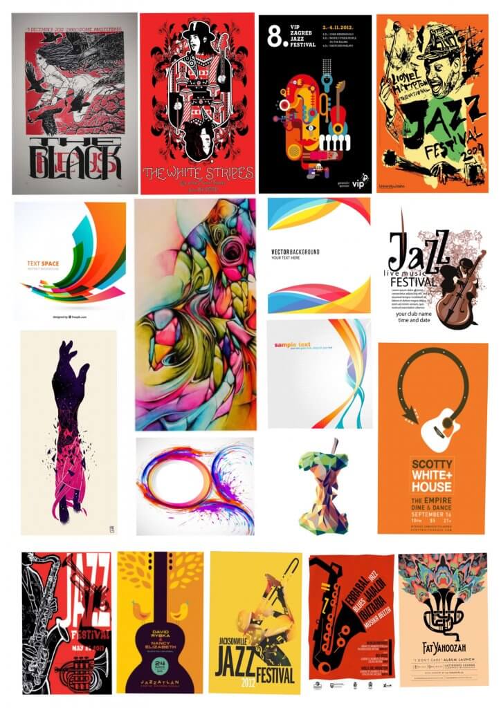
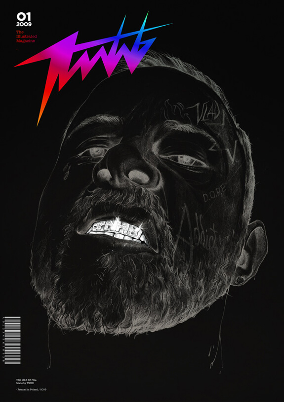
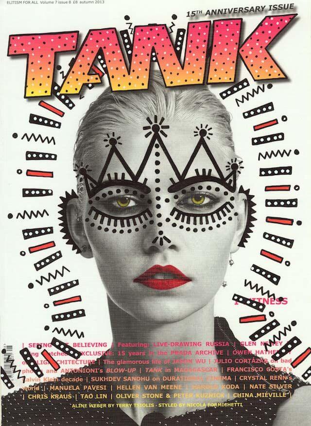
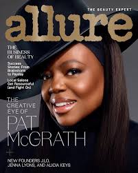
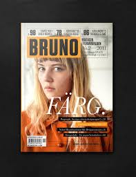
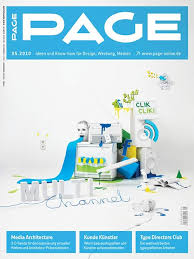
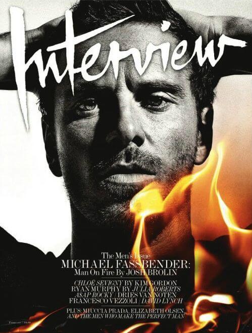
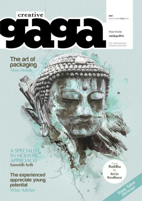
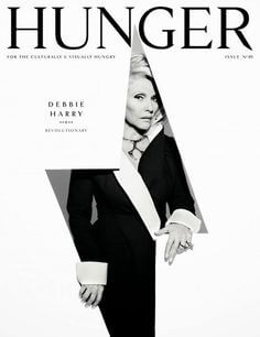
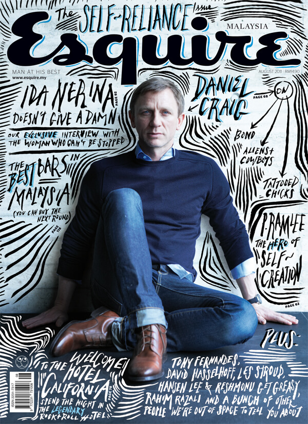
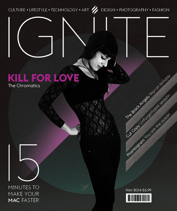
The first thing I did was prepare the articles, whilst doing that I began to collect some magazines titles that I liked the look of. It was clear from my favourites I collected I wanted something with a little character, only a few standard looking fonts were included, the ones that could be used elsewhere and maybe. not be obvious they was the same font. The other challenge I had was that this was a magazine about type, sop certain fonts were out of the question, like a handwritten script type for example. I started to think of old printing presses and maybe there was a way. to do something in a modern style. I started to experiment, but even that was its own journey.
I made a grid in photoshop, just three lines for a baseline, median line and an Uppercase height Line, I had thought that the font would be more impactful in uppercase, but didn’t want to shut down any lower case experimentation. The grid was good but very rigid, I didn’t take into account a gutter for each character, I decided to make something that worked for each letter and also offered more versatility. I did some loose scribbling but the grids were too flexible. I. then turned to the ipad and turned on the grids available in the procreate software, this was much better, I could turn the grids off when. they was a distraction draw shapes and curves more acutely, any small mistakes were easy to undo. I had found my preferred workflow.
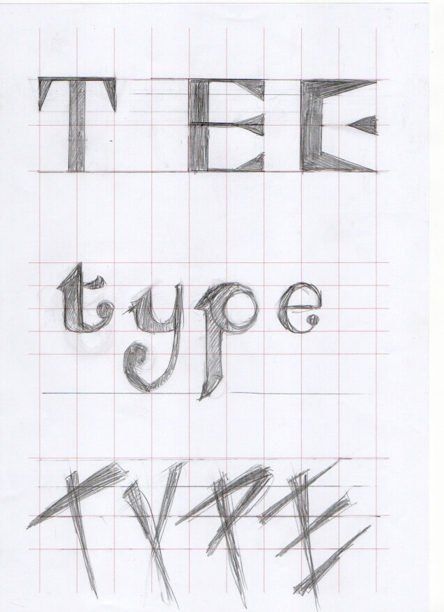
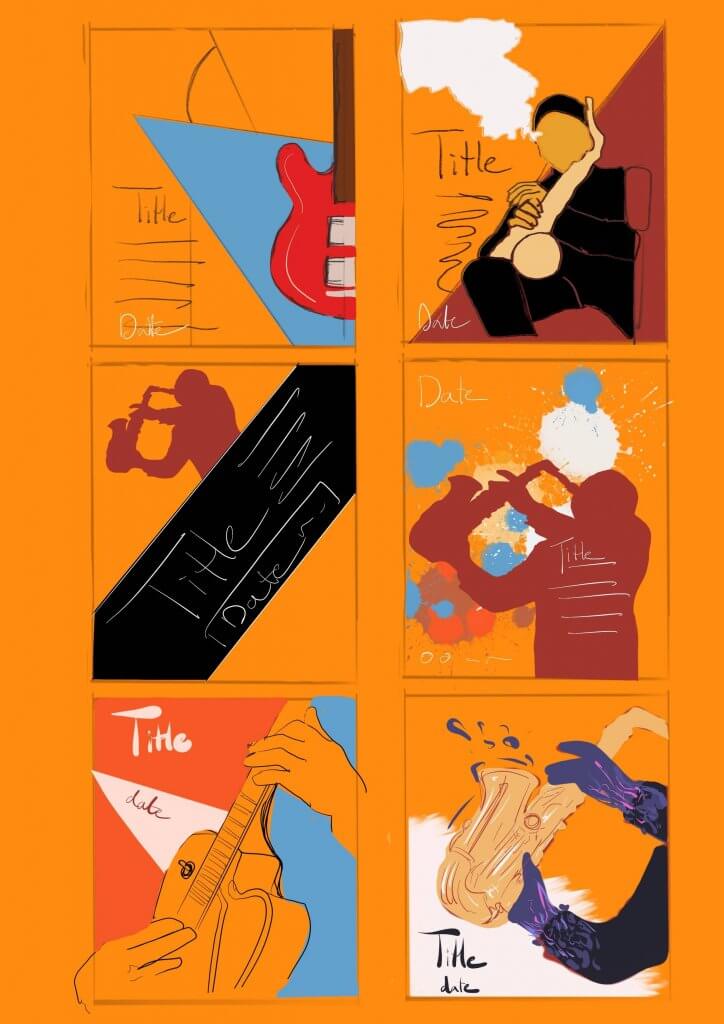
I tried to draw purposefully, looking for a theme or common thread that would weave through my typeface design.
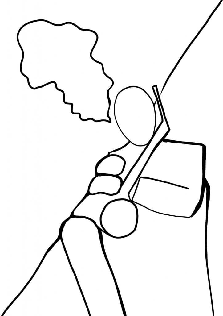
curly terminals! not the only thong that was terminal, I soon stopped this line of experimentation. 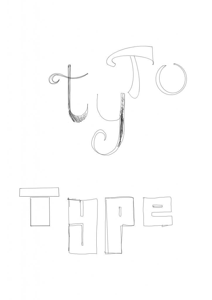
These initial sketches started to evolve 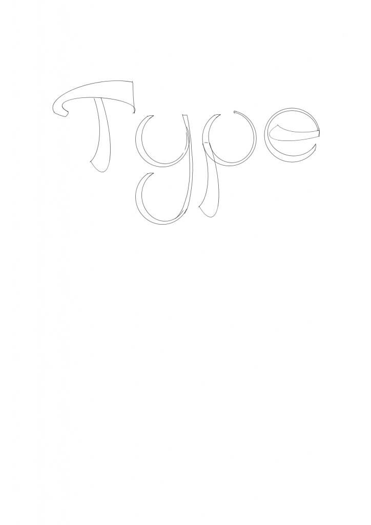
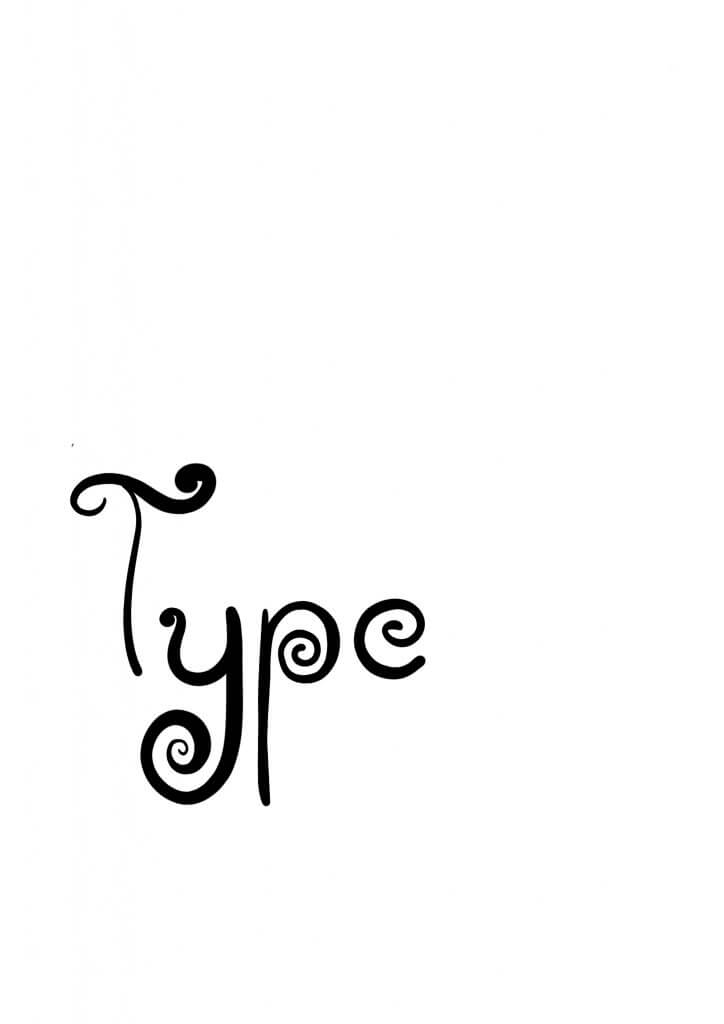
I started to play with this one more, the idea was no straight edges 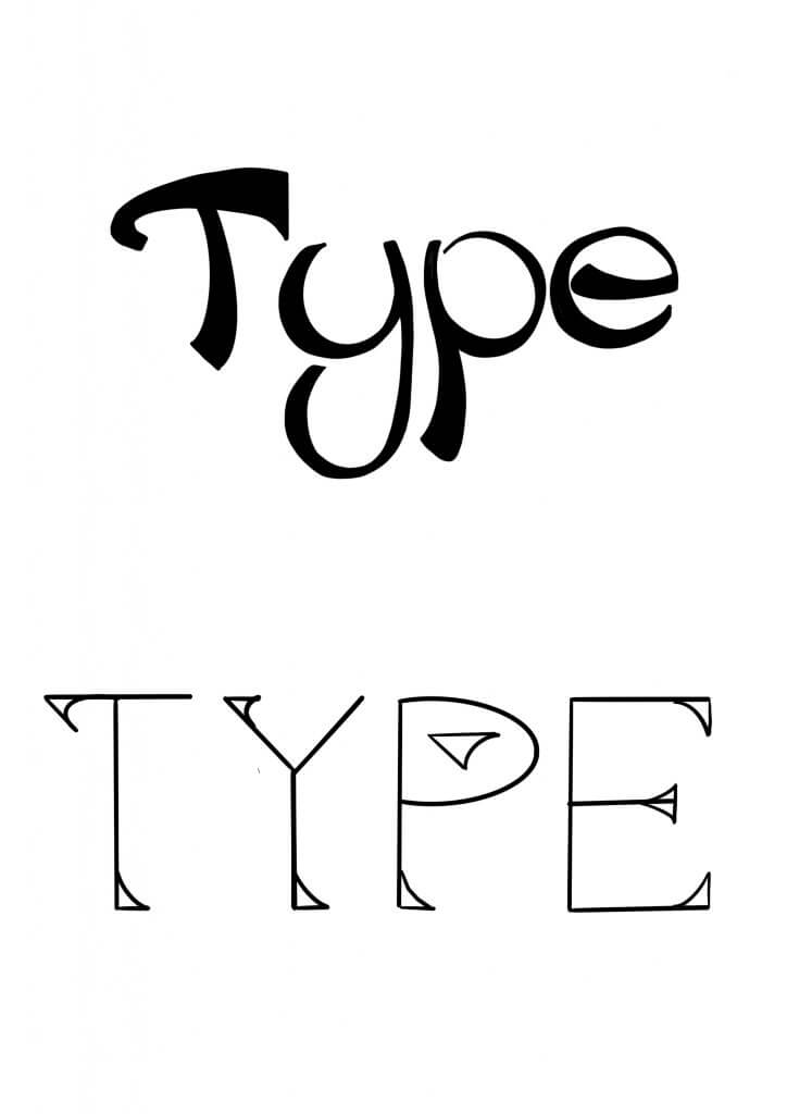
it looked like a novelty font, I decided to try some serifs. I learned they was a good way to add character to the familiar shapes 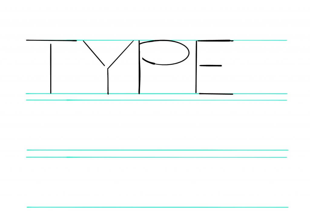
too thin.. 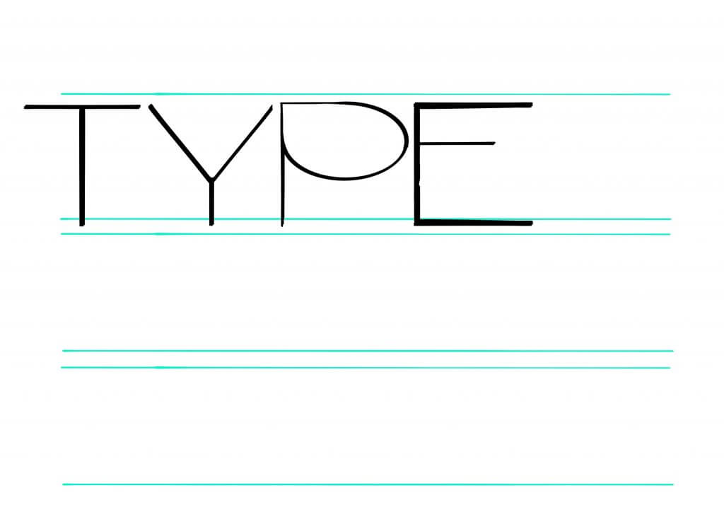
… and still too basic 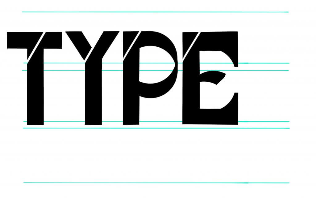
I started to get heavier, this one felt very 60’s, I liked the shape in the “E” 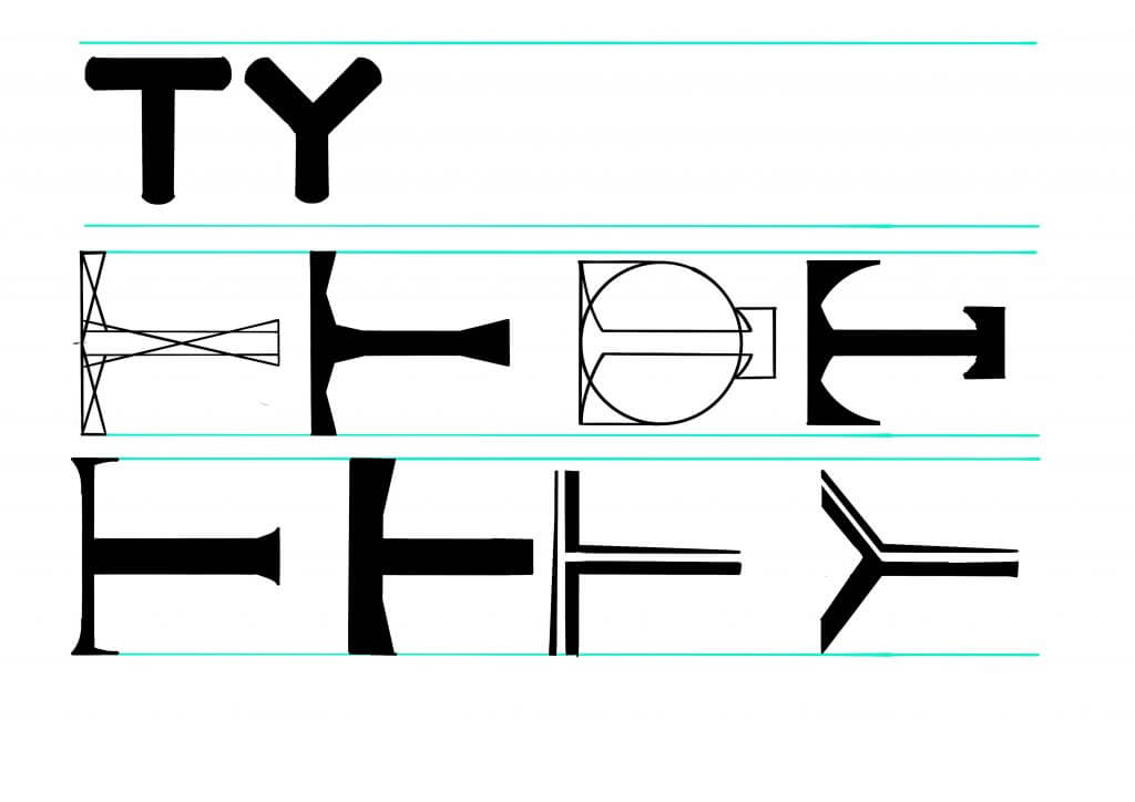
The T seemed to be the character that had the least potential to decorate, something I had noticed form my movie collection.I focused on the T to ensure it had something special. 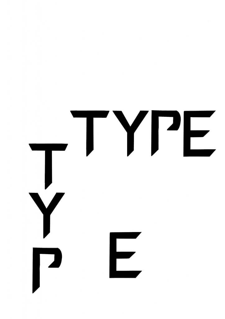
This started to feel like it was going somewhere 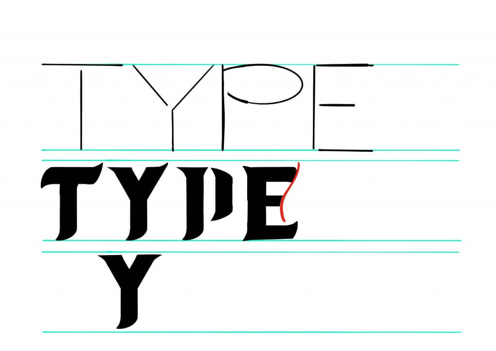
I experimented with shape, and forming letters from them.
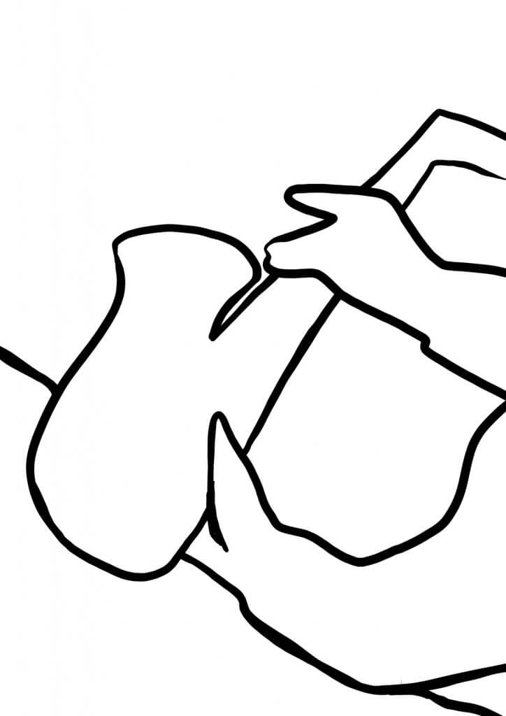
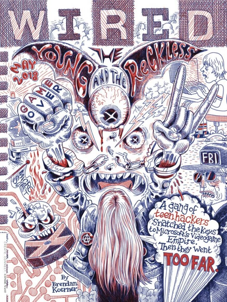
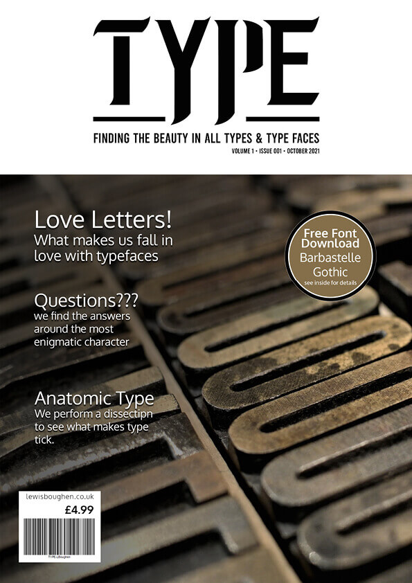
Once I had something to work too I moved the sketches into adobe illustrator, it was here that I added two serifs together and created. a familiar shape, it was from this I decided to base the font, I had read. in my research that typographers will look for something to add, a theme or a method, my serifs together looked like a bat with wings extended. It felt Gothic, like an old printing press maybe, this fit nicely, I called my typeface Barbastelle gothic, named after a genus of a bat.
I had the start of my final design
I really enjoyed this assignment, it felt like a real challenge and was very rewarding, I don’t think my font would find its way. on many font foundry websites but i was pleased with what I created with my new knowledge on the anatomy of a typeface. It is something I would like to have another stab at another time.