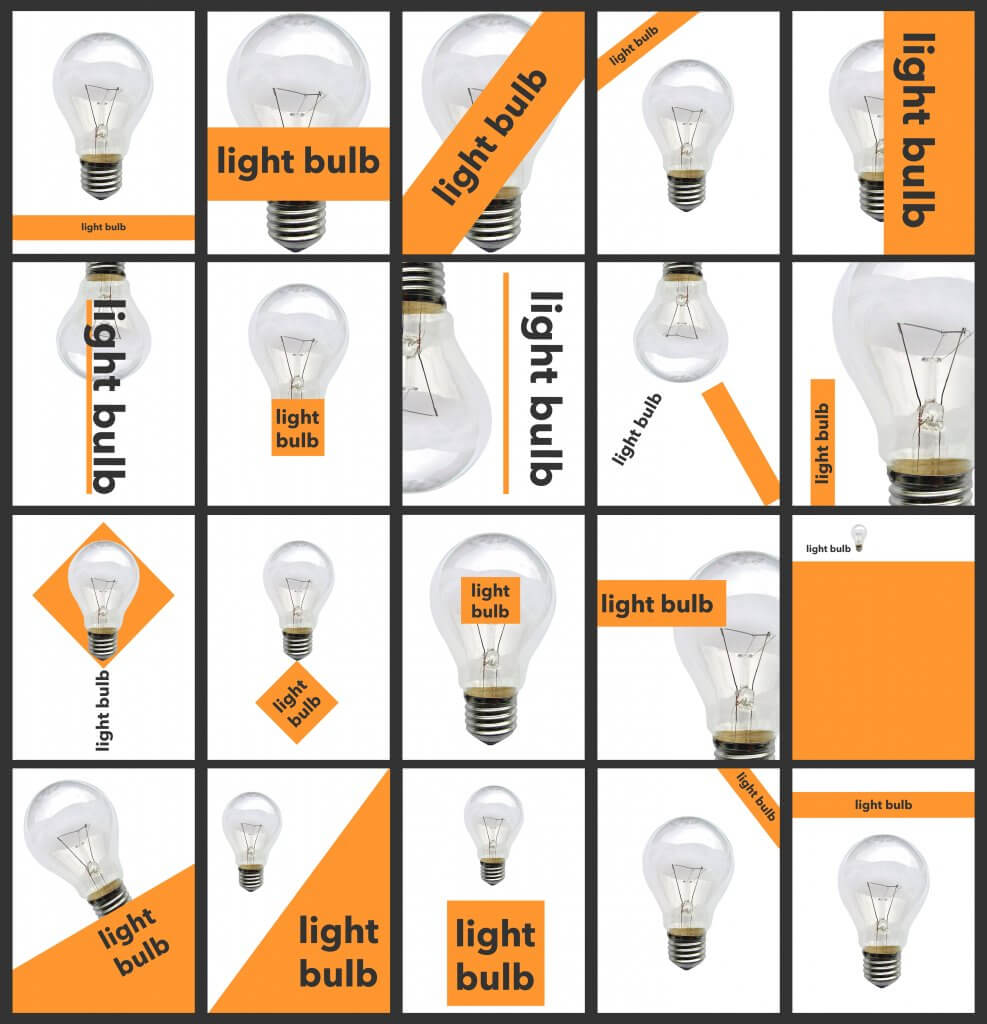
This exercise asked me to design point of sale for a local green grocer, it needs to be highly visible so it catches the eye of the passers by through the window as the viewer makes his way to the other shops in the area.
The final reproduction size will be 2 x A1 landscape, and it states that my art work will need to be produced at a smaller size.
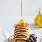
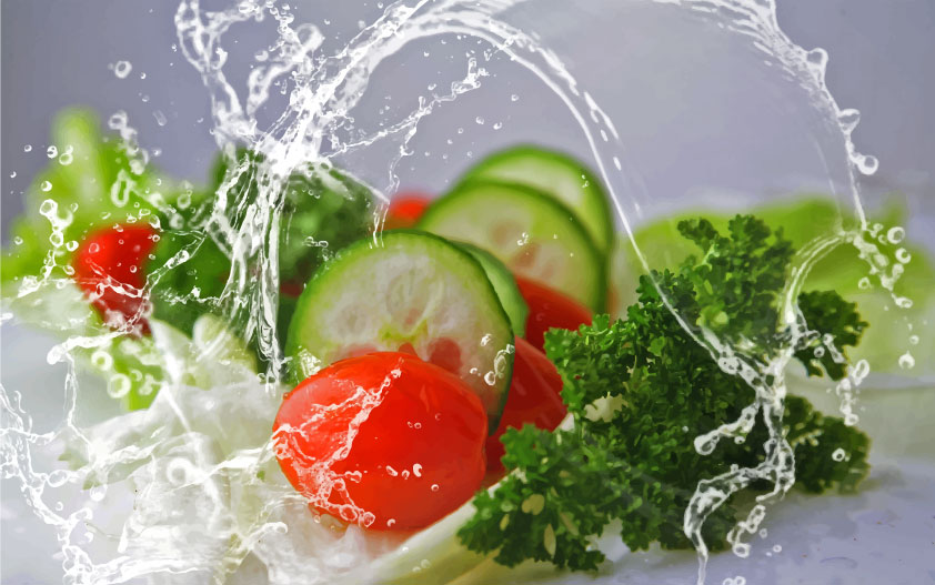
Ideally where food is concerned I feel good quality photography, with expert lighting water droplets etc would work best, drawings can work if they can capture what people love about food. if I was aiming this at children I would maybe take it into a cartoon vegetable direction, this would cut down on anything technical, and i would love to draw a muscley carrot flexing his muscle next to a round tomato.
The challenge of using photographs here will be resolution, a vector drawing would be sharper and more accurate, and not constrained by resolution. A photograph would need to have been taken with a camera with a high resolution, this area of photography/design isn’t so familiar with me, but as I understand there is methods to push the boundaries of useable resolution, for example the photos printed on vinyl for large lorries and vans look fine from a distance, so I will research this further to see whats needed to use photos at this large scale.
The rules on large scale printing seem to be mainly based on viewing distance, in this case our POS wont be viewed up close, a good quality camera with a high resolution would take a photo that could scale up the image without having too much of an impact.
Adobe also have a feature in photoshop that increases the resolution, I have read that this gives good results, this would be another option to use photographs.
I have also read another method where by photographs are vectorised, this can change the appearance of the the original photograph but when viewed from afar still has a photographic quality.
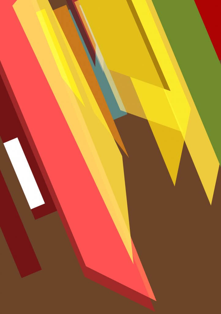
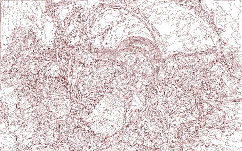
jpeg zoomed 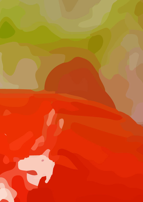
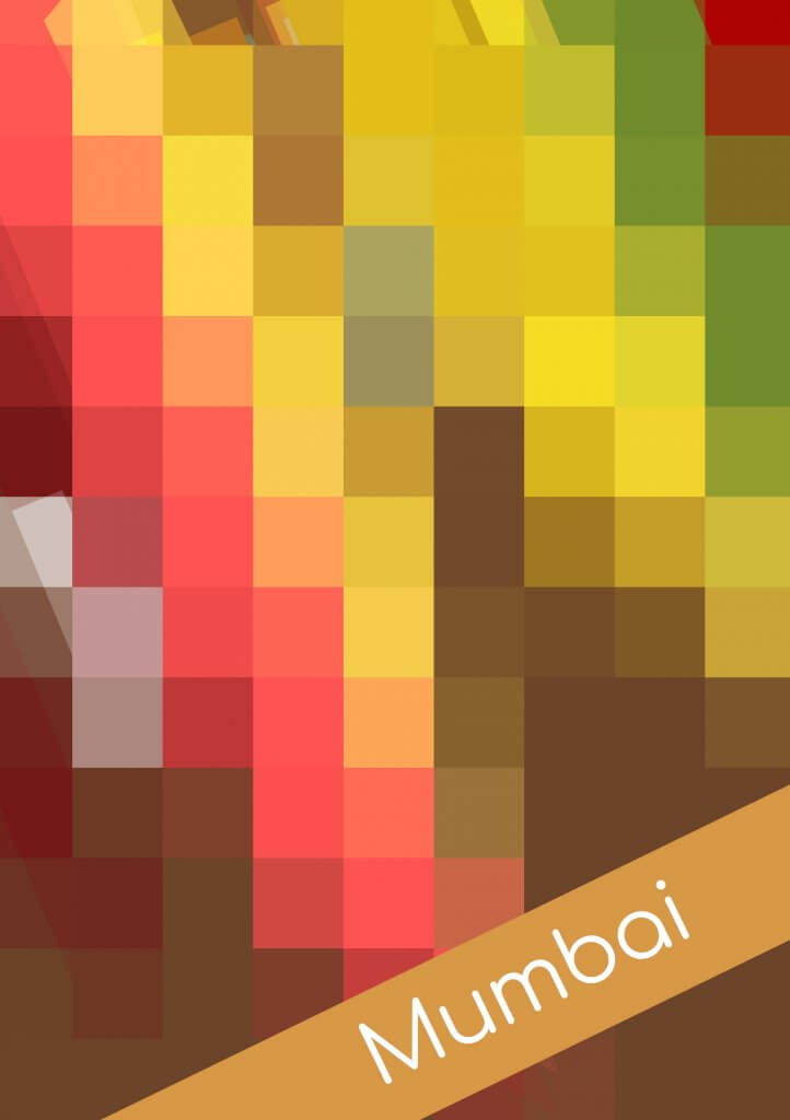
vectorised image zoomed
I think given the results of my research I am happy to consider photography for this POS, it would be the best way to accurately represent the quality and freshness. I wouldn’t expect to see food portrayed as a cad drawing for example at a fast food restaurant, and I have never seen a cook book where they have used drawings, although I am told they exist.
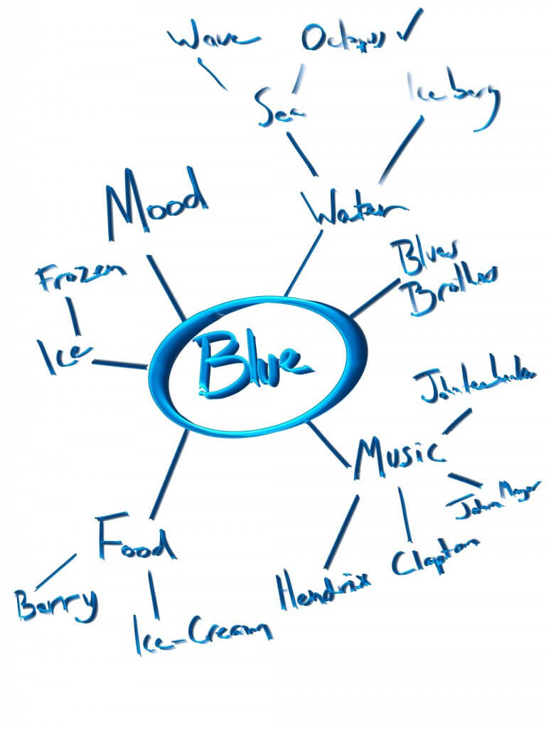
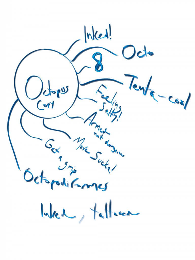
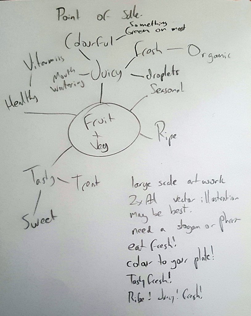
To offset the imagery we will need some fresh text, this is where we can add some character to our image. I wrote some ideas down from the spider diagram I had made earlier. I decided to use “Eat Fresh!”
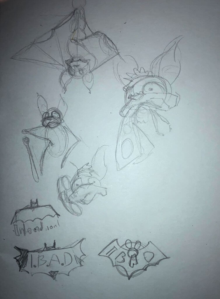
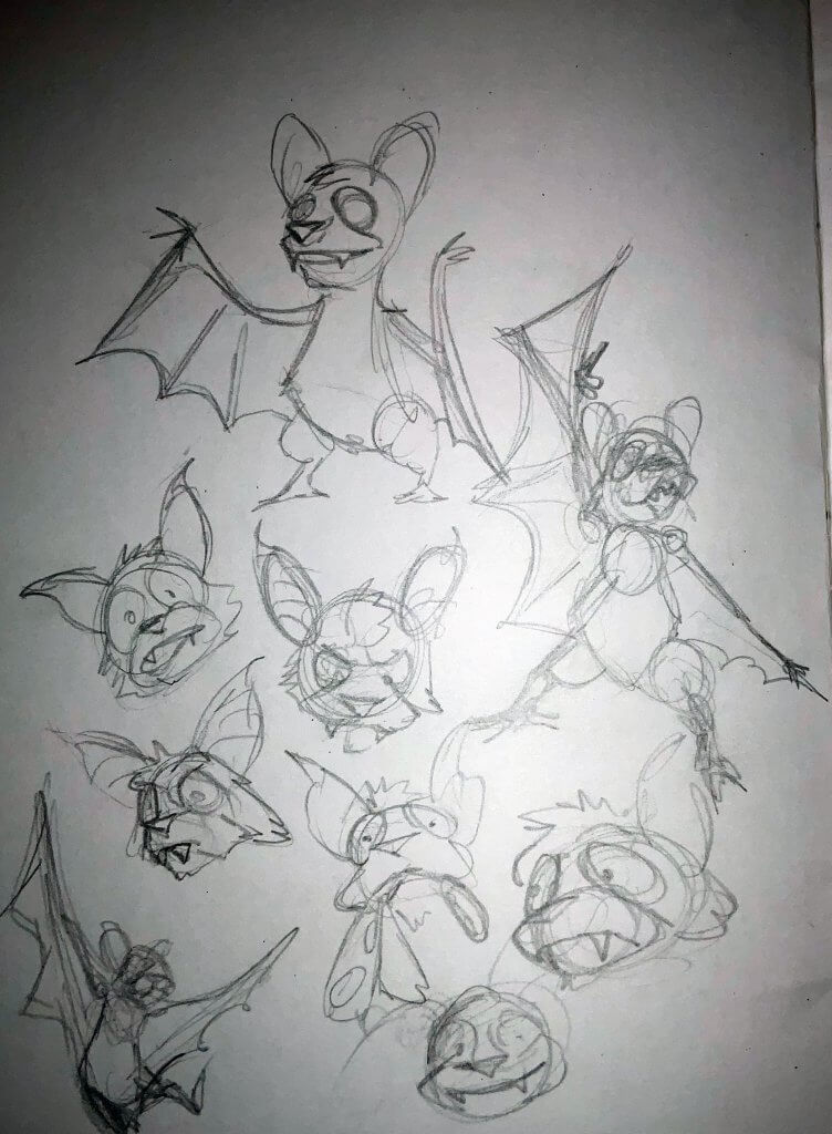
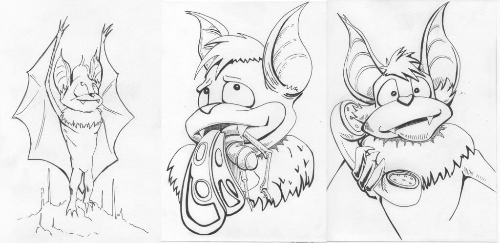
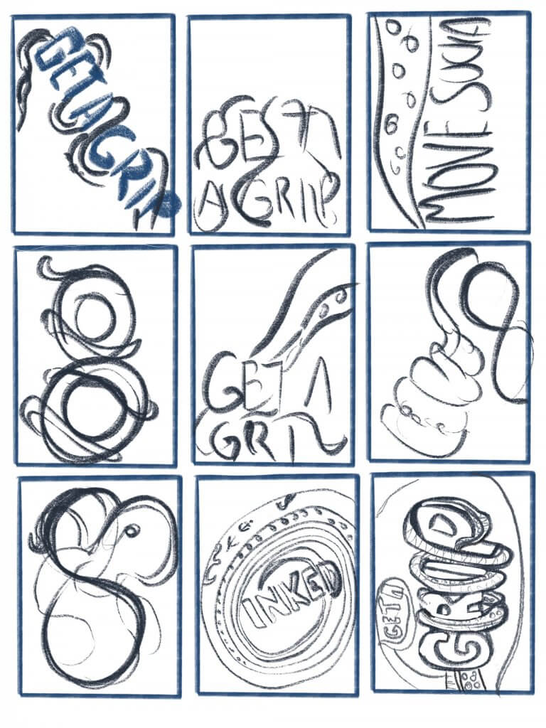
I sketched out some possible ways I could use the text, I tried to spot any shapes or patterns in the text that might be relevant to eating fresh food.
I liked the bite idea and explored that over several of the sketches. the “f”. and “h” open and close the word fresh, these letters are tall and made a little cradle shape for the word eat, i liked the version where the “e” in eat was bitten into it was the most subtle of the bites and thought this was lively and energetic.
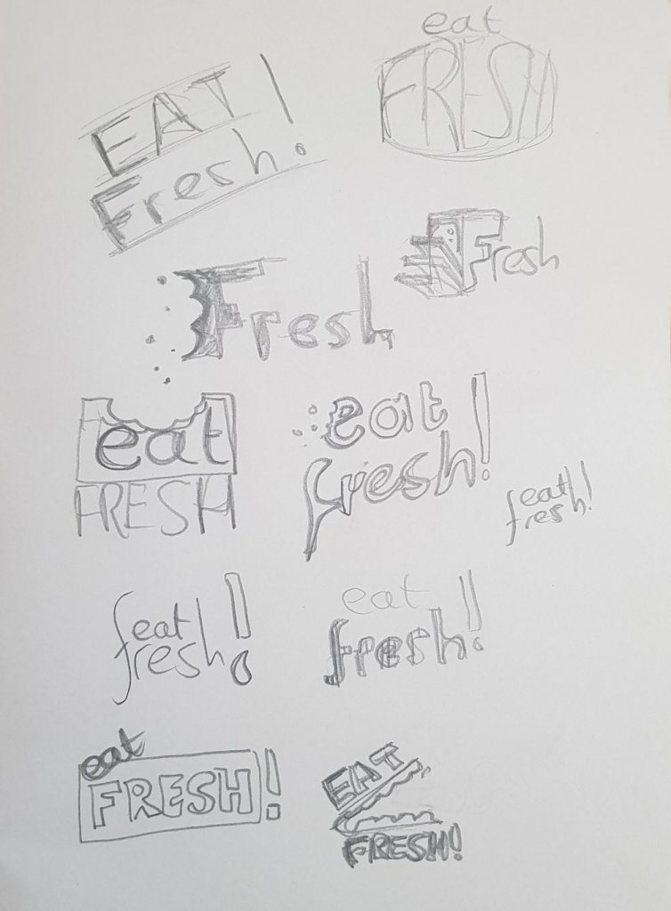
Next I would have to find a font that had a similar energy to it, a brush style or some over decorative font. Adobe have a good range of fonts and they are organised by style so I went there and found a font called funkydori for the word “fresh” for “eat” I used a simpler font called charter, Using a layer, mask I brushed out the shape of a bite mark and added some crumbs as it felt a little bare, vegetables don’t crumble but it seemed to sell the bite mark a little better.
In terms of colours I recognised in my notes that most fruit and vegetables have something green on them, be it the remains of a stem or stalk or leafy material. The colour green is very clean and natural, and the brighter green something is generally the fresher. I knew I wanted a green in my colour palette. I kept this in mind.
Imagery
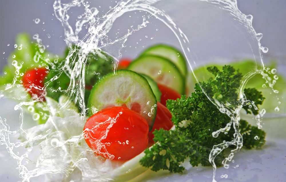
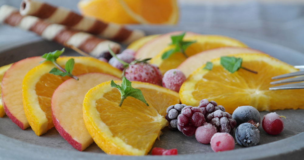
As I mentioned earlier normally a photographer would be employed for something specific or stock imagery could be used if the resolution would allow or using the methods above. I went to a site called pixabay, they have royalty free images, I selected two images that looked nicely composed and would suit my point of sale. I boosted the colours and contrast so they would really pop when somebody walked past.
I used the green as mentioned earlier, I wanted some rhythm in the final image so made an “S” shaped area, adding in a white border made a little more distinction from the image and the text area. yellow over green seemed like a good fit, especially for the lemons. I added a drop shadow in a dark blue to add some contrast and used that same blue for the “eat”
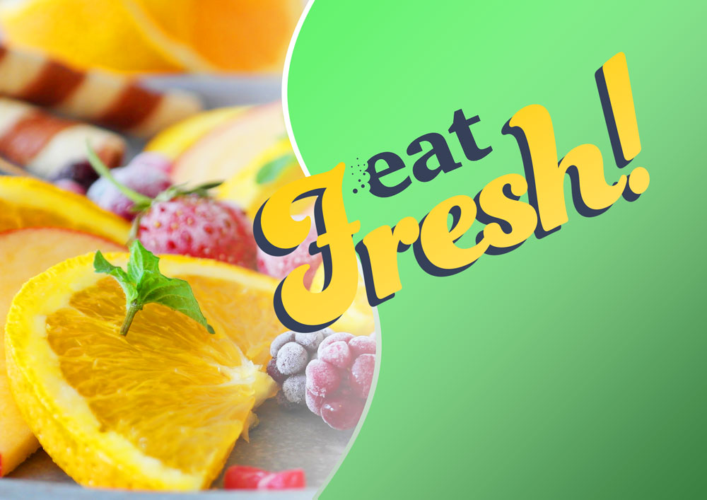
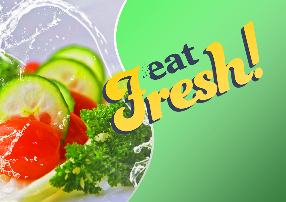
Overall I’m happy that the outcome would serve the brief. The point of sale is bright and full of energy, the food looks appetising and edible and the message short and punchy. The POS would be caught and processed very easily by someones peripheral vision. The imagery would be interchangeable in this design too, allowing for easy expansion if the client wanted to, this could be used for seasonal fruit and vegetables, exotic fruits etc.