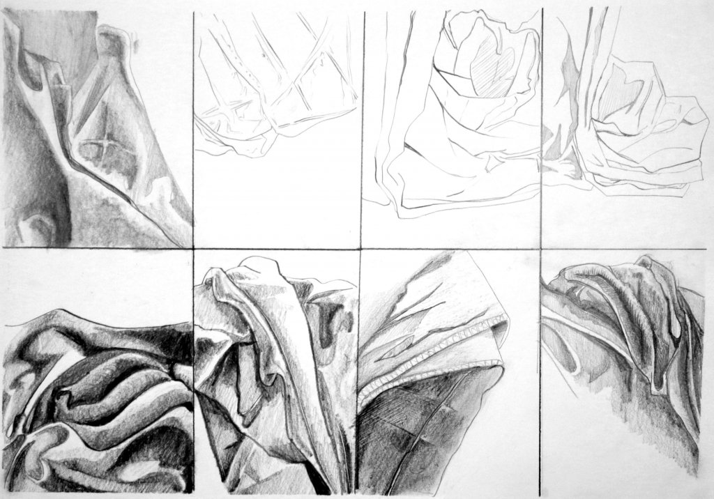
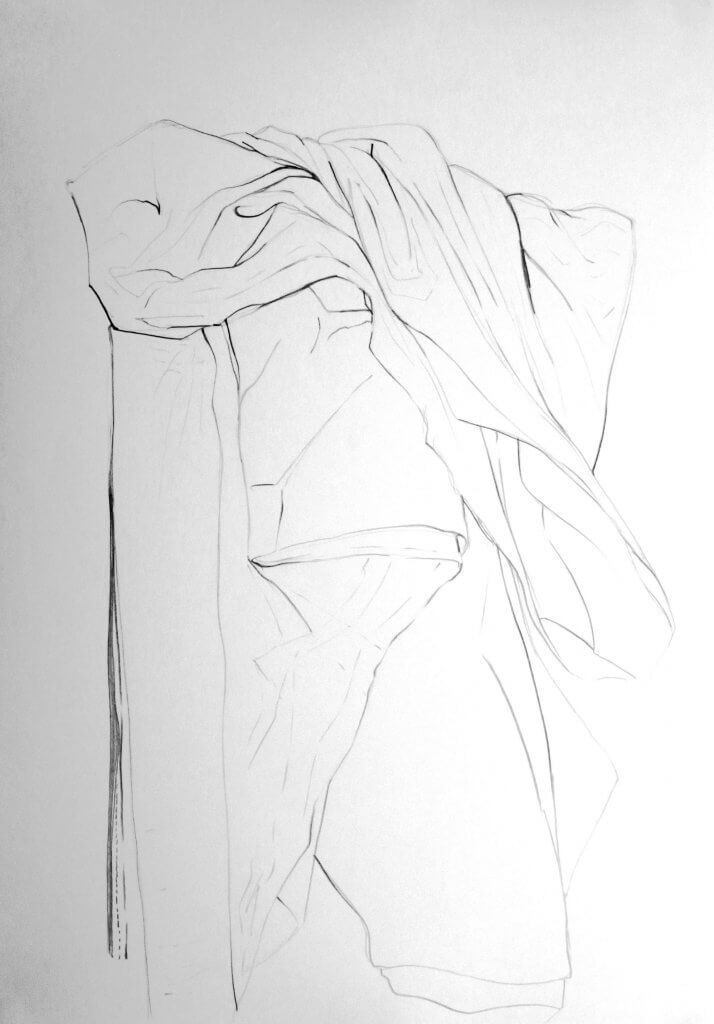
In my opinion fabric is another thing that if drawn incorrectly, looks like a glaring mistake. I think it has a lot to do with physics and the rules that all things ordinarily obey. I tried to suggest deeper folds with, heavier, darker marks. This proved to be quite effective. Observing the shape of the cloth was also important, a fold or crease appears very different to the tube like shapes that material can make. Using line weight was the only way I could think of creating depth without starting to build up areas of hatched lines, I was tempted to do this but restrained and stuck to a purely linear approach.
Creating. a tonal study had its own challenges, mainly resisting using line to map out the labyrinth of creases folds and recesses in the folded cloth before me. The depth was a lot easier to describe with a range of tones and gradual variants. I can see how a combination of both would sometimes be necessary to best demonstrate all the possible combinations of creases and folds.
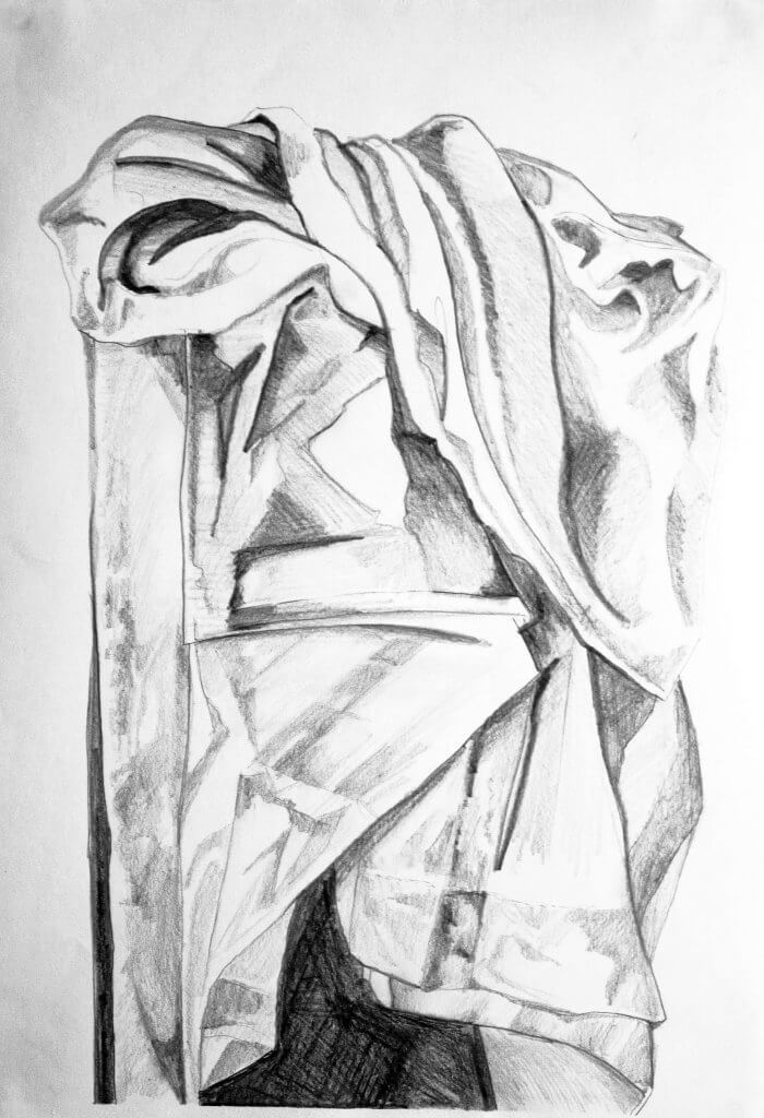
I carried on drawing in detail, I really wanted to try to describe the way the cloth was creased where it had been folded, the material takes on a veiny look, my study below was getting close, all in all I was happy with the study. I felt that the key to this was to study the type of form I was describing as individual components before making a mark, as the cloth is unpredictable and hard to read. A little like map reading in a way, you will often look at the starting point and the destination before setting off, getting an idea of where you will pass through and any noticeable landmarks that may create a detour or change in route.