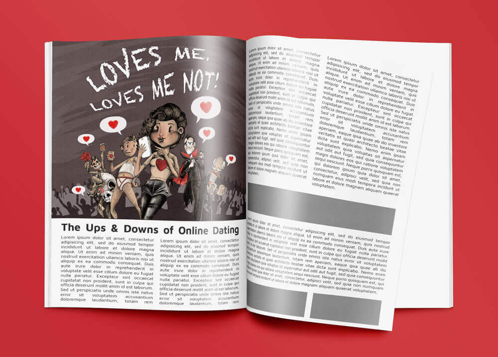
This was a good challenging exercise. From a list of headlines I had to produce artwork that interpreted the articles content, I chose “Loves me, loves me not!”.
After searching online I found an article that seemed to fit the phrase, it was about the pitfalls of online dating. I made some selections from the copy that would give an loose overview of the direction the written work was going, these are the phrases I extracted;
- Online Dating is popular.
- Love is a human need.
- 77% of people feel its important to have their smart phone with them at all times.
- Online dating is the 2nd most popular way to meet a partner.
- People lie on their profiles.
- Scammers and players.
- Can trial several people at a time as you will get to meet more people than conventional dating.
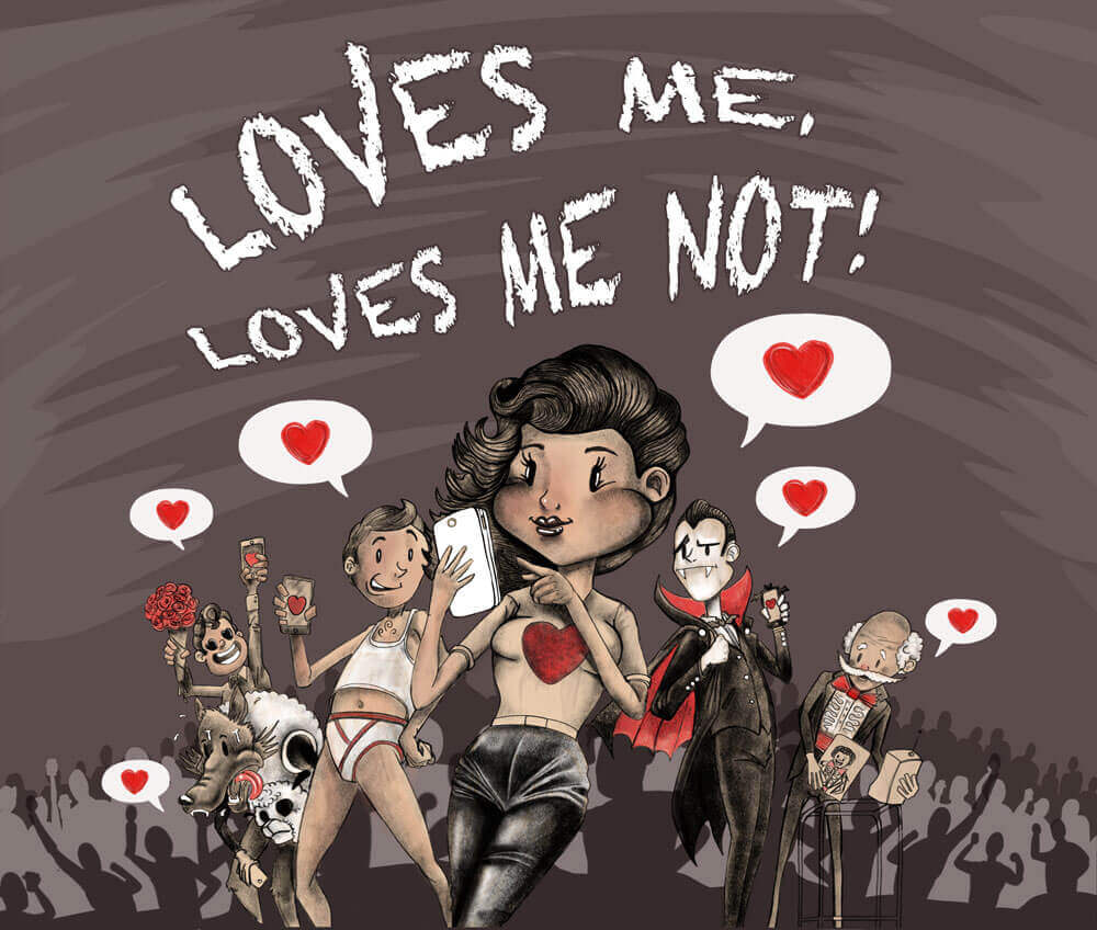
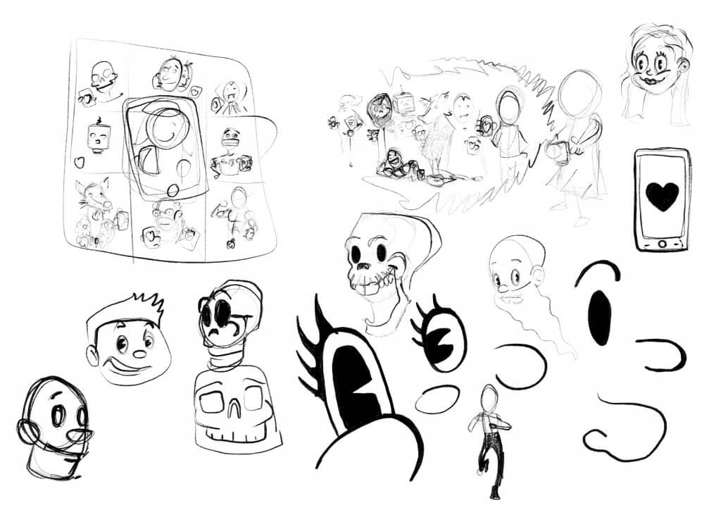
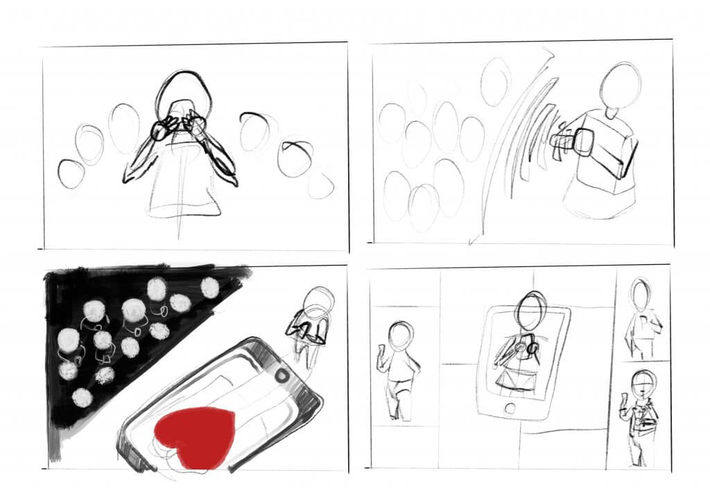
A few things stood out, from the keywords above, I did want to keep it light hearted, I liked the idea of exploring the different types of people you may meet online, and even the phrase “Love is a human need” felt like an opportunity to maybe add some non human characters. To keep it from being negative or depressing I decided I would style it almost like a comic strip or cartoon, due to the references to technology, online and smart phones etc I was thinking that a retro Betty Boop or Max Fleischer feel might be nice to juxtapose old and new. I did some loose sketches, in one I thought I may use a grid with the different characters in them on their phones using a dating app, another featured a cue of people lining up all inside a virtual world, that one was hard to make it look like they wasn’t actually there a tried to put the crowd in a radio wave style bubble, it didn’t really work.
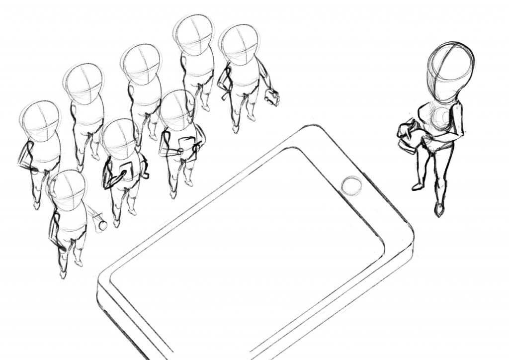
Another was a little more abstract a large smart phone on the floor with a heart would be the main feature and a young girl standing near a crowd of potential partners stand near by(image below), this was nice and striking but it didn’t really have enough scope to get over the different types of characters I wanted to show.
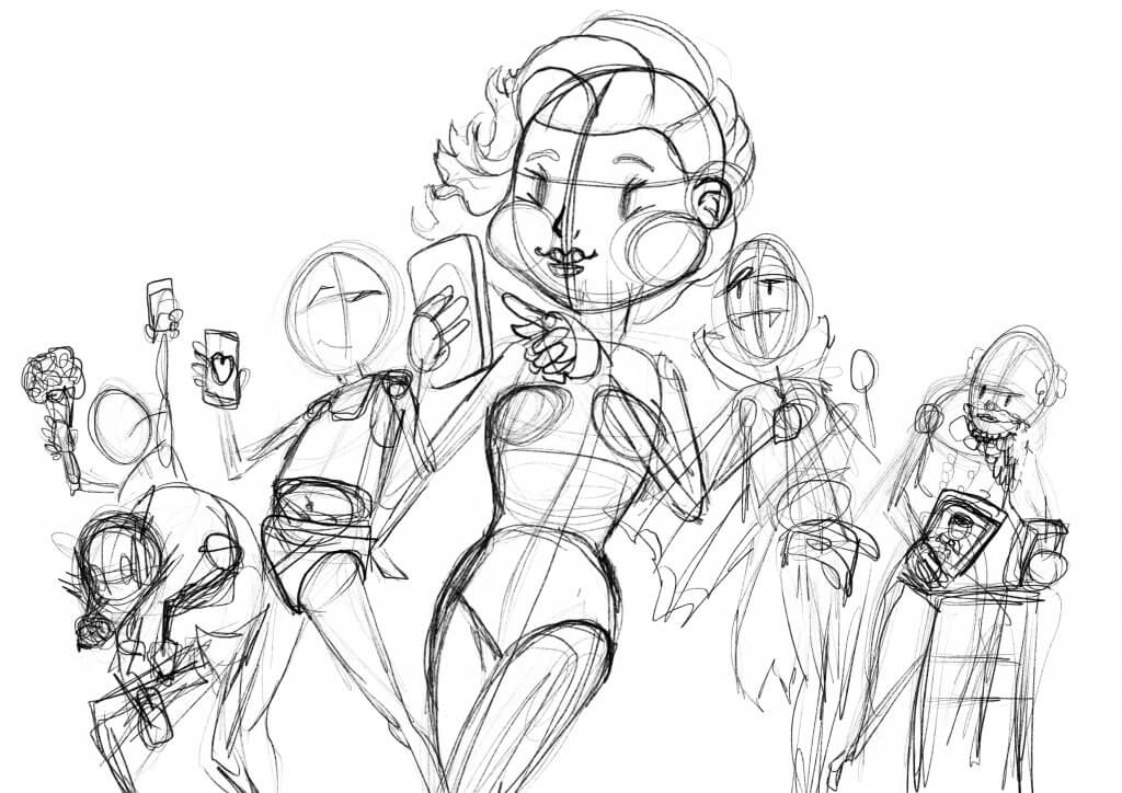
In the end I settled for something a little simpler which centered the main character and gave a crescent shape to the overall image, it seemed to have a better stamp and would be the best way to present the cast of colourful characters I wanted to show.
I did some research on some of the styles I want to cover, two contemporary Illustrators came to light, Mc Bess and Shawn Dickinson, they both have a vintage cartoon style, while their motivation and inspiration are from the same source their implementation is quite different, Shawn Dickinson has a very retro cartoon cell look while Mc Bess uses a lot of texture and grit to bring his mostly tonal drawings off the page.
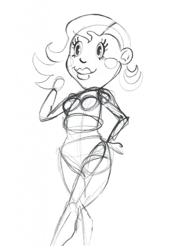
The main character was going to be a young girl with a 1930’s – 1950’s feel, a mixture of Betty Boop and Sandy from Grease with just a hint of Monroe, I had sketched out some possible styles and rules to keep it looking consistent, I liked the idea of making her face heart shaped and even managed to incorporate the two round shapes as cheeks. long cartoon eyelashes and he big curls in her hair finished off the look.
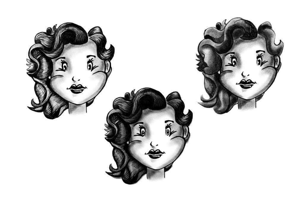
I experimented with some ideas on how to render the Characters, did I want it soft and smooth, a more hatched style in the end I opted for both, adding in the grit and noisy texture that I had enjoyed in the McBess style I had research ed, with some softer gradual tones also.
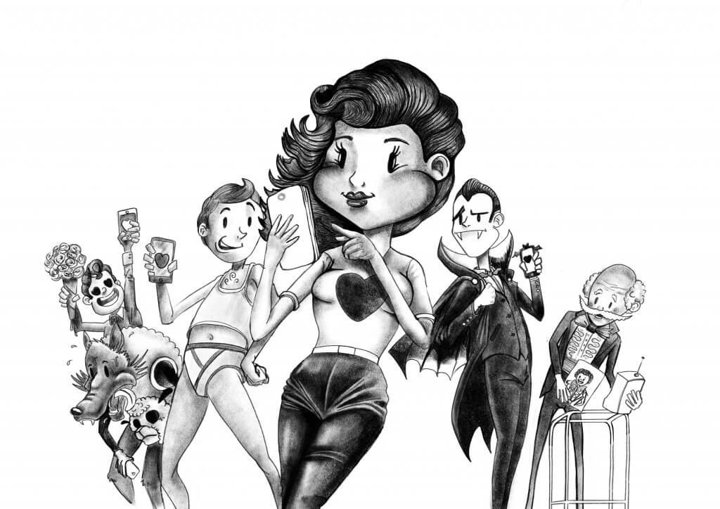
Next up was bringing the layout I’d settled on to life, I didn’t want to include too many secondary characters just a few either side. I used the key words to flesh out the different people, including some stereotypes, the characters left to right was;
- A hopeless romantic who falls in love too easily.
- A wolf in sheeps clothing.
- An overconfident pest of a man after only one thing.
- Our main hero, a single Juliet looking for her digital Romeo.
- Count Dateula, a blood sucking vampire, who will break your heart and bleed you dry.
- The ageing stud, he was a lady killer back in the day, and he is still using the same tired old photo to prove it.
I worked tonally for the next step, rendering the shapes and textures. I knew i’d have to add some colour, I didn’t want anything too bright as I wanted to keep an old looking feel, I chose a muted palette contrasted by the bright red hearts.