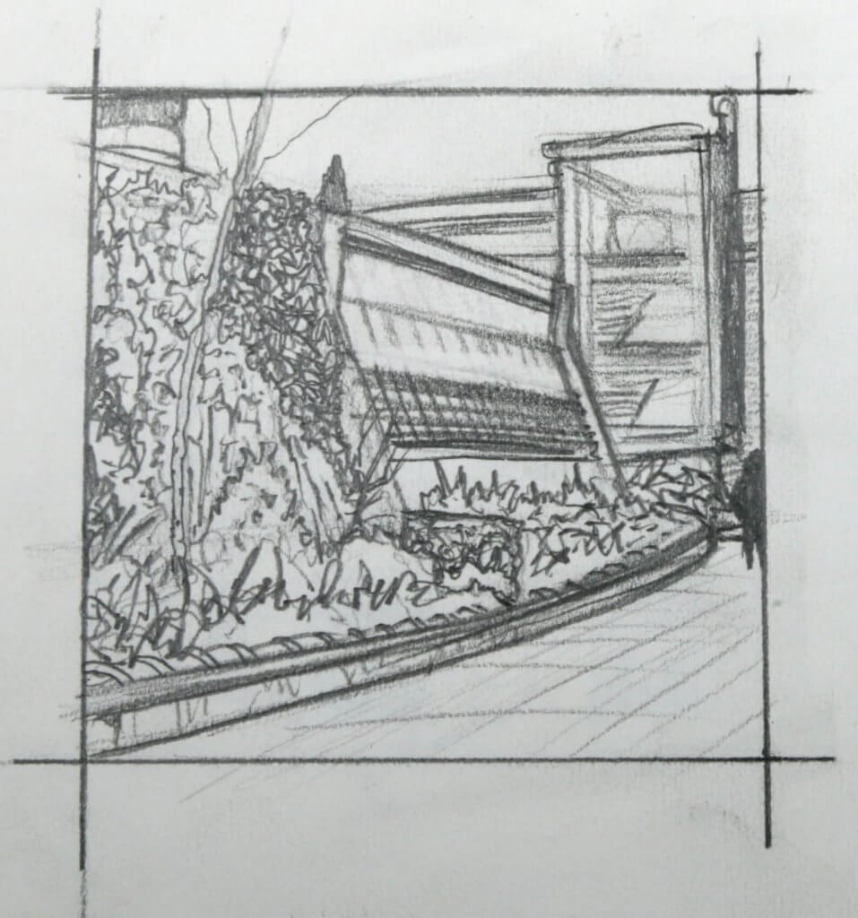
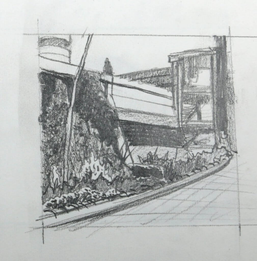
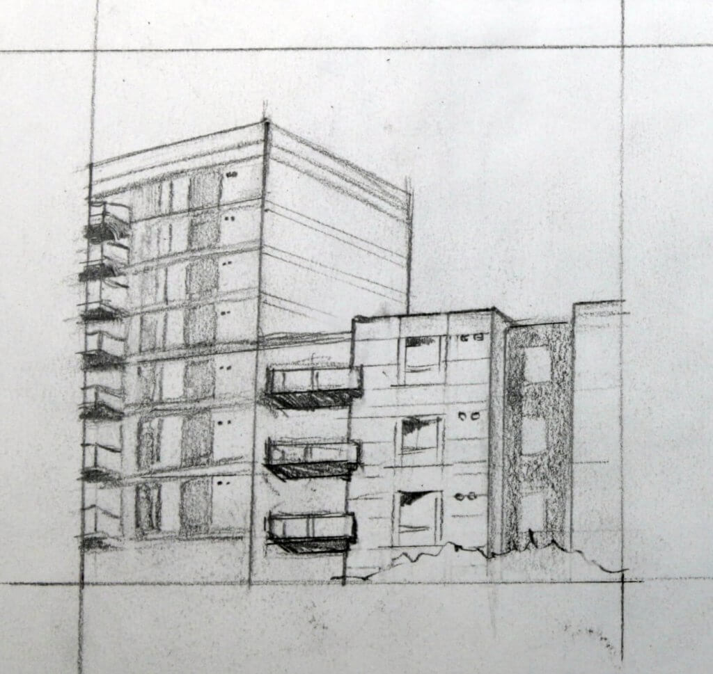
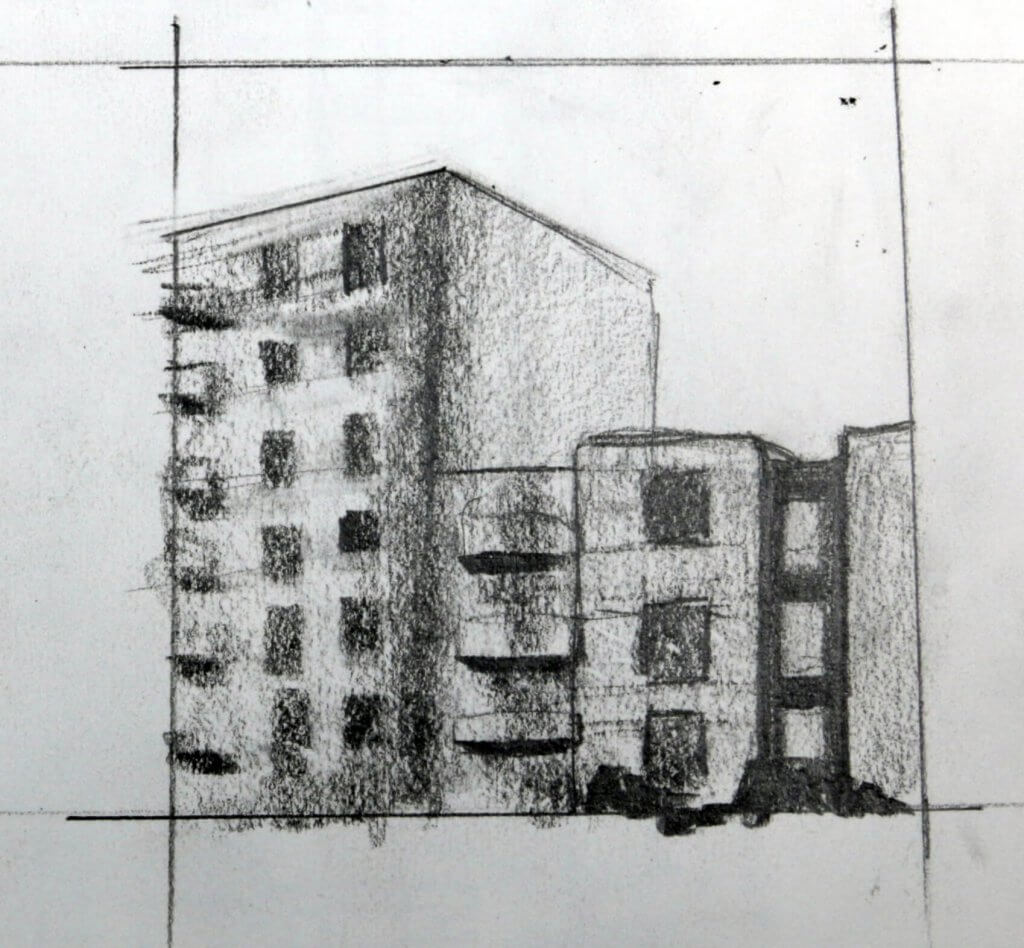
This exercise seemed to be about extracting the most useful information when drawing on site. Due to covid-19 we are currently in an lockdown, I took some photographs and worked from them as a substitute to fieldwork, as I would have drawn faster and loosely I gave myself 10 minutes to complete each drawing. I didn’t want to get bogged down in details and thought after the previous timed exercise this might be a good way to approach. Each view has a linear and a tonal block study, drawn in a 10cm square area. my paper has a fairly rough tooth and this with the addition of using a 3B pencil made the drawings a little muddy and didn’t hold detail too well, as we was asked to work on a small scale I dont think that mattered, capturing the essence, form and shape was more important than accuracy and precision.
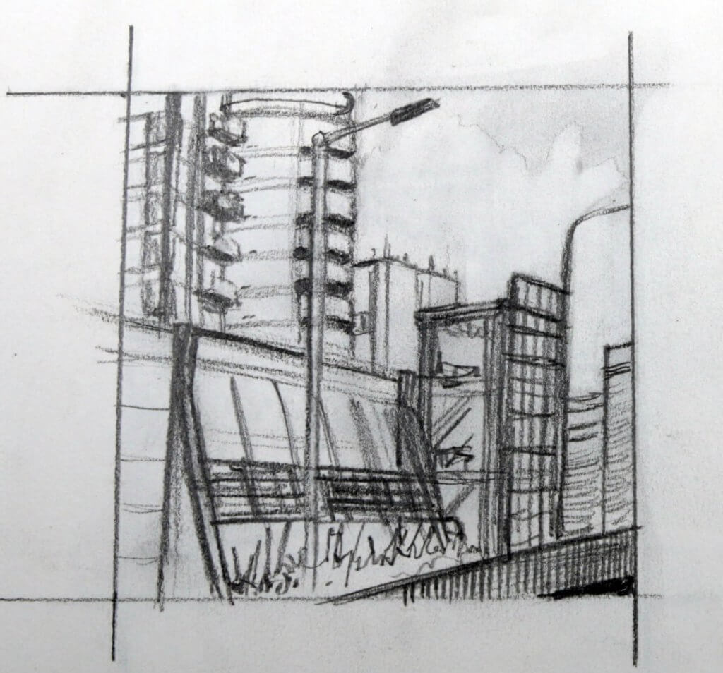
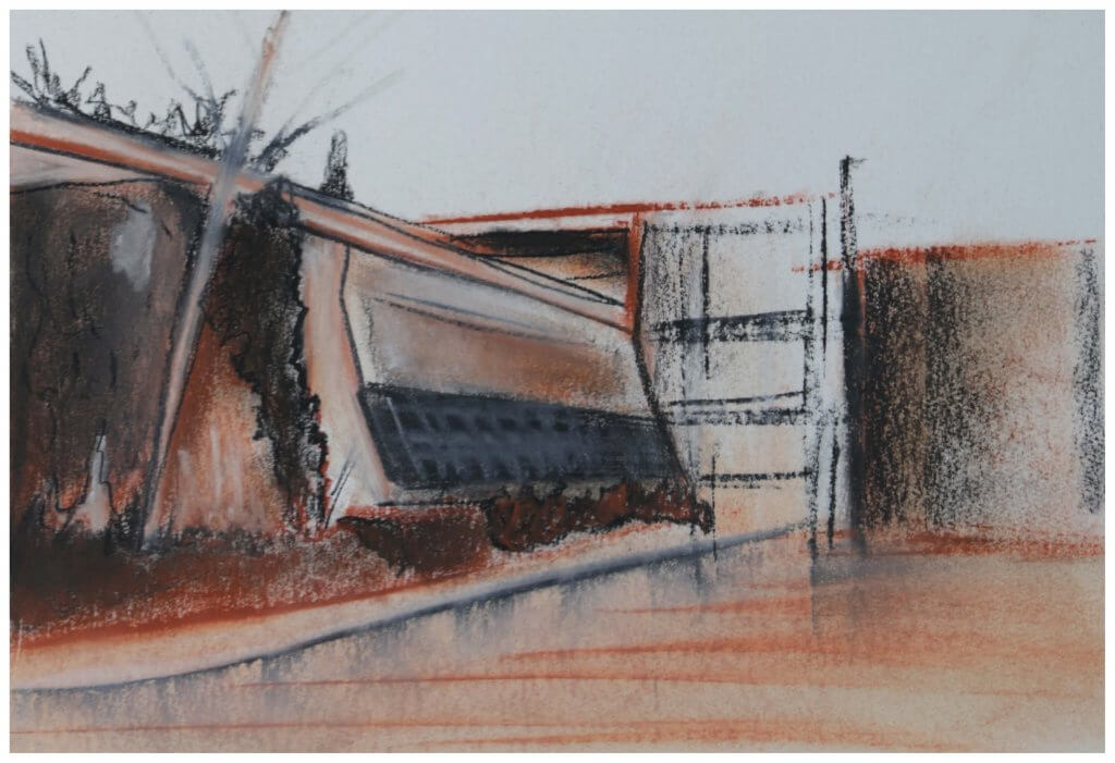
This drawing was also made from a photograph, in fact the same set of photographs I took for my previous drawings. We are still in a lockdown and this area is actually a busy multi story carpark, it did give me a good view point to work from, captuting the tops of the skyline. These buildings are very 70’s looking, the unconventional shapes feel like they they almost could serve as filming locations for something set in the future, like Kubricks clock work orange or Star wars. This is Romford, below that scene is an expanse of retailers, coffee shops and mobile phone repair. Not the most scenic or interesting place to visit or indeed draw. I started out with a sketch as instructed, I learnt a great deal of how the buildings were constructed and gave some thought on how I might apply some texture.
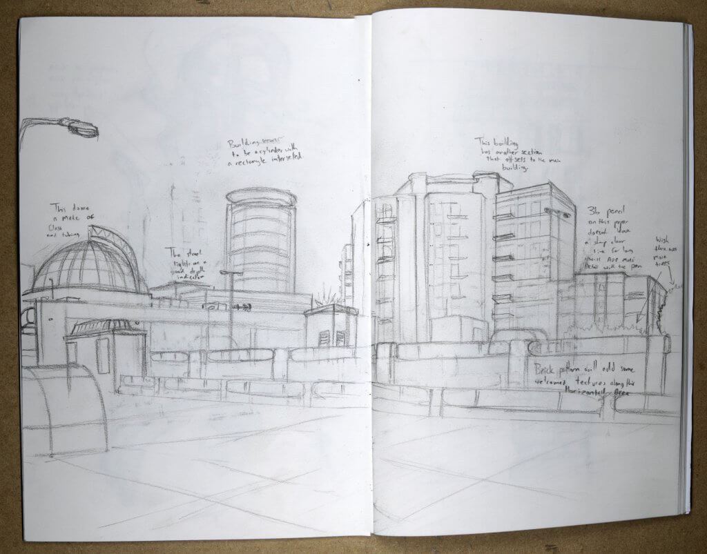
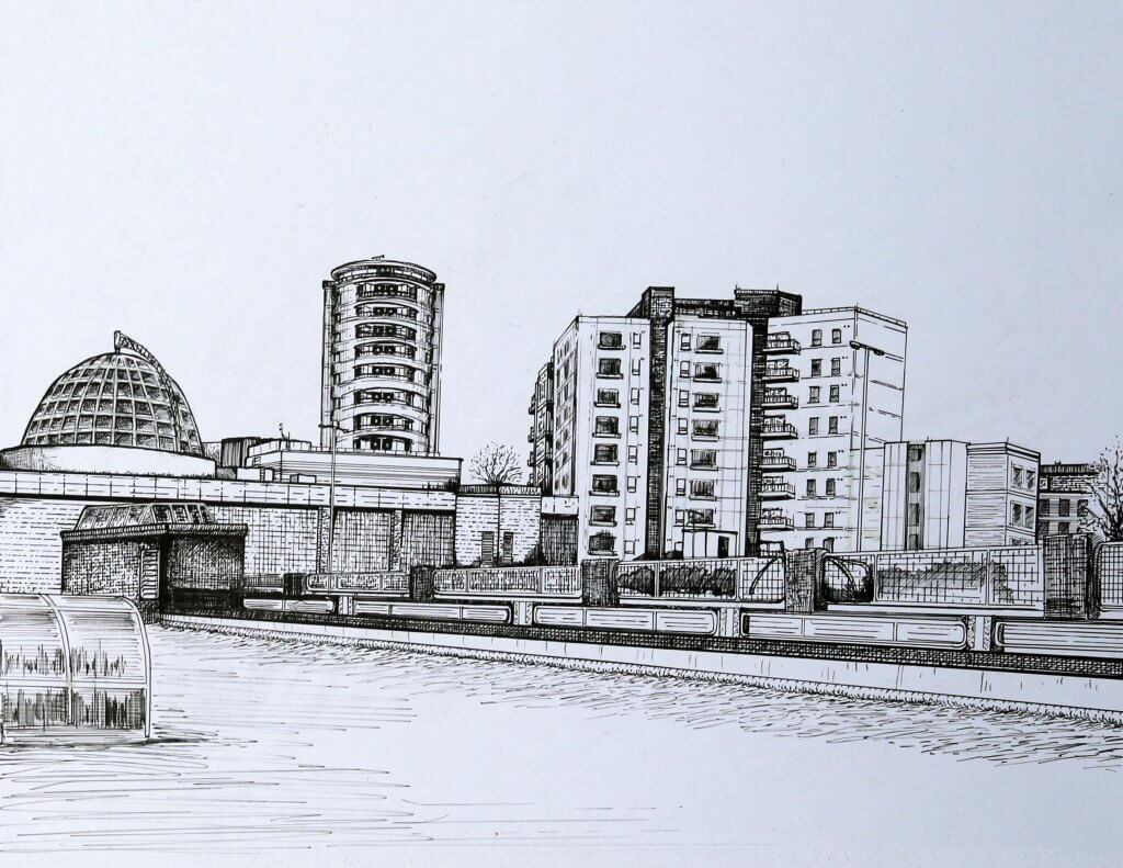
I decided to draw the final image on bristol board, the image looks a little skewed here which I think might be more to do with the photography and the angle I photographed it at, I will try to re photograph this if I end up selecting this as a submission piece.
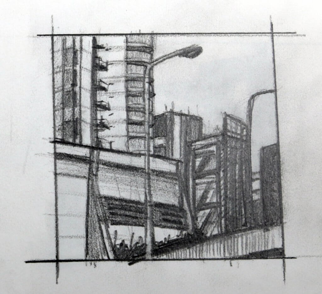
I Initially didn’t want to use a ruler, keeping it free hand would give it a very different feel , this proved to be problematic, especially in the details, one false move and it really threw off the perspective. I carried on with the ruler and tried to keep the line weights varied.
The weather was very over cast there was little to no shadows, I wanted to add some texture to the drawing to try to stop it being too flat. This made a lot more work, I ended up developing a bit of a system using pen and ruler to help aid the line work, hatching and angling the ruler to cross hatch I would sometimes use a flat line and sometimes a broken line, sometimes i would stop and add in some dotted marks along the edge of the ruler. I could see with a little more practice this could be worked into something quite stylish.
Another view of Romford, this is even more of a star wars set than the last drawing, it even has a metal grid, almost like a rampart.
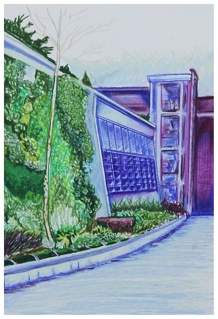
I had two attempts at this exercise, I started out using conte crayons, this quickly turned into a bit of a mess, it maybe wasn’t the best medium for a subject that had a lot of geometric accuracy and small details.
I switched to waxy pencils, I was asked to pick up to three colours, I used green and purple, this almost turned to blue in some instances.
I mapped out my composition with a 2h pencil, very lightly with small indicative marks so I didn’t define any shapes too early on, I wanted to work in blocks of colour rather than linear marks, in the end I used a bit of both, but mainly the blocks prevailed, I thought back to exercise 1 and the two approaches for a similar drawing. I was pleased with the texture I achieved with the foliage, this contrasted the flat surfaces of the buildings.
I tried to create depth with my colour choice, I was hoping the green would advance and the purple hues recede adding depth, It worked to a fashion but maybe a warmer hue such as a yellow/green or an orange would have been more successful.
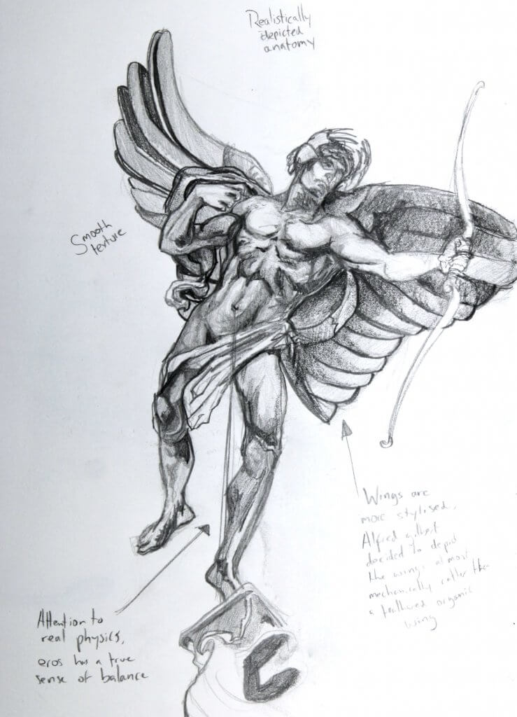
Again Covid has really left me with limited options, I googled to see if there was any local statues, but didn’t have much luck. In the end I decided to find some statues from artists I have admired, Sir Alfred Gilbert, Bernini, and Michalengelo, I also found a really nice statue from a church in Stratford. I noticed part 4 centers around the figure and all the statues I picked all portray anatomy in their own unique way. Some intentionally stylized, some incredibly accurate and even one that breaks convention.
Sir Alfred Gilbert was a sculptor I was introduced to by a tutor at college, I was absolutely knocked back by the level of life that these pieces of bronze had, they was all strong dynamic figures, they looked like they had been peeled from a page in a comic book, I would loved to have seen how Alfred Gilbert would have lent his art to a character such as Super-man, or even a Gothic Batman. The statue of Eros, has a tremendous sense of balance, the gesture in the arm looks like seconds before it was hard and taut, we see the statue micro seconds after he has let his arrow fly into his next love struck target. It was these things I wanted to try to capture, you can see I have the horizontal line tracking down from the naval, this would be the center of gravity, this lines up nicely with the foot firmly planted. The right arm of Eros with tension now released, wrist relaxed offset with the tensed bicep of the bow hand.
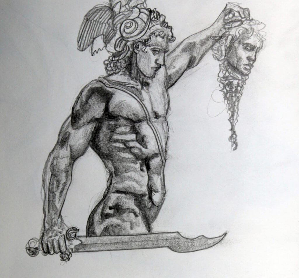
Perseus slaying medusa is another one of Sir Alfred Gilberts works, this is a favorite of mine as the musculature is very nicely done, a real sense of weight and tension can be seen in the arm of Perseus, no doubt Medusa’s head of snakes, still writhing was a challenge to hold steady and aloft.
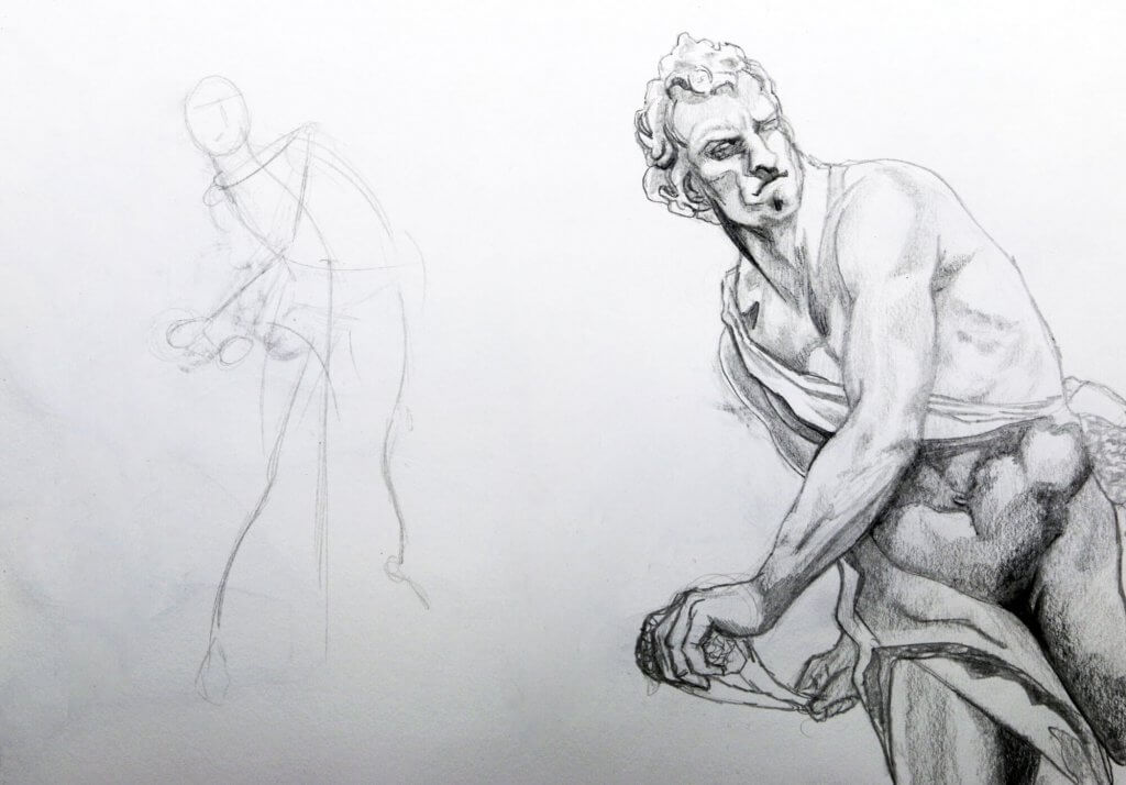
Next is a sketch of the sculpure of David by Bernini. I have to say that Bernini really is one of my favourite sculptors, his work is so sensitive, the poses and depiction of mass, soft and hard and all under the influence of physics, such as gravity and force is just on a different level to anything I’ve ever seen. I would love to see these amazing pieces of marble in person. When you compare this baroque piece vs Michelangelo’s Renaissance version of David you really have to marvel the amount of action and life that Bernini portrayed, this is by definition as I understand the main aesthetic difference between the two periods.
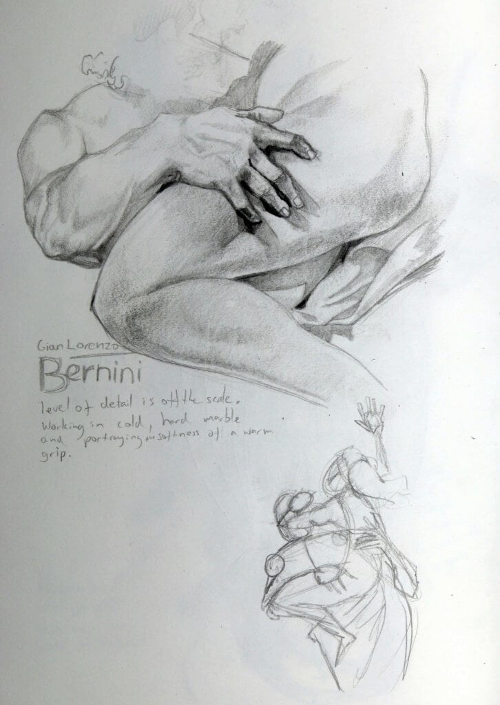
The image below is a detailed drawing of Bernini’s approach to soft sinuous tissue in comparison to a softer almost gelatinous mass. The rigid fingers impress into the soft thigh, his embrace, very physical and tensed, muscles engorged, and rounded. I also included a looser gestural drawing of the whole figure, this shows the forces at work.
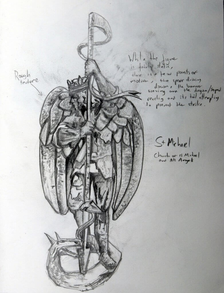
Below is a statue of St Michael, this is on an exterior wall of a church in Stratford, I really loved the way it had stylized anatomy and a really rough texture, the stance is mostly passive, but St Michael is driving downwards a spear into a dragon, this is not a natural pose like we see with the likes of Bernini but a really interesting one all the same.
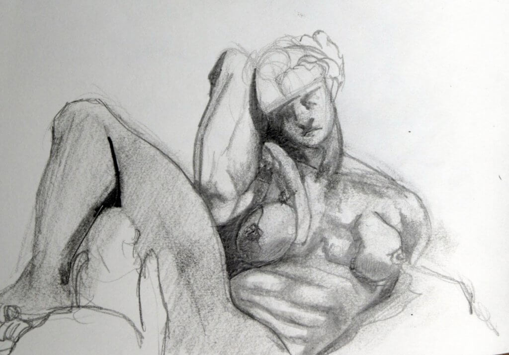
Finally we have Night by Michelangelo, I am always fascinated by Michelangelo’s depiction of the female form, there are several theories for this, albeit speculative reasons I needn’t go into here, but he had clearly used male models, the male form is apparent in every instance, even the female breast appears to be an after thought, almost affixed after the fact,to a muscular ches. Obviously this isn’t the case as he sculpted in marble and would be planned meticulously. Whilst his female statues don’t portray the female form as accurately as the likes of Bernini they still are fascinating to see, and offer an insight into the artist, his choices and the mystery of why.