I was asked to draw 2 self portraits, before doing that I was also asked to make some 5 minute sketches, this not only served as a good warm up exercise but also gave me oppurtunity to observe my own face in detail.
I worked in a3 size, and used my thick graphite pencil . This has proven quite useful in creating fast and loose drawings that require minimal detail.
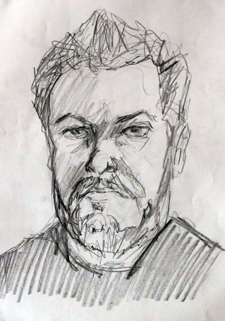
5 minute sketch #1
My initial sketch is actually my favourite, I think it might have turned out different because I was a little more cautious, and thoughtful even though 5 minutes didn’t seem very long, I seemed to have made more useful choices in describing my face.
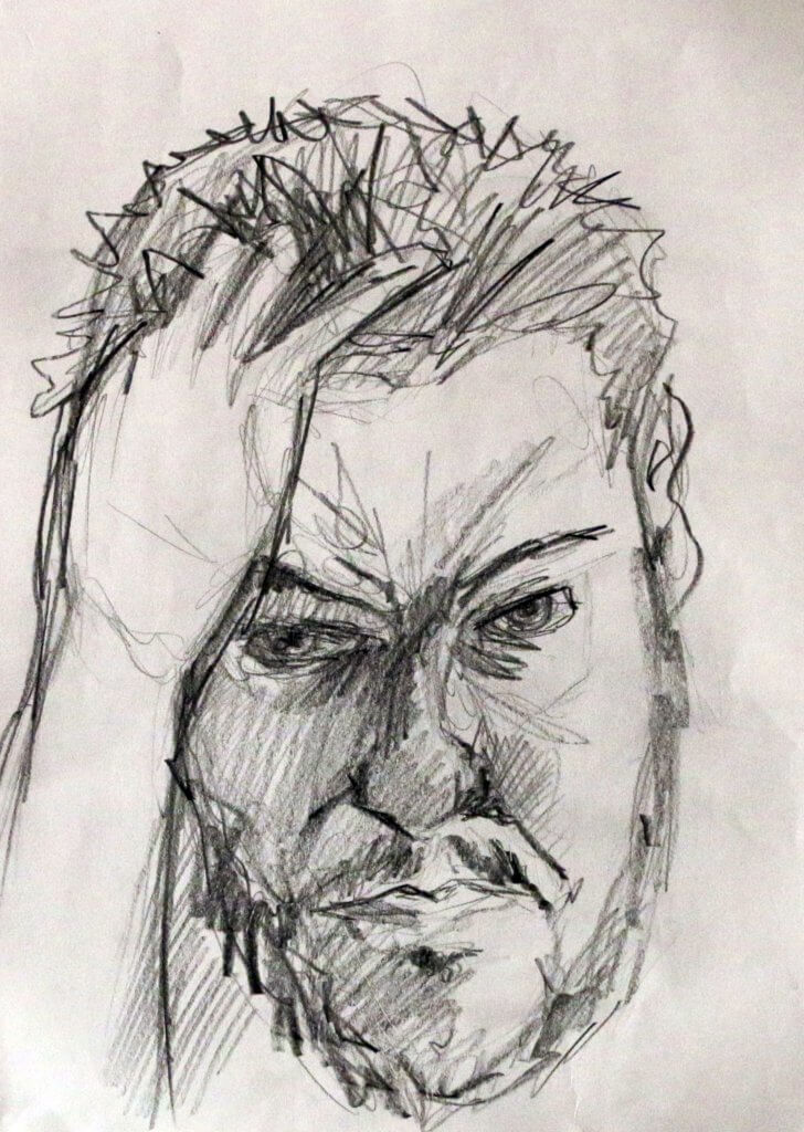
5 minute sketch #2
The pose for this one was better, the proportions of the hand was a little off at first, and look still to be on the small side in the final drawing. the emphasis on this drawing was more tonal than the previous, the abscence of light on the right side. of my face does help to describe the shape but could have benefited from some refinement, after a’ll this was a 5 minute sketch so withy the time allocated I think it captured some useful information, on not only my face but how I would approach a more complete image with less strict time constraints.
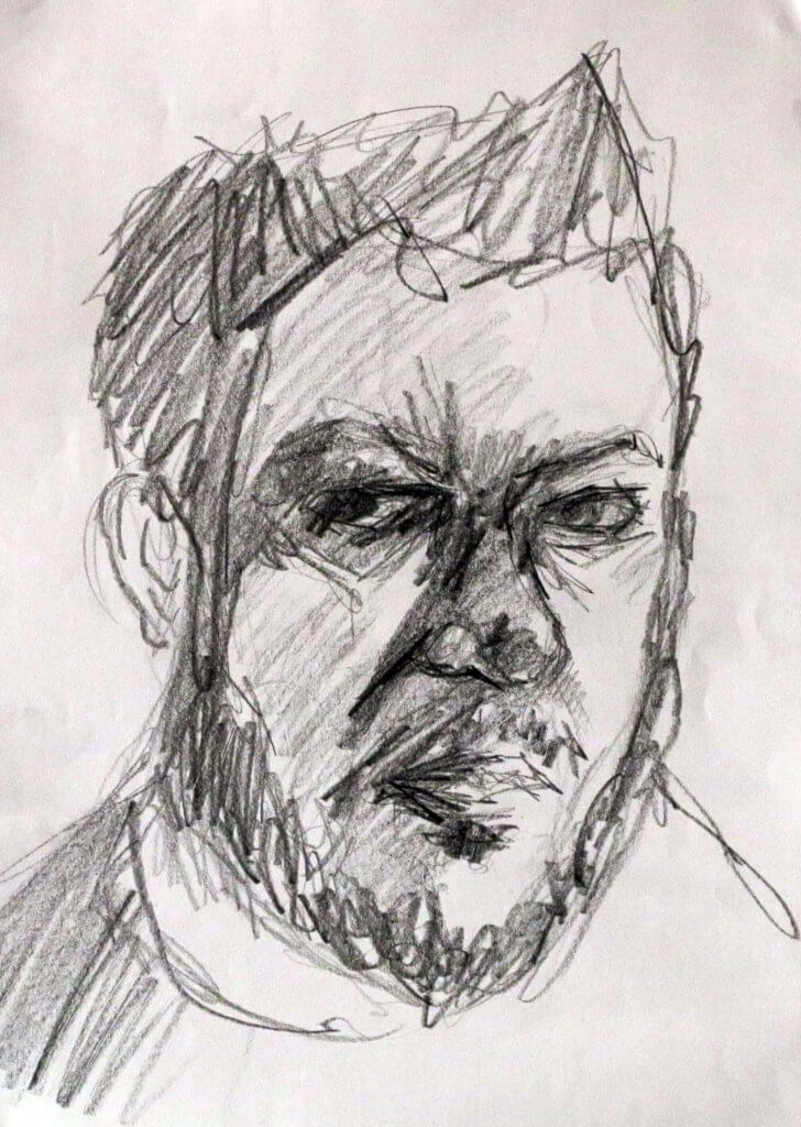
5 minute sketch #3
The heaviest of the three sketches, this one remains the most unfinished, I didn’t have enough time to describe all the tonal range I was seeing in my own reflection, I went in quite fast and bold, another ten minutes and maybe I would have created enough dynamic range to describe the form of the head and added some more detail.
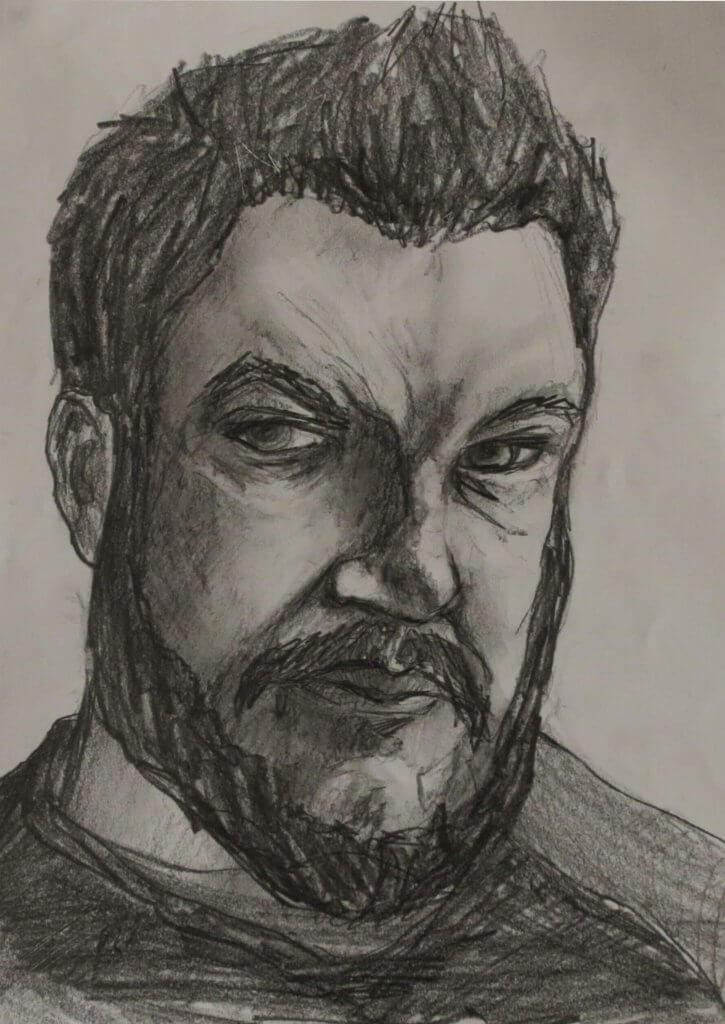
Portrait 1
The first portrait, in my opinion suffers from 2 things, 1) it is very heavy and 2) it is quite elongated. It’s not the end of the world but it feels very heavy, I ended up forsaken a lot of form by going in too dark, the softer pencils also muddied up the picture somewhat, my next portrait I want to aim to be more subtle, using harder pencils and building them up. this drawing mainly used a B pencil, the next I think i will try one of the H types and layer up to get harder edges and mark, building on each one to get darker and darker. the elongated pictire was all down to the angle I drew this at, i used a board and A3 paper but the paper was flairly flat to the table, my view point across the angled paper was skewed, the large sheet of paper exaggerating the angle, I have tried to repair this in the photos below.
my drawing board angle, really stretched out my featuresThis was more of the image I was seeing as I drew
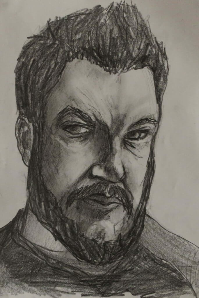
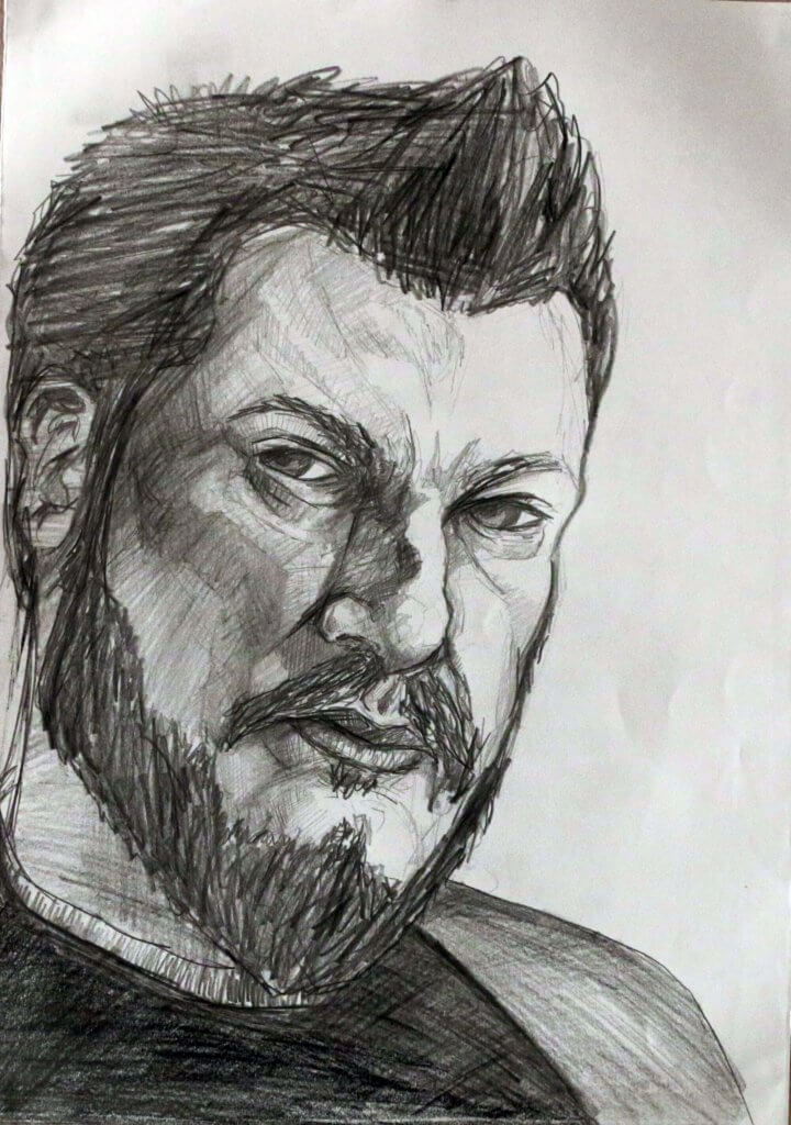
Portrait 1 (second attempt)
This portrait felt more succesful. The portrait is similar to the previous, but harder pencils, a slower approach and a suitable angle for the drawing board made for a slower and more calculated approach, I used small marks for texture and tried to follow the contours i observed in the mirror around the shapes in the drawing. I felt there was a lot more tonal range here to be used and offered more detail.
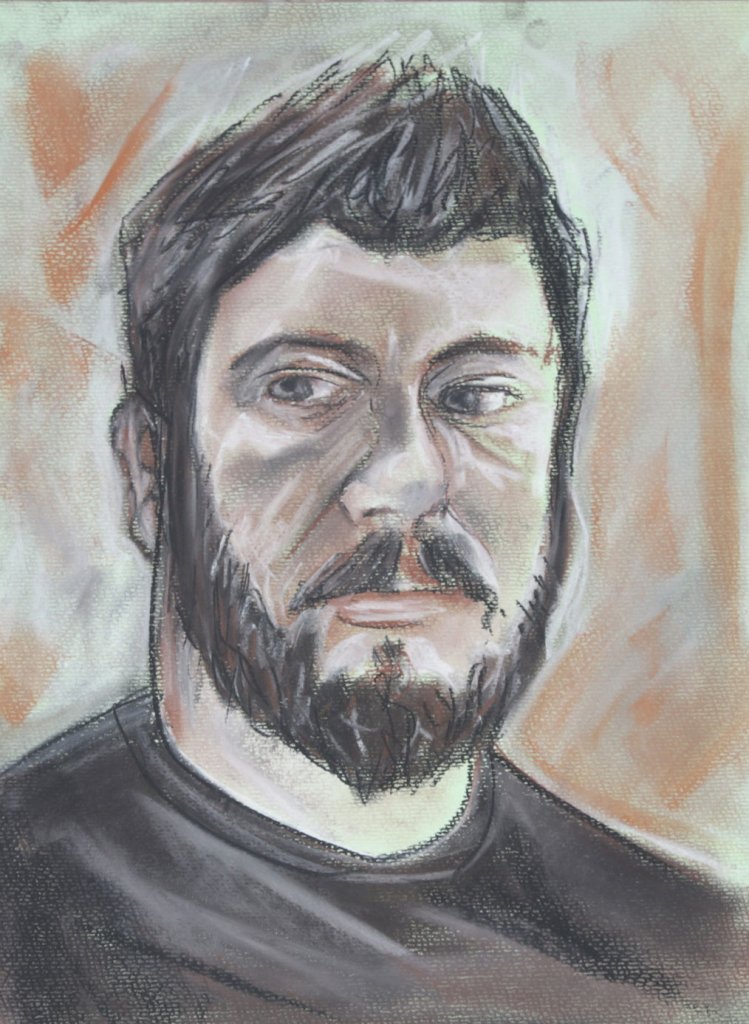
Portrait 2
Using some toothed green pastel paper with conte sticks, I quickly marked out my face, a mark indicating the harline, top and sides, some soft marks for the eyeline, then nose and mouth position, I mark out the hard fixed structures around the eye the cheek and brow and then start to observe and document the shape of my features. my conte sticks are brown, orange, white and black. surprisingly the red in the brown conte stick when blended with the white makes some good skin tones on the Green paper, that was not my intention, but I didn’t mind it all the same.
Over all I was really happy with the session, in fact I really enjoyed it, although my angry expression would make you believe the contrary. I learnt an important lesson, and one that needs to be applied before I even make a mark, make sure you are in the best position to draw, particularly on a large surface.
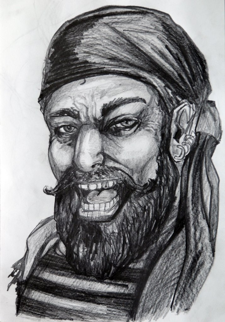
I have recently been reading treasure Island to my stepson mason. I have always developed a strong visual sense of characters from their descriptions in books, often after reading a book and watching the film version I have questioned the choice in casting. Long John Silvers descriptions have become pretty much the blueprint for the stereotypical pirate, The wooden leg, the shoulder perched parrot, the round hooped earrings and so on.
The actual facial description is quite thin, even so I have always had a good sense of the characters persona and facial appearance. Jim Hawkins, the books narrater and key character describes him at first site as a pale, plain faced man, his first impression was that of a happy man and very likeable. Later on we find that he is in fact much more than a retired sailor and pub landlord but a pirate. he is proven to be cunning and deceptive. Even though he is described as plain and pale, I tend to think of him as tanned or dirty looking, a nut brown face, being out on deck at see would certainly affect the tan of their skin and produce some weathering, especially around the eyes. I don’t tend to think of him wearing the tricorne hat, that feels to me like a status indicator, or a symbol of leadership, almost like a crown. Long John up until a point keeps his Pirate status and position of leadership hidden, masquerading as the ships cook, waiting for his mutiny to come to fruition. I also Imagine him with a dark beard, although this is not mentioned in the book to my best recollection. I tried to make my portrait of long John Silver, friendly and jovial but deceptive, spritely yet weathered. His smile loud and lively is juxtaposed with sinister plotting eyes. Overall I was happy with my John Silver portrait, If I was illustrating for a book, or graphic novel then I’d probably go more in depth in his clothing, his one legged gait and other defining characteristics. But as an exercise to visualise a person’s character from imagination this has been a deep enough exploration.
I was asked to look at some self portraits of historical and contemporary artists. I compiled a list of work that resonated with me, Im sure I could have spent hours doing this and still found more to feature but these were the highlights.
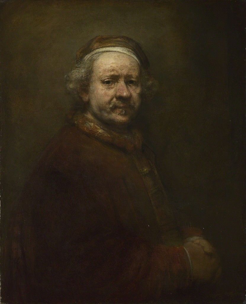
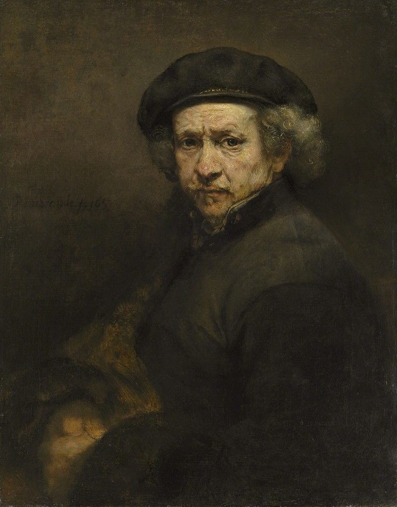
Rembrandt
Whenever I think of self portraits I always think of Rembrant. I think its because they have a very lifelike quality, the lighting is dim with only the face illuminated, the expression quite stern or somber looking in some ways. He was quite prolific with his self portraits, I counted 12 from his early twenties to the year he died at the age of 63.
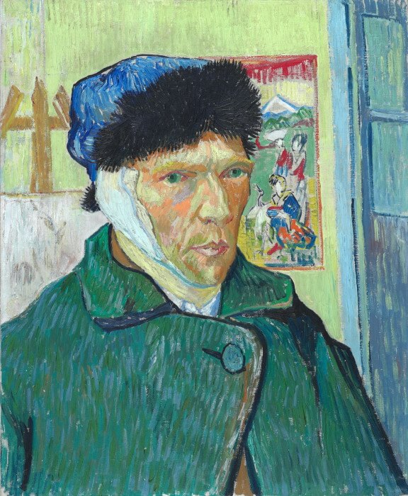
Van Goth
This is a well known self portrait as infamous as the story behind it, I love the textures, and detail given how bold the marks are. The fur of his hat looks soft and thick, the skin tones of the face when viewed closely and in isolation do not seem typical of what you would expect to find in a face, but the hues of the face doesn’t seem to be off or exaggerated at all. Green orange and yellow with warm pink and browns all seem to mix inside the eye to create a portrait of a troubled man with some self loathing issues.
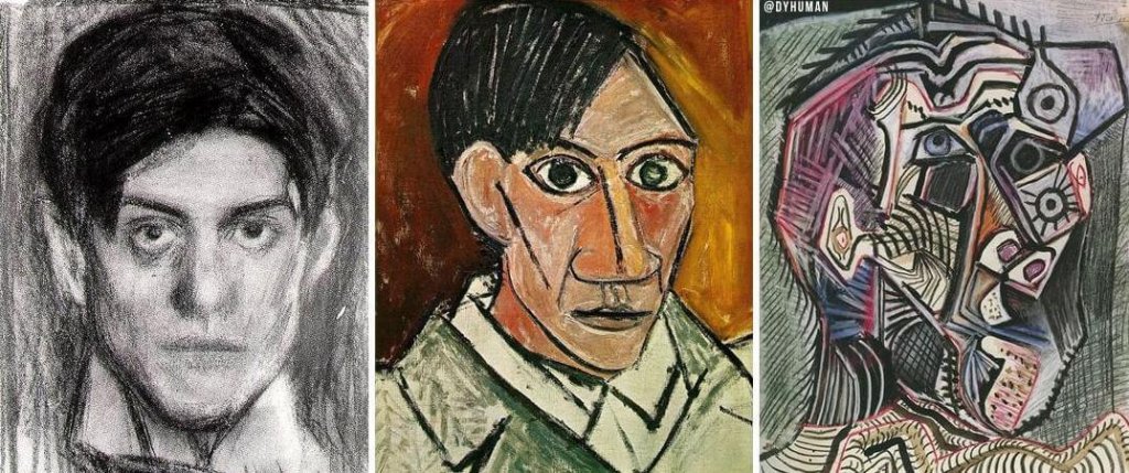
Picasso
I’ve included Picasso purely because his style and the way it changes is very interesting to me, a sense of style is something I always try for. The author Neil Gaiman said, and I may paraphrase slightly that “a persons style is the repetition of the mistakes and choices they cant help but make.” This I found interesting, even in my own drawing I can see an inherent style, but the work below is clearly something that had to be at least initially forced, a conscious effort to create something unique and new. Maybe the mistakes in our art sometimes force the style. Picasso clearly had a realistic style in his youth, and maybe the flaw in his art, to him at least was that he didn’t want realism, and set about a new approach.
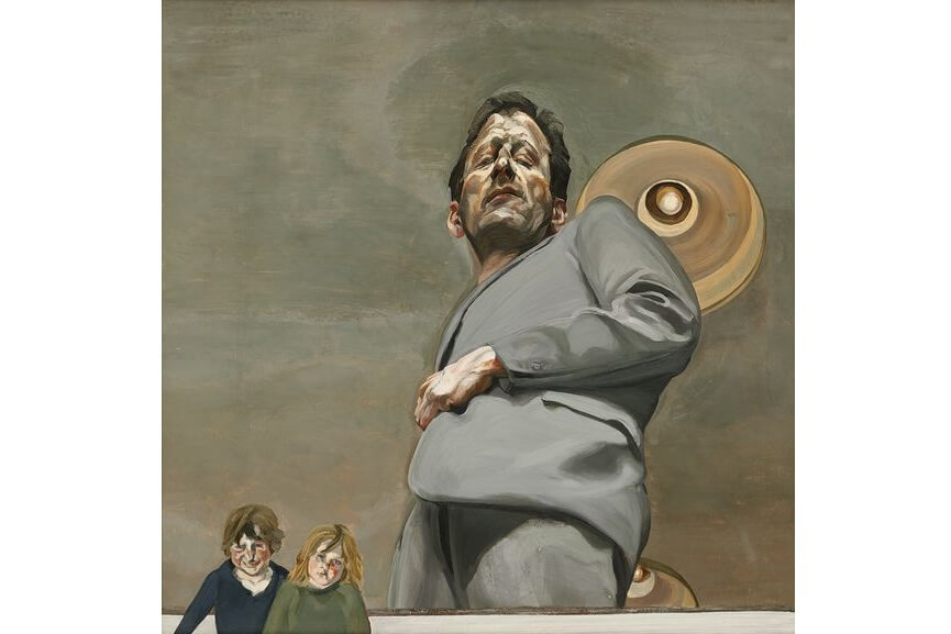
Lucian Freud
This portrait was created using a mirror on the ground, I love the distorted perspective, misshapen head and a sense of grotesque. the colour pallete is dull and the expression is quite uncomfortable for the viewer to look at for too long. The addition of the children, his own children in fact seems to be outside of the portrait, maybe Freud would rather show us his children, not any to show they are a part of him and given awkward expression to divert the attention away from him.
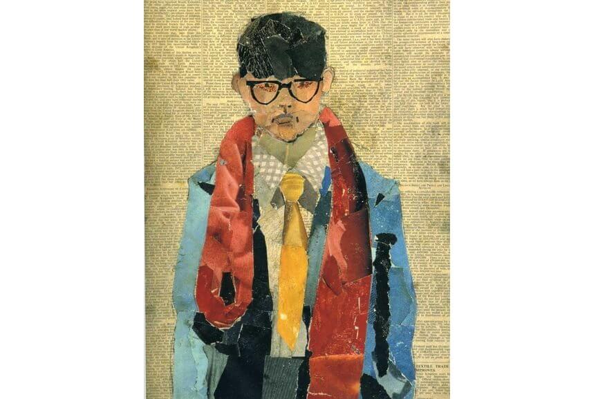
David Hockney
This mixed media/collage is really lovely, it has a sense of realism through its sense of scale and proportion, the David Hockney trade mark glasses give a sense of who this is, he seems to be portraying himself as quite young here. The colours are bright and what you would expect from Hockney.
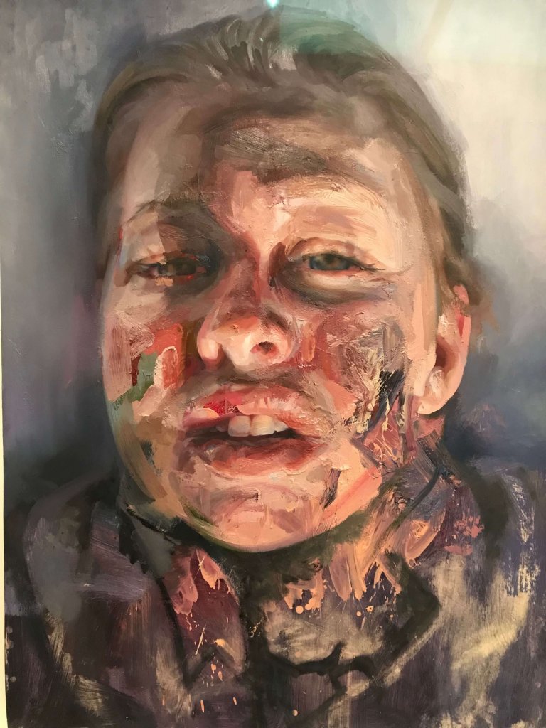
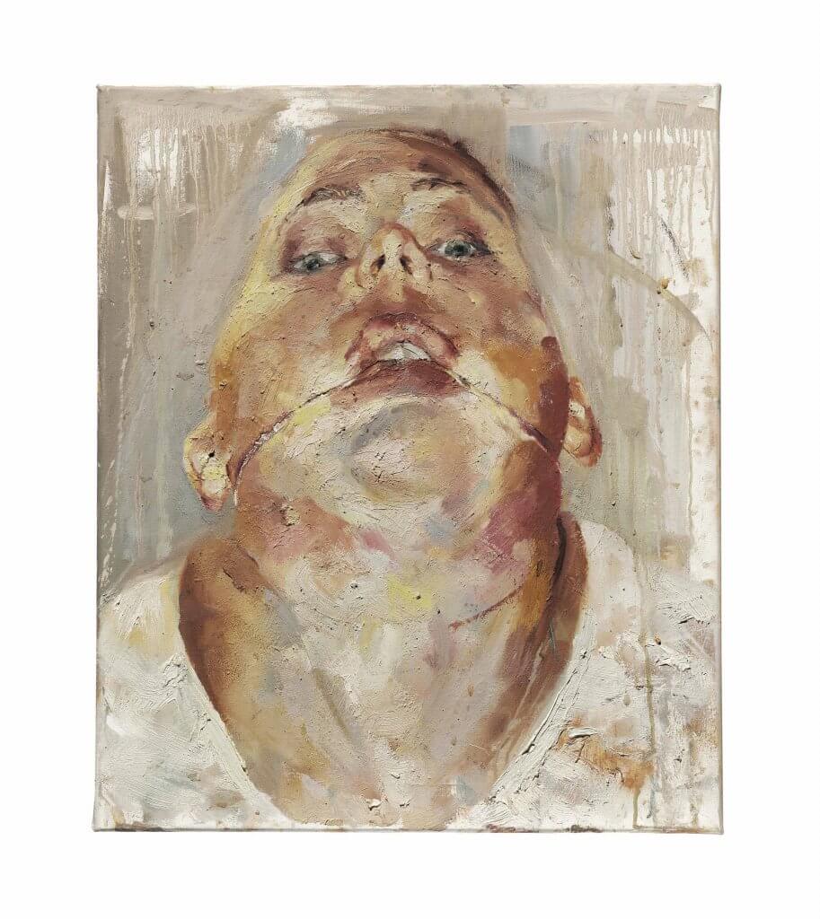
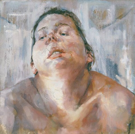
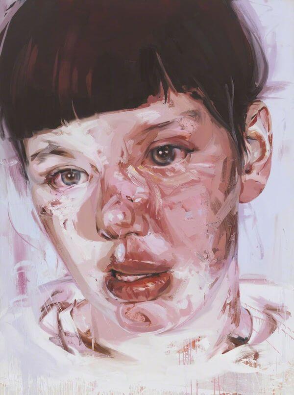
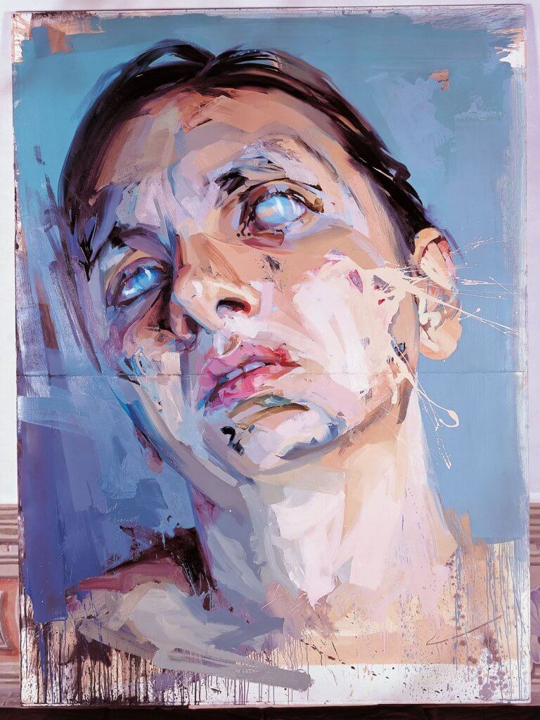
Jenny Saville
A very realistic portrait embellished with some interesting marks and shapes, certainly not concerning itself with vanity, it looks almost like she is in discomfort, I suspect she is laying on her back, the soft areas of her face under the influence of gravity. Again some unexpected colours in the portrait. but they don’t seem to be out of place.
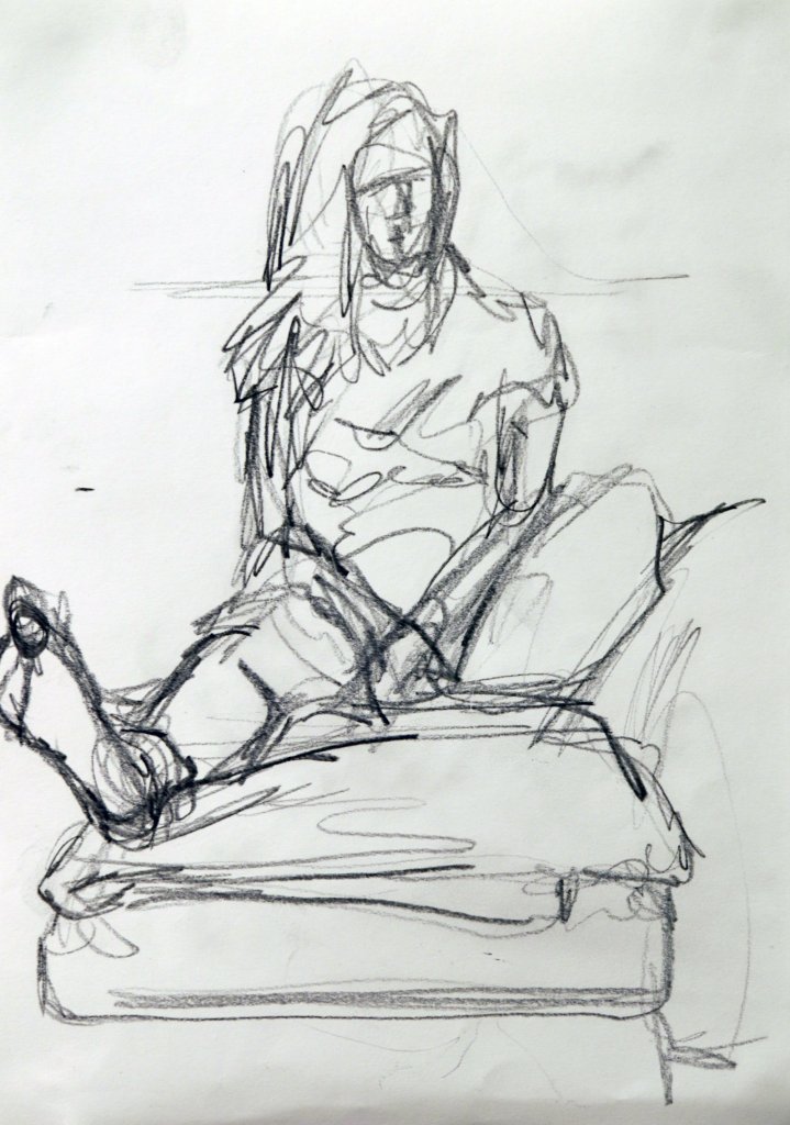
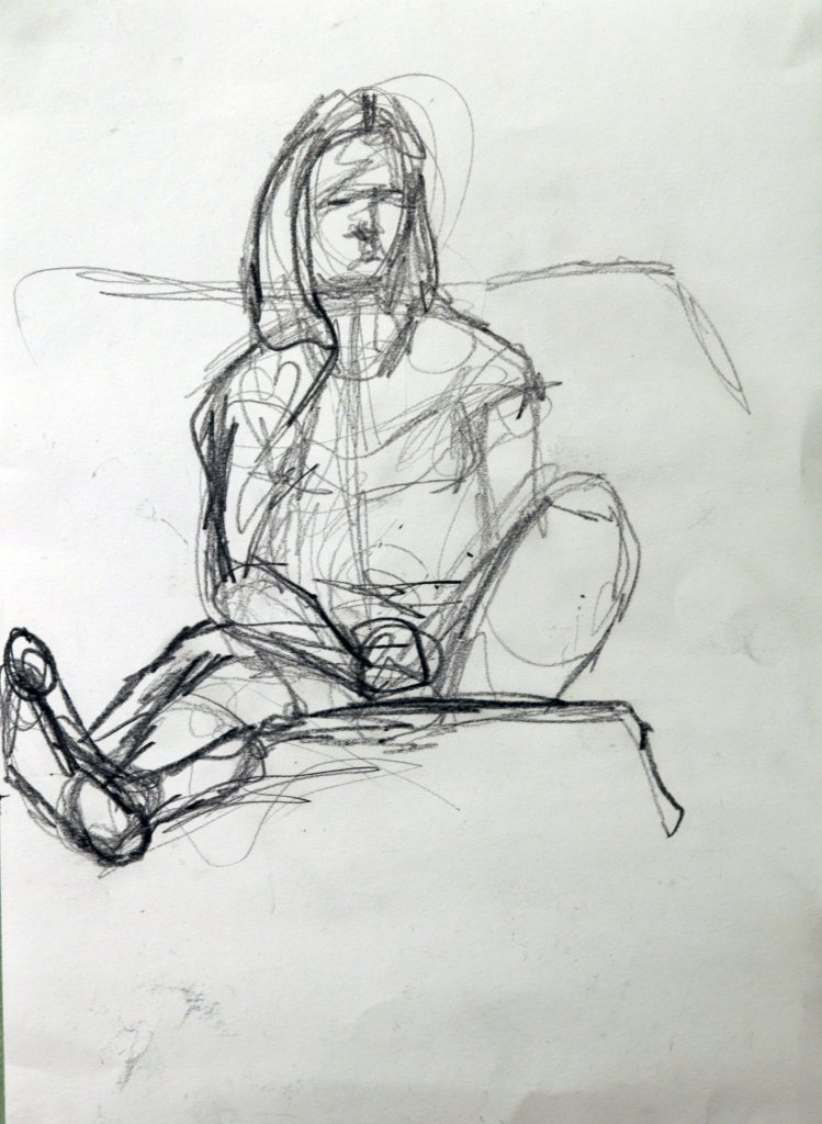
Assignment four was made up of three parts, I have got into the habit of preparing a couple of sketches before the main piece to work out any complicated aspects of the pose and get a sense of space around the composition.
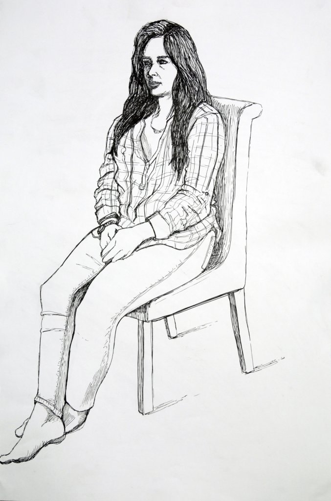
Figure study using line – Seated model in an upright chair
My notes suggested I experiment with some unusual formats, found paper etc, as the drawing was in a large format I couldn’t find any found paper large enough, I also wanted to explore clean lines with smaller marks for details so some smooth paper cartridge paper was probably best, I wanted to work with ink, I like the control of fine-liners but I wanted to use them in a way that didn’t appear technical. My thinking was after I had a drawing I was happy with I would use some of the techniques I explored in the Experiment with mixed media exercise, such as wax and inks or water colours. I also wanted to try water colour and salt, to texture the paper. I could add all this to the image in post. This was ideal as I didn’t have access to the model the day after so this could be carried out then. After my drawing was complete I didn’t want to ruin it, I really liked how fresh the lines appeared, I was happy with the tonal values I had created my the length and orientation of my marks.
I thought about how it would look if the paper was a different colour, or even if I could experiment non destructively, for example with a large sheet of acetate, almost like a film cell overlaid. Another option was take the drawing and work on it digitally, changing the background colour, texture etc.
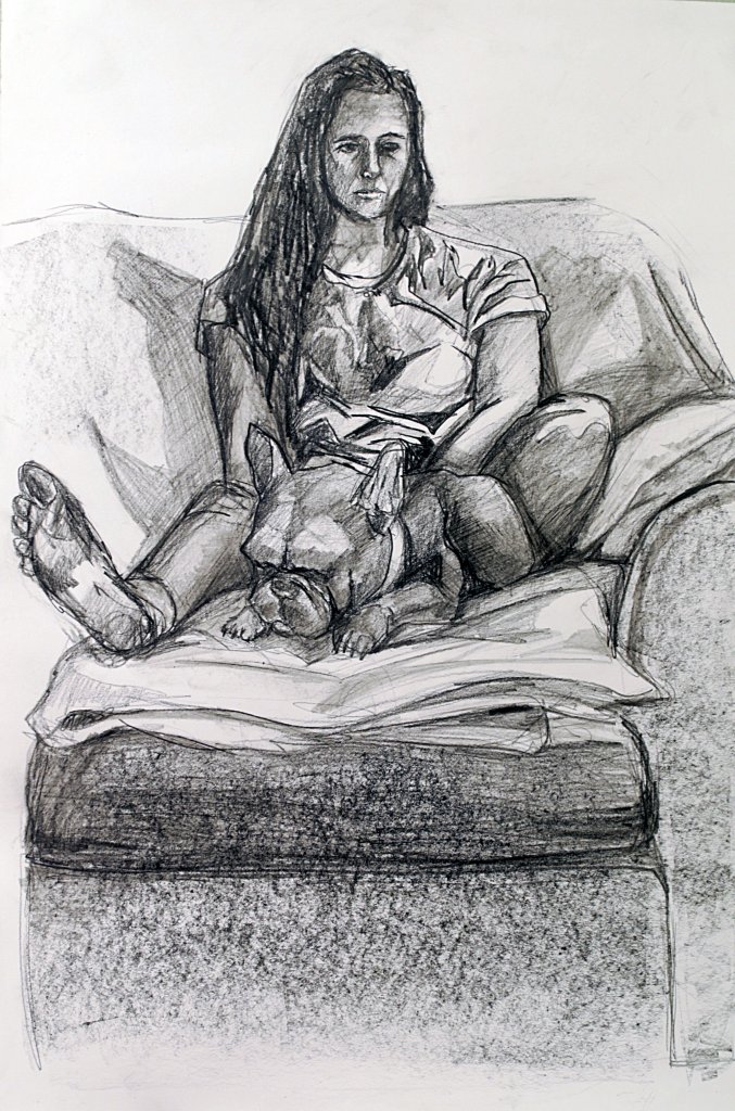
Figure study using tone – Reclining model
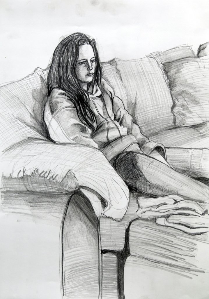
Again I produced two sketches for this piece, I also wanted to revisit some perspective in the body, after my frustrating attempts to do this before, now calm and focused I thought I would take another stab at it. I sat a lot lower this time, in hind site I wished I sat closer to further distort and exaggerate the perspective. Again I found it quite a challenge to not work initially with line, I ended up outlining blocks and filling them in before finally settling into a blocks of tone only style. my subject was actually watching the tv, it was really quite shocking to see just how much the light from the tv fell on the subject, and how the changes on screen affected the shapes of the face as the shadows changed positions. Overall I was happy with the drawing, if I was to do it again as I mentioned above I would change the pose to a more exaggerated, distorted almost fish eye effect.
Portrait combining line and tone
Feeling a little guilty about the lack of experimentation from the first study, I thought it might work nicely here to do something interesting with the surface for the portrait. I was thinking I would like to use colour, the exercise does ask for line and tone, tone is present in colour so I thought this would be ok. I was hoping to achieve something similar to Jenny Saville’s work, big bold blocks of textured thickly applied colour. I decided that oil pastels would be a good medium. Ionly had some smaller sheets of pastel paper, i wanted to work fairly largely, I thought if I was to rip them leaving an uneven edge I could join them together and add the resulting off cuts to build up some, different surfaces on the paper, I also thought some black marker pen as an under drawing might make a good effect, similar to the one that I was trying to achieve with the “group of figures” exercise, a kind of moving while frozen double image.
My textured pastel paper, joined at the back with magic tape and then smoothed together with PVA gorilla glue, which has its own brown hue.
I was looking to cover most of the paper with oil pastel and black marker so the surface was of more importance than the actual colours, we will see how successfully they cover over the paper and glue. Another interesting thing about this method was that the pastel paper has a heavy toothed side and a smooth. While the main body of the paper is toothed the additional texture scraps are a mix of smooth and rough. I am hoping this makes for interesting marks.
My picture had a lot more texture than I was expecting, my loose under drawing, was all but lost under the pastel, I can see the advantages to using wet media to get the effect i was after, I added vaseline and baby oil to try to smooth the pastel together, as I had used PVA glue over the scraps of paper this actually acted a s a barrier and smearing the pastel resulting in “cleaning” off the marks, it would seem my experiment was more of an obstacle in this case.
I also used the other side of a brush and scratched into the oil, this is a trick that Rembrandt used and In an interview with Jenny Saville which I actually saw on the OCA by pure chance she reveals she does the same, claiming that you can learn everything you need to know about painting by studying Rembrandt. If i was to attempt this style of portrait again, I would go larger scale and ideally with paint, I think oil pastels was a good choice but not wet enough to produce the broad unpredictable swirls and dashed marks.
I do like the final image, but already I can see things I would approach differently. I tried to separate the face into three colours, green for the shadowed side warm pinks and red for the light and yellow green for the top of the forehead. I feel this structure would work better with a bit more distinction between the areas. The positives are their is certainly a mood to the piece, albeit not a happy one and there is a decent amount of form described. I think it had a good resemblance to the model, she didn’t see it as much. Hopefully that’s because how we see herself is different to the perception of others. None the less, I very much enjoyed all of this assignment and hopefully my deviations from the text aren’t too much of a problem.
The first part of this assignment required me to summarise my previous assignments, communicating the successes and problems that needed to be resolved.
Assignment One
Looking back at this piece, I am really happy with the way the different surfaces came out, I think the composition could benefit from some cropping but overall I am still happy with this.
Assignment Two
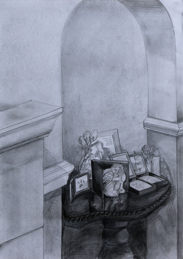
I remember really enjoying the research for this section, I wanted to draw something that would have multiple points of interest, the table is quite personal, if I had to re draw this, I would add more textures, separate planes by using directions of my marks and maybe add in some points of interest around the drawing.
Assignment Three
I remember this assignment being very tiring physically and mentally, constantly having to think about the direction of my pen and the type of marks to make. If I was to approach this drawing again, I would try to be more expressive with my marks, I would break my lines, especially outlines, to make for an airier lighter drawing.
Assignment Four
Figure drawing is probably my favourite of the subjects I have covered, I was happy with the way these individual examples came out, they all have a diffrent feel but still feel like my drawing style. If I had to work on these again I would attempt more challenging poses, especially perspective, this is something that I never seem to be able to get just right, and if its off makes a half decent drawing look awful.
Finding a subject
I really enjoyed working with the figure and portraits, I also really liked researching artists throughout the course, but especially the research in part 4: the figure and the head, I found this of great benefit and it has certainly broadened my approach towards my own artistic efforts and working on a sense of style based on what I enjoy looking at myself.
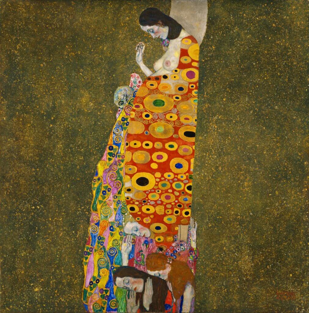
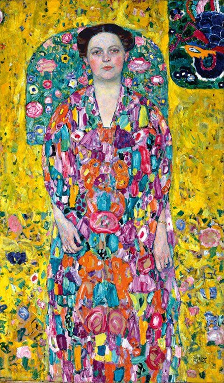
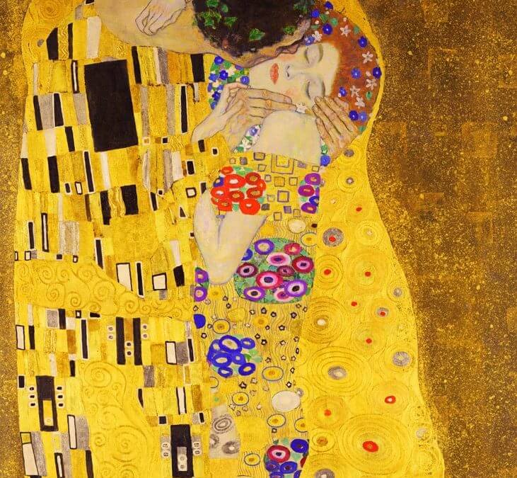
I found a lot of inspiration looking at the work of Gustav Klimt, the way he portrayed realism within the faces partnered with flat areas of colour and pattern, I also enjoyed seeing Jenny Saville’s huge artworks, her use of broad strokes and abstract artefacts, they almost look like the faces are bloodied, bruised or marked with dirt.
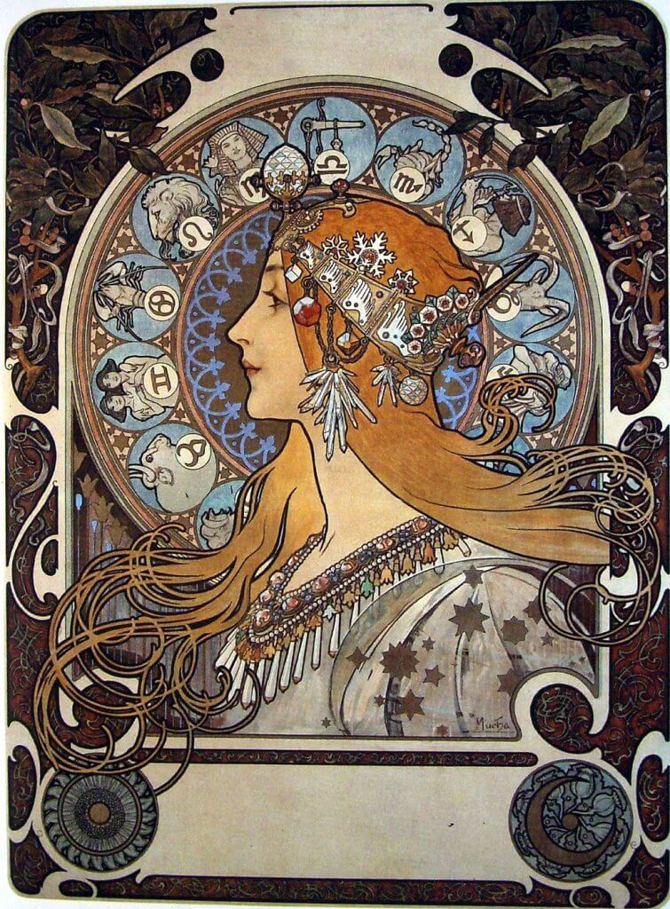
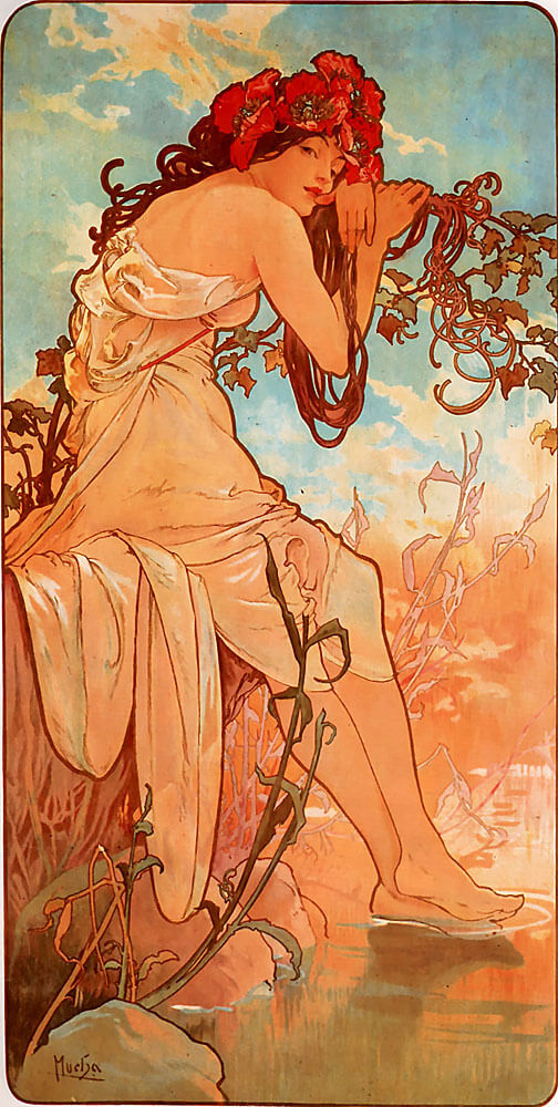
With those artists in mind I thought about maybe a figure or a portrait, I had a look over the web for some more examples of Klimt and Saville’s work and saw some pieces by Alphonse Mucha, I’ve been a fan of his since college, a tutor suggested I look him up after I showed him a cd single I had just purchased, I mentioned to him I liked the art work. He suggested it to be a mix of Alphonse Mucha and John William Waterhouse. I really appreciate Mucha’s presentation and the poses of his figures, I also really enjoy his use of line. I have been advised by my tutor to control my reliance on line work, this has been an extremely hard habit to break, but I do feel I am getting there, I normally go on an autopilot but making the effort to draw in blocks rather than line has forced me to think more about my drawing and look at the subject in a different way.
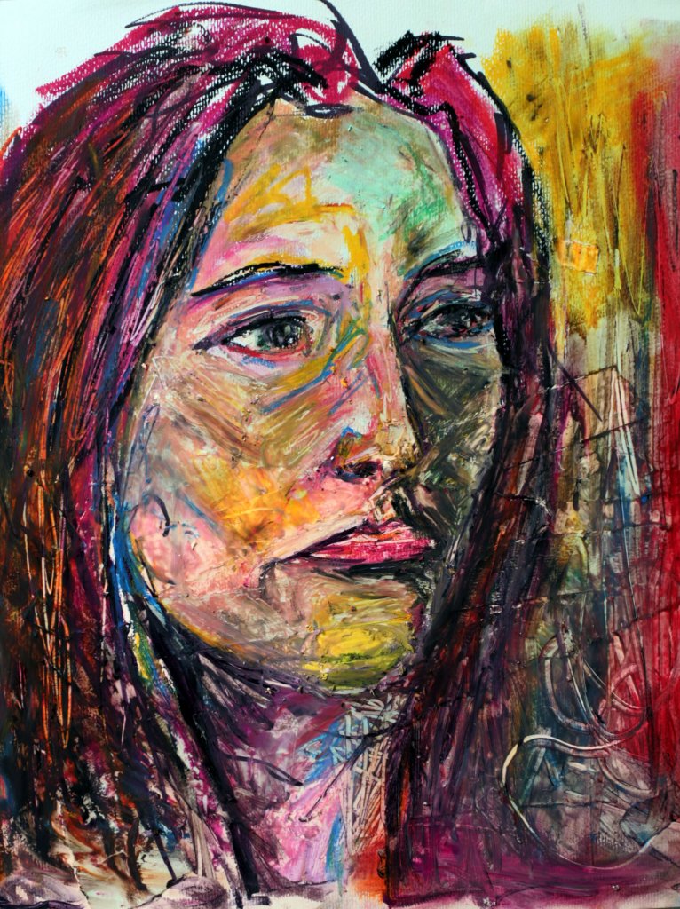
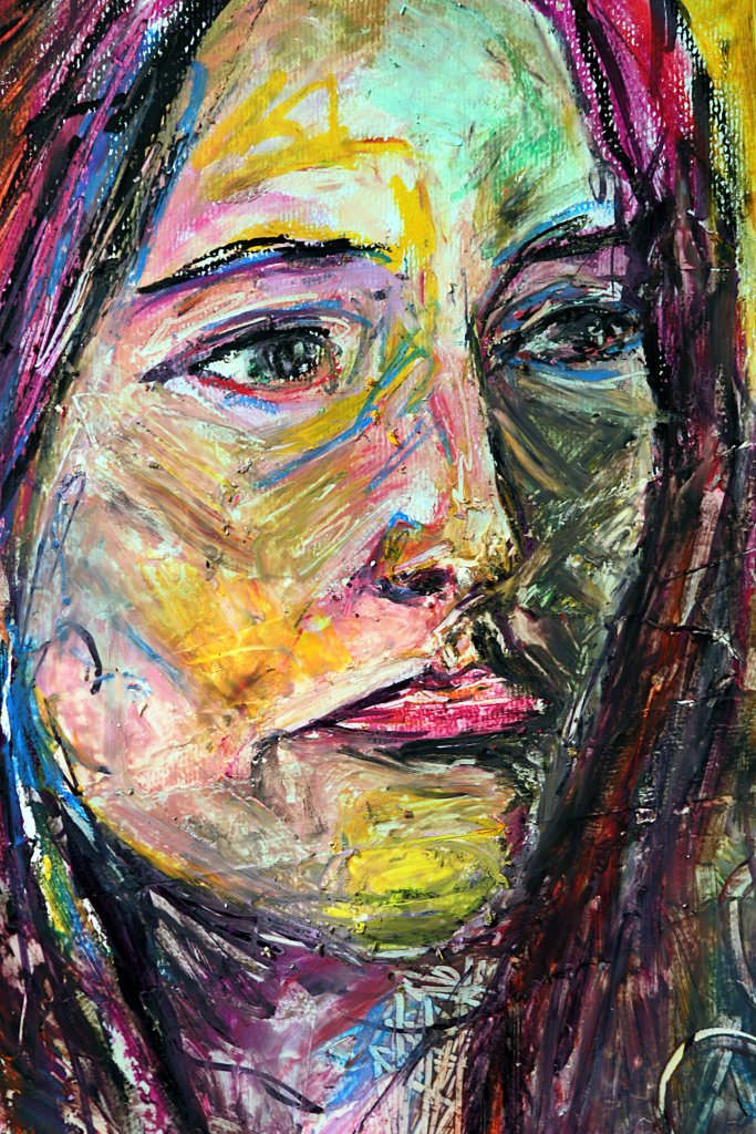
After some thought I decided on a portrait of my partner Kathleen, I wanted to work as large as possible, seeing Jenny Saville’s huge works looked like so much fun, I imagined myself using big brushes and reaching across a vast white space, filling it with angular shapes and harsh marks and scrapes of course my image couldn’t be a fraction of the sizes she can work in. Around a year before I had bought some really nice paper on a roll, I thought to myself it would good to work bigger than I ever had, and wondered if it would change the outcome of my efforts, my approach and drawing style. I looked in our shed for the biggest (improvised) drawing surface we had, I found an ikea table top that was donated to us but never used, as ikea desktops are made of compressed cardboard this gave me a light weight, flat surface measuring 120 x 60cm minus a border around the image for the tape I will use to fix it to the table. The paper is very thick and has a medium tooth, it would be suitable for a wide range of mediums which got me thinking maybe a mixed medium approach would be a nice way to work. As I have mentioned I am trying to work on relying more on tone, but I do enjoy using line in my work. So at this point in my journey I think exploring both is more feasible than tone only, I will of course favour tone more than line to carry on changing old habits. I think I would like to be more experimental in my approach, as this is to be a portrait of a stranger I think that might be more interesting to myself and the viewer, allowing me to get in some points of the subjects way of life and character. Im hoping to realistically depict the subject, but not to the extent of photo realism, I want some abstraction and a freedom in my marks.
Due to light being scarce in the room I will be working in, my sitter having limited time I plan to pose her for a photograph and work from that. To summarise my personal project will be;
A large format (120c60cm) semi realistic portrait
Mixed medium
Thick medium toothed paper
Combination of line and tone
I want the piece to tell a story about the subject
Artist statement
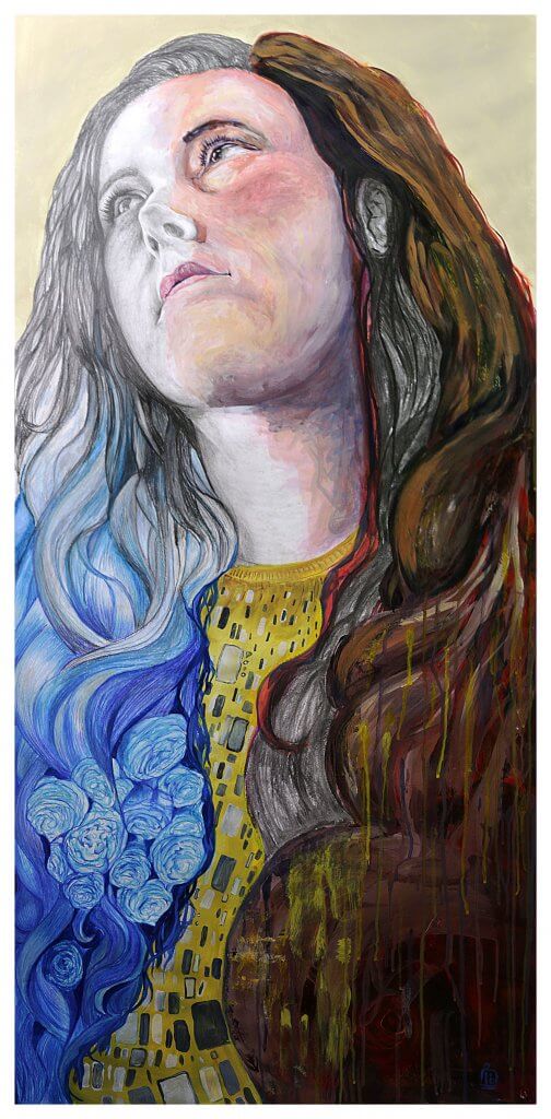
The title of my final piece will be “absense” a mixed media representation of the senses.
My partner Kathleen is hard of hearing, I have often thought about the day her hearing goes completely and how that will affect and impact us. I want my piece to represent the human senses, and as the intentional misspelling of my title suggests, the absence of the sense of hearing. I want to incorporate colour and pattern/texture some structured (Klimt) and some random, such as paint flicks, scrapes, splashes and drips (Saville) I want the picture to feel cool and warm using areas of blues and reds. I want to also convey a soft area with little clarity or definition to represent Kathleen’s hearing loss, I want the pose to reflect strength and confidence much like the confident women Mucha depicted.
To give some background, Kathleen’s hearing loss was actually caused my complications during a routine ear operation when she was 2 years old, she had several operations to correct this but unfortunately those were unsuccessful, she has scars behind her ears and usually prefers to cover them, wearing her hair down. As an 8 year old child she was fitted with hearing aids, they were large and ugly and through fear of cruelty by other children opted to not wear them, she relied on filling in the gaps by looking at the shapes on others lips to reinforce what she felt she had heard. Kathleen’s favourite flowers are peonies, I would like to incorporate these into the piece to represent the sense of smell. My paintings usually have a smooth blended appearance, I tend to work in large brush strokes then refine these using a smaller brush until I get to the details, I want to work the opposite for this piece, I want to retain some of the brush strokes, keeping some edges hard. I am not expecting my work to ape or mimic Jenny Saville’s exceptional pieces but I want to approach it in a way that I imagine she would, loose, experimental and most importantly for me not what I would typically choose to do. I will view it as a good iterative start to work towards changing and shaping my developing style.
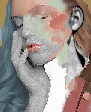
I made a rough mock in photoshop of how I might divide the sections, I found this useful as it gave me the freedom to change my mind and ideas were free to flow at this early stage, as you can see the original idea was quite muted, leaning towards a cooler colour scheme more like Jenny Saville’s paintings.
I really like the detail and vibrancy of the patterns that Klimt uses, they are often flat and almost look stuck on, like a sheet of carefully cut wrapping paper, I would like my pattern to have similar shapes and bright colours, but incorporating it into the image by following the contours of the body.
I want to stylise the hair in my final piece, I also really like the stretched poses, although mine will be a portrait I want to incorporate that energy and life into my work.
Jenny Saville’s work varies, above are some smoother more blended images and some hard edged examples, I want to aim for somewhere in between.
The Sections
Throughout the drawing I made voice memo’s I have transcribed them and adding these in as quotes. The way I intended to approach this image was section by section, with the intent of a final pass to pull the image together if need be. I rarely work with paint and especially colour, so this image will incorporate a challenge for me. Here is a breakdown of each section, its obstacles and successes.
“If I was planning to make further iterations of the drawing, I think I’d be more comfortable being more experimental.”
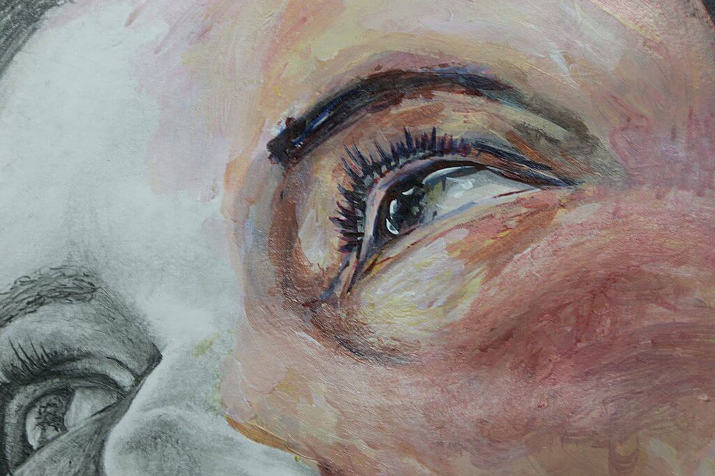
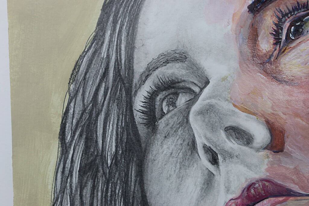
Graphite I started using the pencil to slowly build up the tonal values working between hard then softer pencils, using the paper stump/tortillon to blend and work in the graphite, erasing and layering as I went. Using the tools I follow the direction of the contours of the face, although the image is to be mixed media I want it to hang together as one drawing, I don’t want a big jump from one medium to another, I want the transition to be subtle, so tonally this will have to match the other sections. This will likely mean working on the whole image and then refining towards the end to unify the sections, for this to be successful I will have to be both reactive and proactive, planning ahead as much as I can. I used both a putty rubber and a plastic eraser on its edge to remove a layer, and then put it back on, I do this to try to get a mottled uneven texture, when I work over the pencils too much they start to burnish into a smooth surface and getting more graphite to sit on top is hard if there is nothing for it to key on to, erasing the marks back helps to win back some friction. In addition to this I used an electric eraser with a small tip to bring back any lost light spots. My goal with the graphite was to introduce detail and texture in even the soft flat areas, this in my mind would result in a more realistic effort.
“I have stood in front of and looked at the image for about 20 minutes each day, planning on what areas to work on next, and with which medium, I am trying to be logical with my approach as some mediums will be easier to correct and adjust than others.”
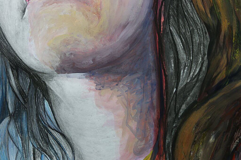
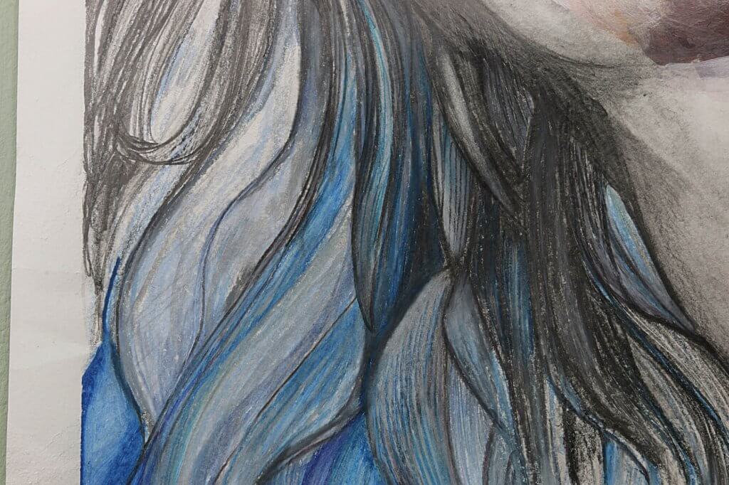
Colour pencil The face is to be divided into a cool side and a warm side, the coloured pencils will be predominantly blue. I am using the waxy type of pencil, these seem to blend well together, again I haven’t used the medium that much, more experience would help me to understand how to get the best from them. “I’m making tentative marks at the moment, Im not really trying to make any concrete decisions, using blocks of colour and lighter and darker tones as my tutor has suggested.” My current approach is to layer the pencils on top of each other. I break up the larger sections of hair and try to get a shape, I look to Mucha again as the hair on his figures is really stylised and has a life of its own, I thought this would be an interesting approach for my work. I liked the way the pencils and graphite merged, giving a silvery look, this helped to soften the transition, it feels quite natural this way and is an answer to one of my predicted problems. The two mediums one waxy and one dry work quite differently but the flowing shapes also help to ease into the next section.
“I want to produce an image that hangs together well, I don’t even want it immediately obvious that the different sections are in different mediums.”
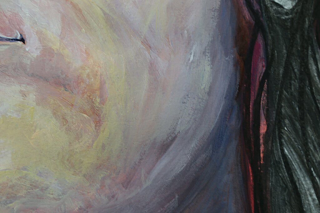
Acrylic Paint Using a similar approach as the pencil I followed the shaped of the face, I started with big vibrant colourful brush strokes. I chose very bright and bold colours, pinks and blues, I see that a lot in energetic contemporary portraits, I eventually worked in more realistic tones, treating the other colours more like an underpainting. I looked at Jenny Saville’s most common colour palette as she was then main inspiration for the painted section, she uses very warm browns and reds with cool pinks, blues and greens. I added burnt sienna to warm up the face, with some blue for the shadowed areas such as the neck. I eventually lost a lot of the abstract marks, when I look at the picture closely it certainly is different to what I’d normally do, visible brush marks, small blocks of colour all when viewed as a whole seem to render the desired shapes and features. I want to do a few more paintings with this approach, physical or even digitally.
“I’ve not completed a lot of physical paintings, its not one of my core competencies. But at this point I just want to get some colour down, I’ve chosen a basic palette as a jump off point, I think as long as I follow the contours of the face and use roughly the correct tonal values then it will act as a serviceable start.”
When I work digitally I do tend to take more risks, thats likely because it is non destructive and easily reverted if my choices aren’t to my liking. It might be a good way to develop a style in conjunction with experiments with real paint, the approach will be the same for both but the actual application differs greatly, so using both feels like would be of the most benefit. The other are of the painted section is the patterned clothing, I really enjoyed adding in the pattern, I call Kathleen Kat, rarely using her full name, but there is something leopard like, I originally was going to use a red pattern but pleased I chose yellow, it sits nicely with the blue and the warmer red/brown hues. The final part of the painting, which was something I hadn’t planned was adding in the scrapes and drips over the hair, I tried to do some bouncy cloud like shapes, I wanted the hair to have life like in the Mucha examples, it didn’t really work as I’d hoped it looked like chocolate ice cream, so I decided to deface it, scraping and dripping colours that was around the image, I think it did help pull it all together and create a little more interest.
“I tried to approach the image, the painted section particularly with a sense of energy and freedom, I’m nowhere near there yet, still a little rigid and driven on details too soon. Looking at some of Jenny Saville’s painting it looks like she has painted the details and then added a layer of abstract marks and shapes afterwards, I cant imagine myself being successful with that approach, I think I would end up defacing and destroying what I have done.”
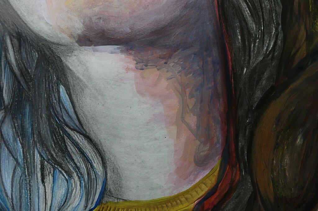
Charcoal This section was to be quite loose, with blended soft marks. I wanted to imply shape, little to no detail, suggesting that the ears are void of colour and nuance, dull, with no sharp trebly tones cutting through. again this section was built up in layers, rough shapes blocked in and then worked into the paper. It took me a while to be content with that final section, it didn’t feel worked on enough, but that wasn’t what I wanted. It needed to be a suggestion and vague.
There are many things that turned out how I planned with the drawing. I was happy with how vibrant it all looked, I had thought a paler pallette (as per the Jenny Saville examples) initially, but with the addition of the bold “Klimt” pattern I think it works better with a bit more saturated colour. The painted area although it didn’t seem as experimental at first was a good primer for the start of a new direction in my own personal style, with time and repetition I feel I could happily arrive at something more free and loose, and less reliant on outlines and underdrawings which have the potential to make the image seem rigid.
I was hoping for something a bit more distinct and abstract, like I said earlier, the shapes and marks that Jenny Saville uses really appeals to me. I was once told If you want to play your guitar like a certain person, then the best place to start is with who inspired them, then you can truly approach it with authenticity. This makes a lot of sense, I don’t want to copy someone else, I want to further develop and grow into my own style and way of doing things so I am in a way happy that it didn’t come out the same as a Jenny Saville, or even reach a new style by easily completing one drawing, I will continue to find inspiration in others, read about who they was inspired by and continue to develop my own voice, by using the same energy and approach I imagine they used. This assignment has been a great start, It really has broadened my interest in the art of others and started an evolution of my own efforts.