Exercise 13: Visual Metaphors


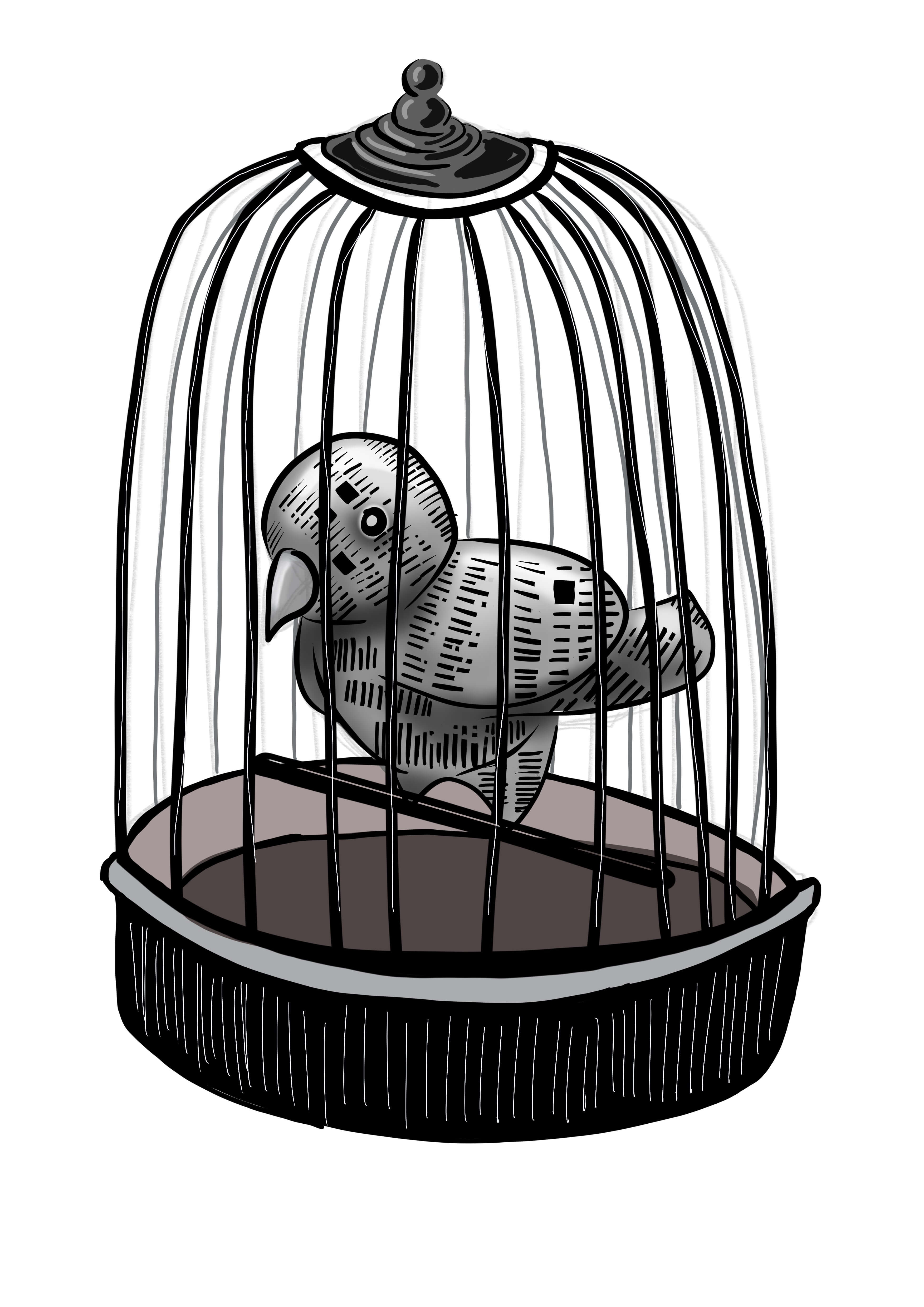
The bird seemed a very appropriate symbol, they communicate very loudly with their song. They are also a symbol of freedom, I put my newsprint bird in a cage, to symbolise he is no longer able to spread his songs of truth wherever he lands. He can only use his songs to an audience chosen by his captor.


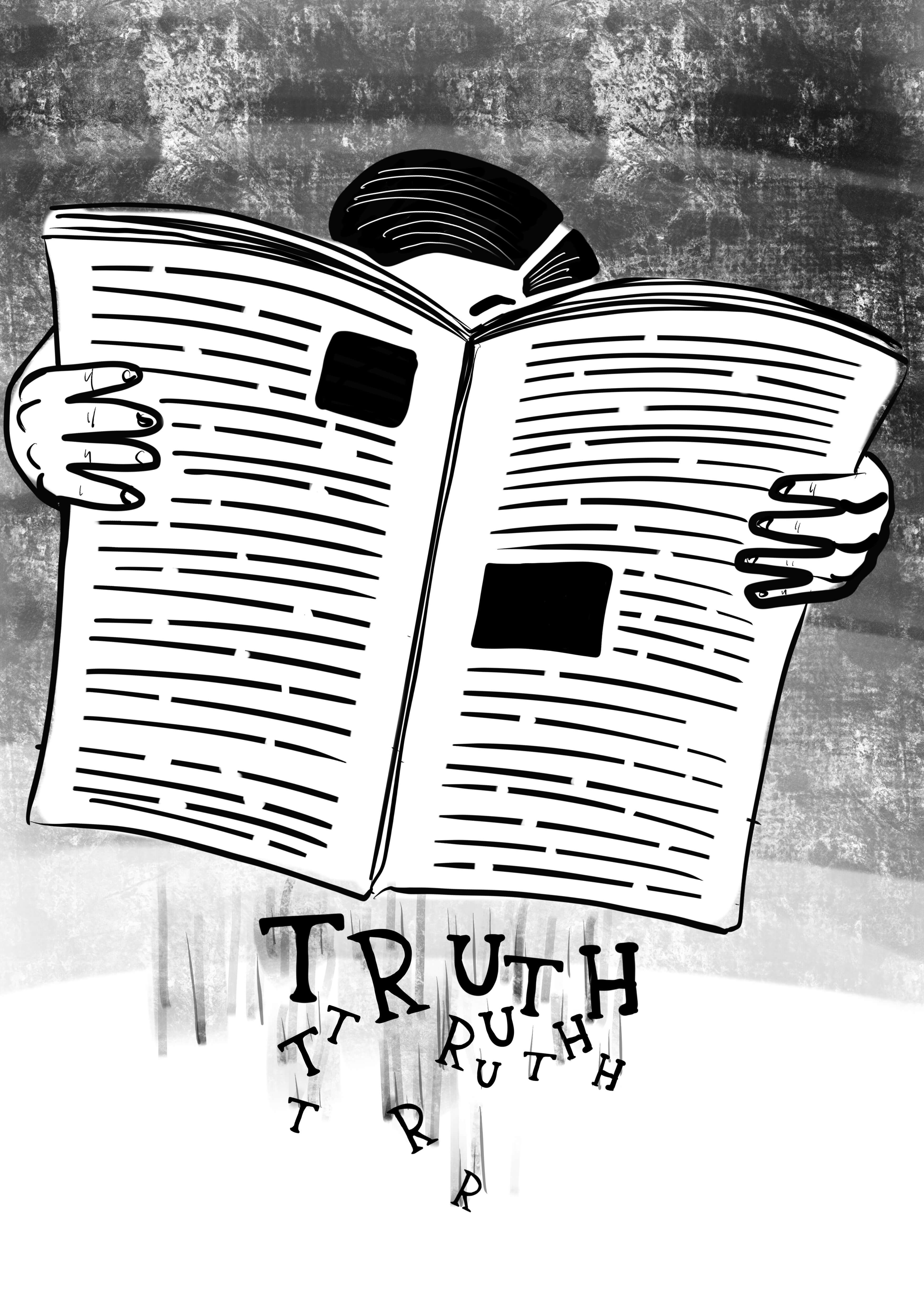
With this image I wanted to show the characters falling out the bottom of the paper after the reader opens it, the letters falling out spelling the word truth, I maybe presented this a little too directly, I wasnt sure people would get it straight away if it wasn’t Immediately obvious.

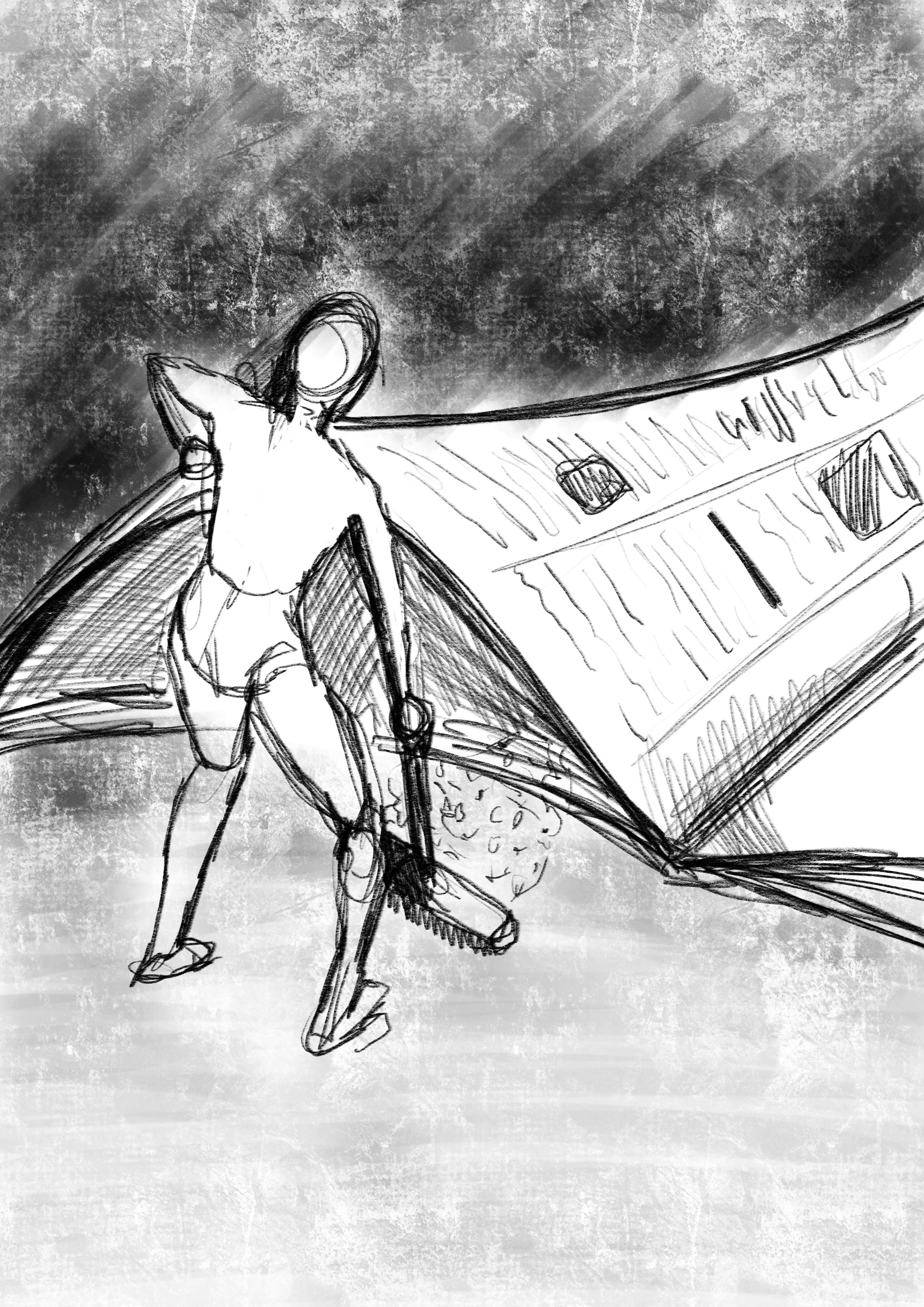
This is an old adage, “sweeping it under the carpet”, in this case the newspaper is the carpet, although in reality they arent censcoring content out, rather neatly moving and managing the dirt or truth showing only what they want you to see.
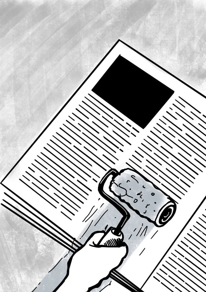
This one was a play on the theme of white washing, covering up something that people dont want to see. In this case we see a tiny roller removing printed columns, leaving just the bits they want you to read.

Exercise 12: Choosing Content

This was a really interesting exercise, I found  it very mentally stimulating as I first had to “paint the picture” of the character in the scene I had just read before I could begin the portrait after reading the passage.

I concluded that the character wouldn’t be a happy man, he’d be quite calculated and a little weathered by his world around him. He is desperate for a positive change but slow and unable to act. He is trying to reach his goal, but after 15 years not too far from giving in, his mood is frustration and turning to an inward anger, He is older and I imagined him smoking a pipe, maybe as its a good prop for a reflecting man of the period.

The man would be dressed in a suit, as he is a police officer. Given the time period I imagined a dull colour such as brown.

War time Britain is below so the furniture would be strong and wooden, chairs would be tall and upholstered, maybe in leather or tweed, but it would be well worn.

The word I chose to sum him up was weathered.

I liked the idea of him being in a dark room, as it mentioned the sun going down, he would stay there thinking and frustrating himself about his inability to catch the girl’s kidnapper. I used the match to add atmospheric lighting to his face and bring out his aged features and defeated mood, the man in my head reminded me a little of Roy Schneider form Jaws, he also had scenes where he was tired and about to admit defeat. The character has a slight resemblance which wasn’t my initial intention, I’d like to think it was  a subconscious choice.

Exercise 11: Using Black & White

For this exercise I was asked to pick a word and draw an object associated with it, I brainstormed the word Sea, I decided to draw a Horse shoe crab, I chose this as it’s quite a strange sea creature and one that would afford some good interesting shape and detail.

I then photocopied the image several times, I then made further copies with the inverted option. After I made the copies I cut out the key shapes, and arranged black over white and vice versa.

It really made me think about what tones to put next to each other to best describe the shape,  as a fan of comic book art I’ve often marvelled at the choices made by the artist who ink the panels, they always put blocks of black in just the right places to bring depth and form to the pencils.

I knew i wanted to draw attention to the legs and have them appear from the hard shell of this ancient crab i cut out the dark shape and laid it on, I then did the same to the legs of the white photocopied image.

I found also that sometimes to draw attention or emphasise detail it was necessary to make surrounding pieces darker,  a good example of this is the bottom section of the crab where i added some blacks to break up the shapes.

This was a lot of work cutting out and making choices to serve the image, but I have to say well worth the effort and was a great exercise to learn the benefits of contrast in an image and how it can take a simple linear drawing into something much more descriptive.

Exercise 10: A Subjective Drawing

For this task I was required to choose a word from a list, the Idea here was to illustrate the qualities of the item rather than its function. I chose Umbrella, i created a mood board to try to recreate the qualities found in an umbrella, I used plastic bags among other things to try to recreate the look of a wet umbrella.

I then  found an old umbrella and photographed it. I produced a simple line drawing including some tone to render the creases and folds of the crumpled material.

I photocopied the drawing and cut out the parts to make a stencil, I used bin liners and pva glue to replicate the wet looking material then creased and stretched it tight in places and crumpled in others, I used silver foil to add in some struts and metal under frame.

If I could do this task again I would do this on a much larger scale, as it was small I struggled to get the control and detail needed to convey what was in my head, I  photographed and tried to add some structure back in the image  with my procreate software.
While I wasn’t 100% happy with the outcome I was mostly pleased with the effect It created.

Exercise 9: An Objective Drawing

For this exercise I was asked to pick from a list of items and visually explore its characteristics such as texture and function, I thought the shoe would afford me a good range of exploration.
I chose a converse High Top style as it has different materials canvas hard moulded plastic and metal eyelets.

I varied the line weight to describe depth and tried to sculpt out the creases buy following the contours of the material, the harder parts I created a thicker harder line and for the canvas I tried to keep it thin to describe its ability to crease and flex.
Although the brief didn’t ask for it to be coloured I was curious what colour and tone would add to the image so I added some.

Linear drawing, trying to convey the characteristics of the materials
I added some colour to see if It would further describe the material.

Exercise 7: Exploring Drawing & Painting

For this task I was asked to make an alternative sketchbook.
I collected paper and card of different textures colours and thickness, and used a combination of conventional and alternative drawing tools. I believe this exercise was to explore the different mediums, again I did not focus on accuracy or producing anything too finished.  I went experimental and had a lot of fun and enjoyment trying new approaches.
Out of the suggestions offered I decided to use cake as my subject, This afforded me some variety, although I mainly stuck to muffins as these seemed more distinct and easier to describe with a few well placed marks.

Oil Pastel on brown envelope
Felt pen on yellow paper with thick acrylic paint cherrys
Screwed up waxy paper with coloured pencil and correction fluid
Blue paper splashed with bleach, drawn in marker pen with cut paper
Gold card with marker pen and correction fluid
Brown waxed paper with Oil pastel
Grey card and thick acrylic paint, once dried I applied a thin water colour wash to fill in the cracks and grooves
Ripped box with exposed corrugated card effect drawn with chalk pastels
Felt tip under black wax crayon, the drawing was scratched in revealing the colours underneath
Oil pastels on smooth card
Chalk pastels on rough corrugated paper

Exercise 5: Using Reference

In this task I was asked to collect reference from the 1950’s period.
A lot of the reference I found seemed to originate from American culture, 1950’s Americana didnt take long to influence other countries, we can see this in car design fashion, advertising and interior design.

Checkered or Gingham patterns seemed to be favoured, American diners seemed to feature checkered flooring and wall tiles, while young people wore gingham shirts and dressed as part of the “rockabilly” look.

Car design seemed to heavily influence other aspects of 1950’s aesthetics, Radios Juke boxes and kitchen  appliances, were all styled with curves and chrome embellishments, this probably was inspired in turn form the american space programme, things were being designed to reflect the futuristic space age.

My drawing based on 1950s styling

I found a picture of Elvis Presley having his hair cut, I thought that may make an interesting alternative of someone sitting in a chair, is it Elv is or just one of his fans emulating his hero’s look, who knows, he is reading a chevrolet magazine/brochure. His college jacket is hanging up on the hanger (didnt mean to but looks like the one Michael J Fox wears in Teen Wolf) next to a glass bottle coca cola machine. For an extra 50’s touch I added the chequered tiles and a 50’s tinged wall sign, similar to what’s seen outside motels of the period.

Exercise 4: Making a moodboard

In this exercise I was asked to create a moodboard from my previously chosen word, wild.

While I was collecting the references for the moodboard I instantly saw the benefit, not only did it serve as a good collection of reference including texture and color, but it also served to generate and bounce new ideas, Its definitely something I would incorporate into a professional workflow.


Exercise 3: Turning Words into Pictures

In this exercise I was asked to produce some loose drawings from a list of words, I chose the word Wild.

This was quite a liberating exercise as I didn’t have to worry so much about accuracy or finesse, just the idea of portraying the theme pictorially.

I would like to revisit some of these little scamp sketches and work them all up at some point, I purposely worked small, so I wasn’t tempted to add in too many details


Exercise 2: Spider Diagrams

In this exercise I was asked to generate a spider diagram from each of the following four words, Seaside, Childhood, Angry, and Festival, I was then asked to get another person to repeat the task.

This exercise was an interesting one, based on personal perception, experience and recollection. This will of course vary from one person to another, but anything that featured on both lists would suggest a common or universal connection to the words and the individuals memory, thus making any artwork produced from it have a broader response and appeal.

– Which word was most difficult for you to work with?

Festival was the hardest one for me to relate to, I have never been to one and isn’t really my scene, although I love music.

– Which strategies that suited you best to come up with more words?

I liked getting the input of others to get a broader view. The spider diagram does grow and stem off into new ideas, maybe sometimes too many, but is a great way to come up with something that you wouldn’t have normally considered.