Exercise 7: Client Visuals

This exercise I believe was to understand structure and layout to create interesting composition.

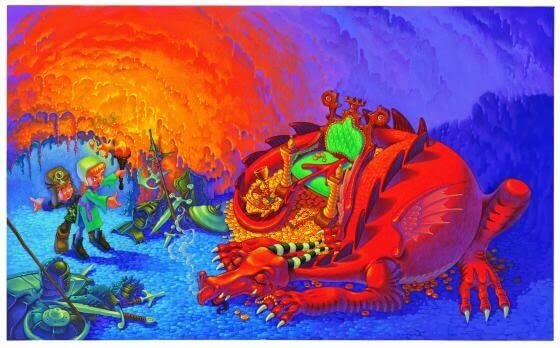
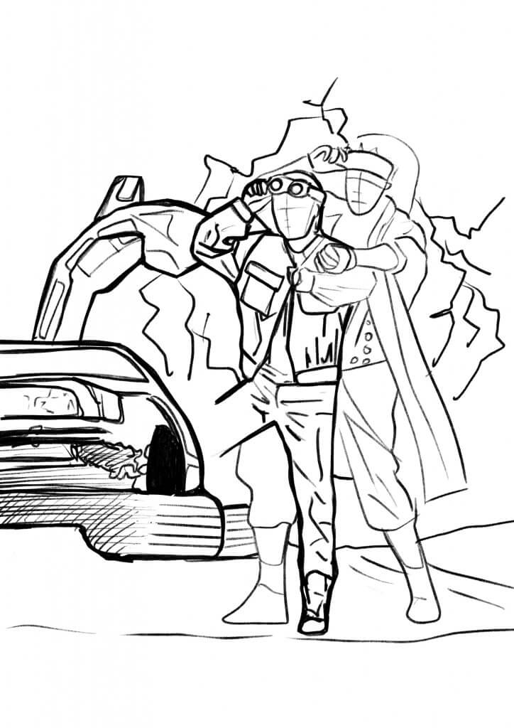
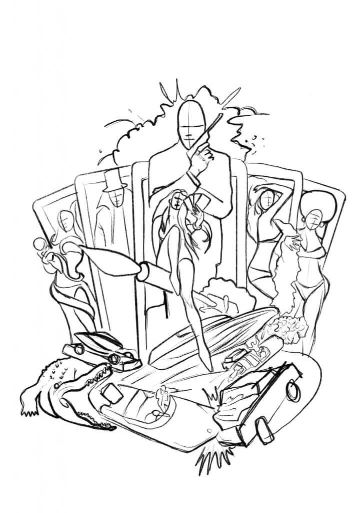
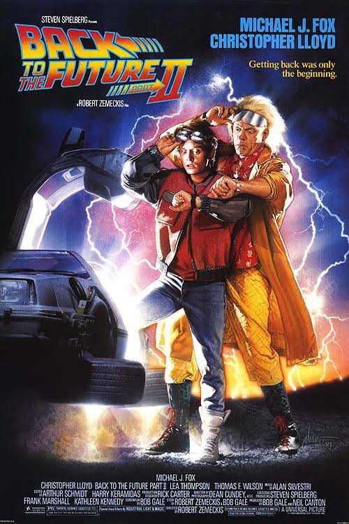
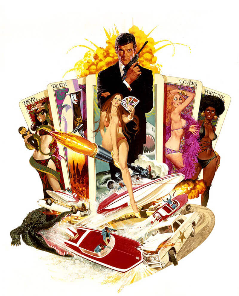
I found two illustrations and broke them down into their simple shapes. One was the live and let die poster by Robert E McGinnis and the other was Drew Struzan’s Back to the future 2 artwork, I liked the way that Robert E McGinnis included the key characters and events within the scene, classic looking montage of action and interesting characters, they rarely do this on film posters anymore. The Back to the future cover has great contrast and is an update of the original poster, this includes both characters looking at their watches standing next to the Delorean time machine, only the bare essentials of the car haven been included, the rest obscured by light offering great contrast for the main characters.

The key to this exercise was to simplify the structure, it was very revealing as to what basic forms and shapes were used.

I then simplified it further trying to keep the essence of the original intact. The second one I’d say, only I knew what was there, when showing others the art direction it definitely would need to be simple yet descriptive, the person commissioning the work wouldn’t necessarily have the same degree of vision to see what I had drawn, that would be the difference between getting a job or losing one.

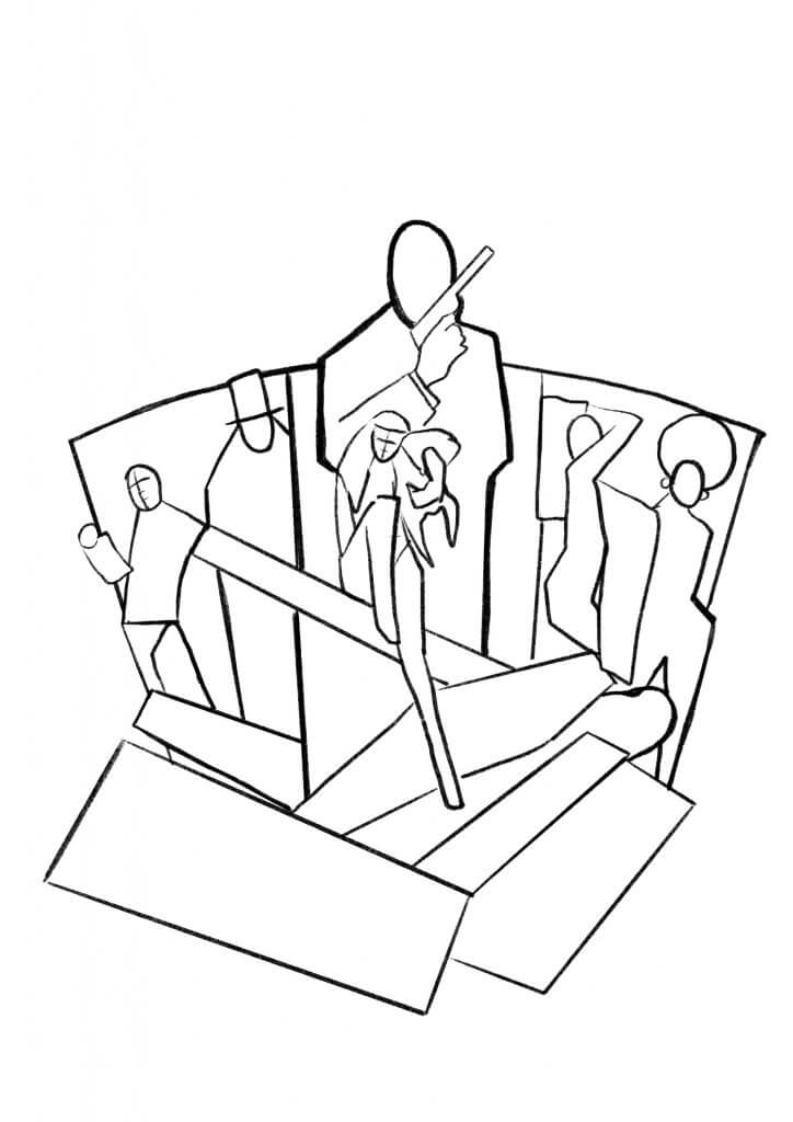
After doing this exercise I can see the choices both Illustrators made, I have made notes on the images below.

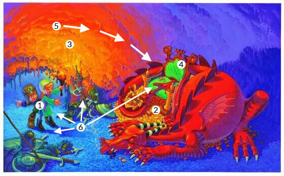
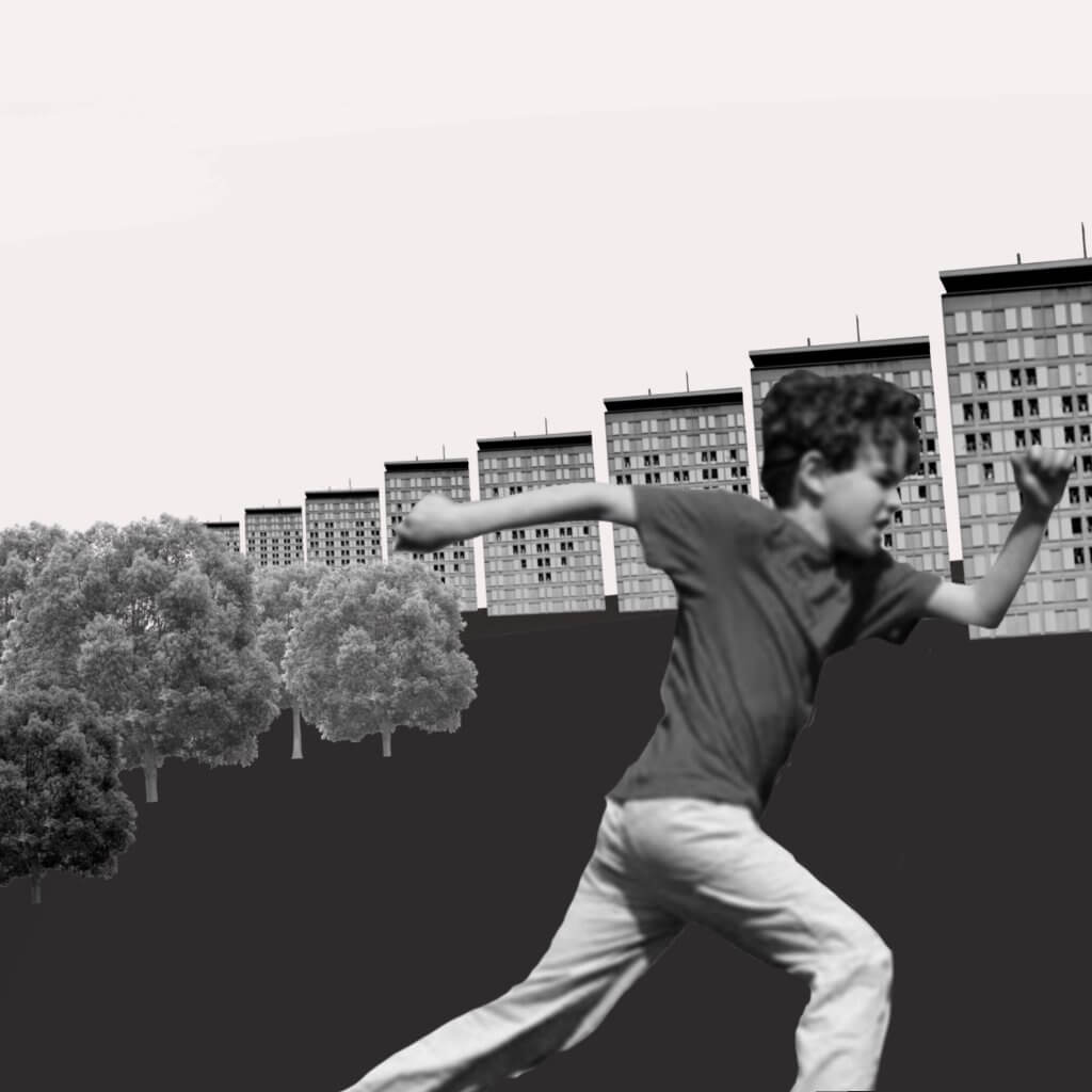
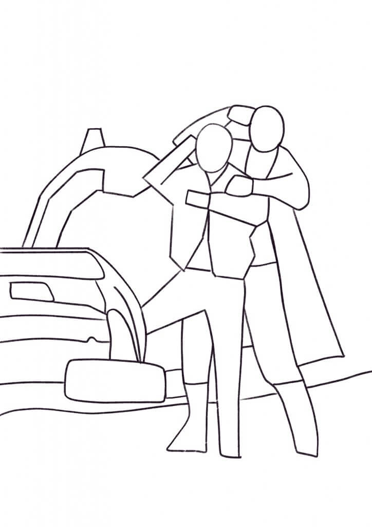
After Simplifying the image above I noticed these points:

  • The Image is made up of 2 parts
  • The car only includes as much detail as it needs, the back of the car is not included
  • The bottom of the car runs in line with the ascending horizon line
  • The structure is very simple, as a result the hierarchy of the images is dictated by colour and contrast
  • The negative space at the top makes up a diagonal space

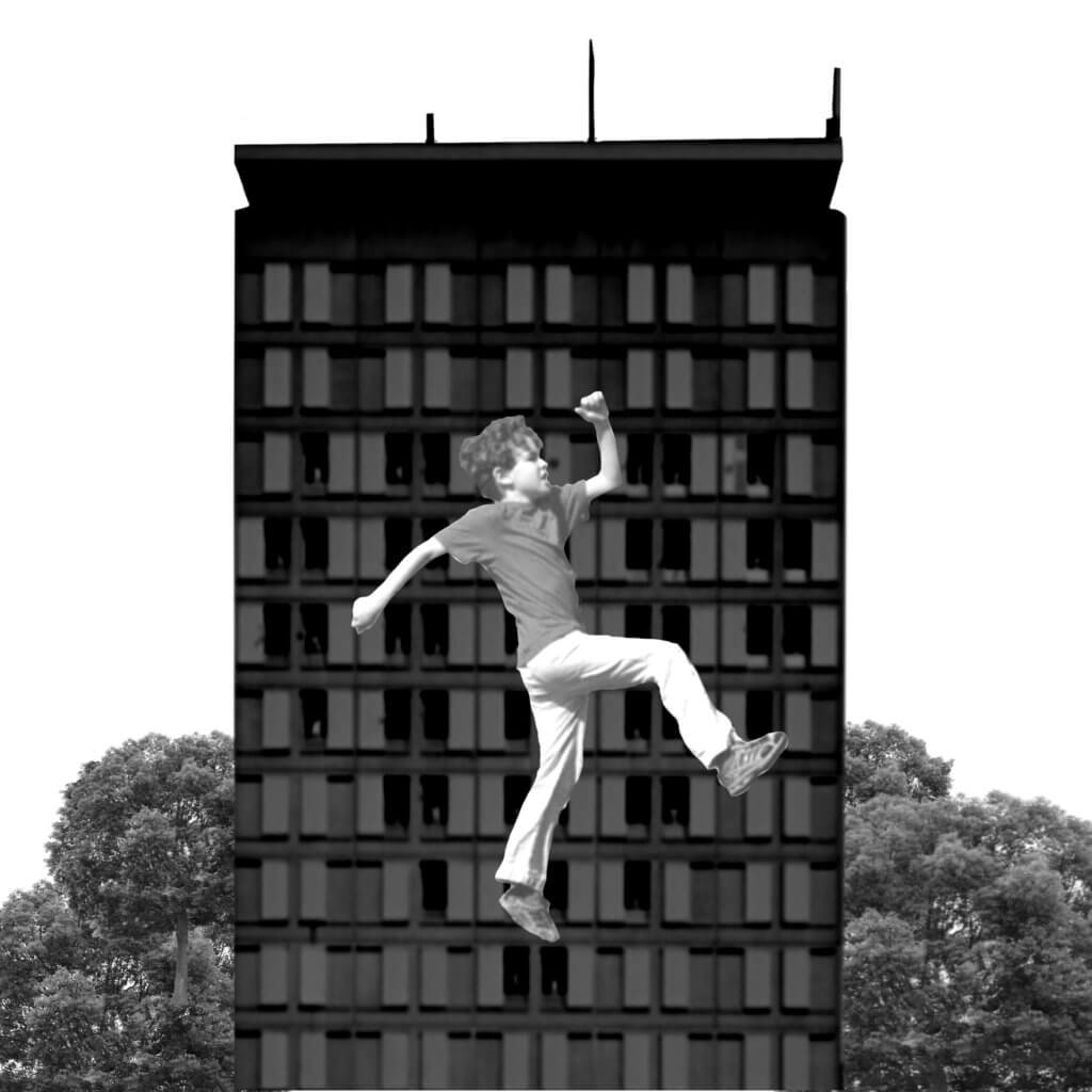
After simplifying this image I noticed;

  • The image is in 3 distinct parts the main figure breaks up the main Fan shape
  • The bottom third section is made from 2 opposing diagonals
  • The secondary figures all sit in there own spaces only slightly breaking their boundaries

Exercise 6: Viewpoint

This exercise involved some photography, I was required to photograph some objects related to the keyword workshop.

I gathered some tools and placed them on a wooden table to mimic a workshop enviroment. There was several challenges in this exercise, then main one was to make an interesting image from things that are normally in action or being used by a human, I decided to emphasise texture, shape and chose interesting angles, to create some “movement” around the composition. This was part of the criteria when I chose which image to work from.

As these were representing tools in a workshop, I wanted to portray a feeling of expertise and craftsmanship, a passion for detail and a methodical and organised approach, I carefully positioned the tools considering their similar and complimentary shapes and textures. I wanted to experiment with zoomed in and tightly cropped images and also using some perspective to generate some movement around the composition. I feel that a close and distorted angle worked best, it did give more of an expert crafting in his workshop feel, the flat images felt like it could have been a tool catalogue cover.

The square format didn’t really give me the movement I was looking for, I’m sure If I had used colour I could have done more to create a focal point, as this was a pencil drawing it seemed easier to use a tall rectangle to get the eye moving along the diagonal shapes. If I was told it was a square format I needed to use then I would have definitely made different choices when it came to arranging those items. I probably would have added a horizon line in so I could trick the content in the square format into a rectangle to get the focus I wanted.

This was the final drawing. I feel it does give a sense of an active workshop, I feel it was the correct choice from the photos I took, it gives a  good sense of detail and the close nature suggests a detailed meticulous craft.

Exercise 5: Giving Instructions

In this exercise I was asked to create a set of instructions accompanied by visuals, I thought making tea would be an interesting one, I also wanted to settle the age old argument about when the milk goes in, this will hopefully clear it up.

I wanted to use one image and split it up into incremental steps, using numbers and clear text boxes, after some experimental thumbnails I opted for an isometric view like lego instructions or an exploded diagram.

examples
Some Examples of Instructional images

I broke it down into the simplest steps, I wanted it to be clear and easy to follow.

The top down and to the side view I chose did offer some challenges as the visuals while more interesting at this angle still needed to be descriptive, I had to consider the order I displayed the steps in so it was a functional diagram.

I used warm colours on the numbering to make sure they stood out from the diagram.

The style is playful, and not quite as clinical and detailed as a medical journal or Haynes manual, and not as CAD looking as a lego manual, which are colourful but offer little character beyond that. I feel the style I chose works in this context, its light and doesn’t patronise, my test group found it was straight forward and clear to follow.

I was thinking if I had picked playing an instrument or how to get to the house this would have called for a more direct no nonsense approach, I then considered who might be using it, a change in direction would have been led by my audience, if it was for children then this approach would have been intimidating to a youngster or too detailed to be able to focus on so the informal one would work.

Deciding on an audience wouldn’t be my decision to make, that would be a question to ask if it wasn’t clear in the brief, either way it certainly got me thinking about how to approach diagrams and was a good challenge that involved more communication than drawing.

perfect-tea

Exercise 4: Abstract illustration

I quite enjoyed the freedom in this exercise, creating something completely abstract is a very liberating feeling. Using the rhythms, beat and dynamics of a piece of music I interpreted the sounds I was hearing into visuals using colour, shape, marks and textures. I was asked to use an adjective to describe the tone of the piece, I used the word Dynamic, I chose the Gypsy Kings as they are known for their dynamics going from loud to soft to create invigorating, rousing songs.

I listened through Bambeleo a few times and a few more as my pen moved across the screen, I did this digitally, it was important for me to be spontaneous and be able to change colours and style quickly.
The rhythms I was hearing quickly translated into peaks and dives across the canvas  each instrument I focused on creating their own shapes, even a solo guitar has its own isolated area, just like the song has.

The changes in volume I represented with size, as the volume pulsed I drew circles in different sizes, dancing across the work area.

This was the initial artwork

It did look a bit of a mess if I’m honest, a bit like childish scribble. But after re drawing it I was quite pleased with the way it turned out.

Reworked Abstract Image

It almost looks like a spanish landscape, the colours are very warm and seem to suit the style of music very well.
I was asked if it would work as a cd cover and I think it probably would pass, I have made a mock up with their logo to see how it might work.

Final cover in context

Exercise 3: Image Development

For this exercise I was asked to take an image and crop it into different formats and present the content in different ways, I chose Édouard Manet’s Le déjeuner sur l’herbe, this painting has a lot of different “scenes” and I thought it would lend itself nicely to the exercise.


Édouard Manet, Le déjeuner sur l’herbe (luncheon on the grass)

This image did cause controversy when first exhibited, it is quite a surreal scene, and my research did seem to lead to most art historians disagreeing  the meaning behind it.
Are the ladies prostitutes, if so why the picnic, why is one dressed and bathing in the lake? Why is the nude staring directly at the viewer, is she trying to catch your attention. even the title which translates into luncheon on the grass and originally titled “the bath”  makes little reference to what seems to be the main focus of the image.

Once I had changed the compositions and format, I was asked to sum each new arrangement in a word, these are below.

philosophising

The mans arm is raised as if he’s making a point or telling a meaningful anecdote, his dress almost makes him look like he is philosophising.

Exhibitionism

The lady is nude and looking right at the viewer, she isn’t shy and wants to be seen in a state of undress.

Nature

The forest, the fruit and the lake, even being nude all seems to be a nod to nature in this composition.

Beckon

Similar to the philosopher the addition of a second figure makes the man look like he is calling the lady over from the stream/lake.

Picnic

A simple still life of a fruit and bread basket.

I was then asked to take one of the images and re draw using colour and texture to reflect the meaning of the word.

exhibitionism

I used the word exhibitionism, I wanted this to be bold and vibrant and extravagant. I decided to use red as it seemed to fit the context and is a colour that demands attention. The typewriter style font seemed to fit as it’s almost calling out it’s a condition or psychological disorder or even an entry into a dictionary.

This exercise was quite an invaluable lesson to me, that one image could be read so many different ways and certain parts in isolation can change the theme drastically.

Exercise 2: Reading an image

The image is of two children exploring a cave one holds a torch up high illuminating the interior of the cave and making the ceiling glow red, inside a dragon sits guarding his treasure horde. The dragon is sleeping and the children are fearful, one cowering behind the other, the braver of the two is pointing to the path ahead, the other back to the way they came. weapons are piled on the ground, a dragon would have no use for these, they are likely trophies from adventurous treasure seekers that have perished before them.

The main focal points are very warm in contrast to the cool blue cave, the dragon is curled around a green throne, this is complimenting the red of the dragon’s body and allows us to quickly pick out his shape of his body and curve of his tail from the warm yellows and oranges of the treasure that surrounds him. The children’s faces are glowing from the torch,  the surrounding blue  area at the bottom and arc of warm red above their faces draw you right in this is balanced by the large scale use of red from the dragon, leading your eye from the top left to the bottom right.

The use of green as a complementary colour to the red can be seen in 4 places, I think this area is intended to act as a secondary focal or resting point.

  1. The boys can be seen one wearing green, this stands out over the cold blue but not as much as the warm reds.
  2. The dragon is the main focal point the warm reds jump off the image.
  3. This is where the eye starts to lead through the picture, it’s the warmest area but doesn’t have a subject.
  4. The green of the chair helps to define the shape of the dragon’s body.
  5. The arrows follow the path diagonally across the image.
  6. Once our eye lands on the dragon, the four green areas act as one to create an additional focus.

Exercise 1: Illustrating visual space

Below are four composited images, my challenge was to use the same content and produce an image that was visually interesting, this didn’t have to be factual.

This image frames the boy against the white background, making him the focal point even though he is quite small in the center. The negative space around him and placement of the buildings and trees at these angles feels like he is escaping danger, it seems everything is in motion. This layout gives me an uneasy feeling.

The repeated characters here seem to have a narrative, it appears to be a race rather than the boy being chased. The main focal point is the boy at the front, he is larger and also his face breaks into the white sky creating a contrast too strong to ignore.

For this one I made the building behind a bit darker and placed the boy in front, I wanted to give the impression of height, the negative white space around the building leading the eye toward the centre where we find the tall dark block , the trees at the bottom add weight to the image and also help to force the eye up which is then broken by the figure of the boy.

This image with its buildings ascending in height and scale give the figure a good sense of motion, the placement of the figure, large and cropped out of frame suggests to me that the figure has ran in front almost surprising the viewer. The small trees give a good sense of space in the surroundings,  and giving the illusion of depth.


Exercise 1: Identifying tools and materials

In this exercise I had to use the work of illustrators who use a particular medium. I decided to use inked drawings in black and white. The artists that I chose all work in the comic book industry, the standard process/workflow for comic book artwork production is normally split into three roles, penciller, inker, and colourist.
The artists below all pencil and ink their own work.

*

*

*

I decided to try and work in a style similar to Brian Bolland, he’s a very highly regarded comic book artist so I knew I was in for a challenge. I recall watching a documentary about the creation of the cartoon series The Simpsons.
In the documentary The Simpsons creator Matt Groening set out to create certain rules to keep the style and presentation of his characters consistent.
I decided to make some observations and set rules about Brian Bolland’s style to see if it would help in emulating his work.
The main things I picked up on was;

  • His usage of line weight is on the thin to medium size, he doesn’t use a lot of thick weights.
  • He uses blocks of blacks sparingly and leaves a lot of white space to great effect, creating great moody lighting.
  • Hatching, he uses a lot of hatching to really describe form and tone, his lines are very tight and have great precision.
  • I also noticed he uses a lot of lines to bring with it a level of high detail.

I was asked to revisit a previous work and present in the style of my chosen artist, I selected my final piece “The Witch” from the very first exercise, I thought it would lend itself to a comic book style well and give me opportunity to re explore as that was trying to achieve a degree of photo realism where as this was more stylised.

The Witch Pencils
The Witch pencils

Paying attention to line weights and planning in where I would add in my black areas marked with an “x” I went about redrawing the image. I tried to follow my rule list, I guess I have more of a drawing style than I gave myself credit for, its hard to break drawing habits! My line weights were a little thick for a Bolland image, and likely my black areas were more about contrast than faithfully depicting the characteristics of light. Here is the inked image.

The Witch. Inked
The Witch. Inked

I was relatively happy with the outcome. I tried the tight controlled hatching and aimed to address the line weights of the pencils by making them a lot thinner. I think I’d need a lot more time to emulate his style successfully, I read in a music book that if you want to perform like your favourite recording artist then don’t practice their songs but practice the ones that inspired them.

I wondered if this applies here too, the artists that would have inspired Brian Bolland would have been using less sophisticated printing technology and maybe that would result in simpler imagery, I suspect that while he learnt his trade he went through similar mimicry as this exercise, drawing in the style of his heroes who I have now learnt to be Gil Kane and Carmine Infantino amongst a lot of others, I would hazard a guess that his level of detail combined with that white space was a natural progression from redrawing his favourites and adding his own individual  stamp as accuracy in printing became more effective.

The next part of the exercise was to  draw something very different in the same style. I always thought looking at  Michelangelo’s religious artwork and the way he depicted the characters as muscular powerful figures with amazing stances and positioning. In a way he helped create some of the key elements in creating comic books, I decided to redraw  his “Creation of Adam” as if it was a page in a comic book in my “Faux Bolland” style.

creation of adam
This was my interpretation of Michelangelo’s Creation of Adam.

Again by no means perfect but a more detailed effort with more delicate line weight and better placed blacks.

All in all I feel I made a good stab at the exercise its not quite the same but it certainly exercised my analytical brain. They aren’t quite Bolland’s but then again when he tried to do his rendition of a Gil Kane or Carmine Infantino maybe he didn’t feel successful either, but in doing so maybe he discovered his own style. I’d be very happy if this exercise was the first steps towards me doing the same.