Drew Struzan: Understanding his techniques and style

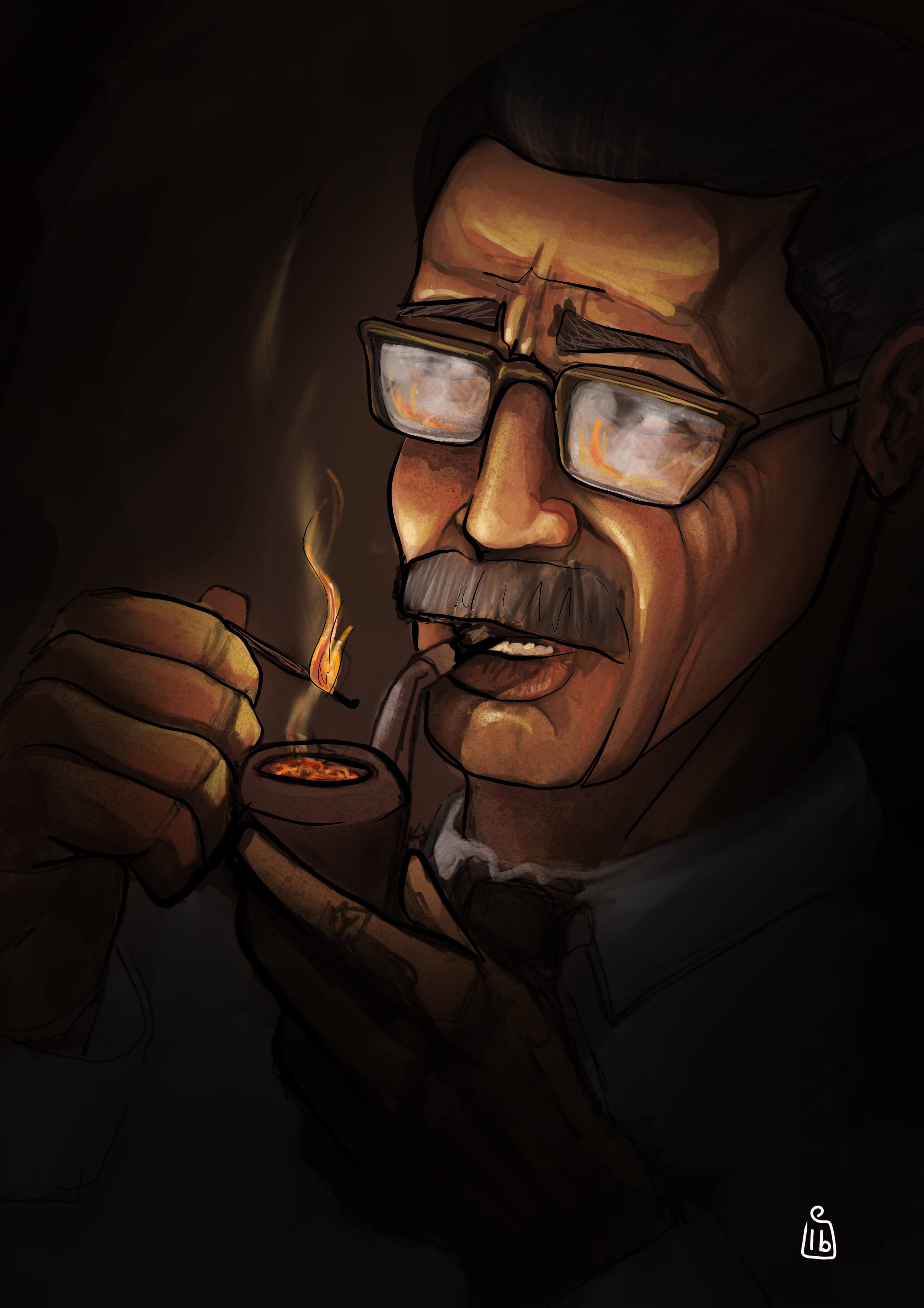
Drew Struzan works heavily from on set photography and publicity shots from the films he is producing the artwork for.  He decides on his composition using several sketches and then projects the provided photographs onto illustration board, tracing the characters with pencil and then drawing in the details. Once he is happy he paints in the darkest areas with black and spatters black paint over areas he wants to be textured, he uses an old typewriter cleaning brush to do this. For the next step he uses an airbrush to add colour over his pencil and paint, he finally picks out highlights and further detail over the airbrushed areas with coloured pencil, its then sent of to be photographed.

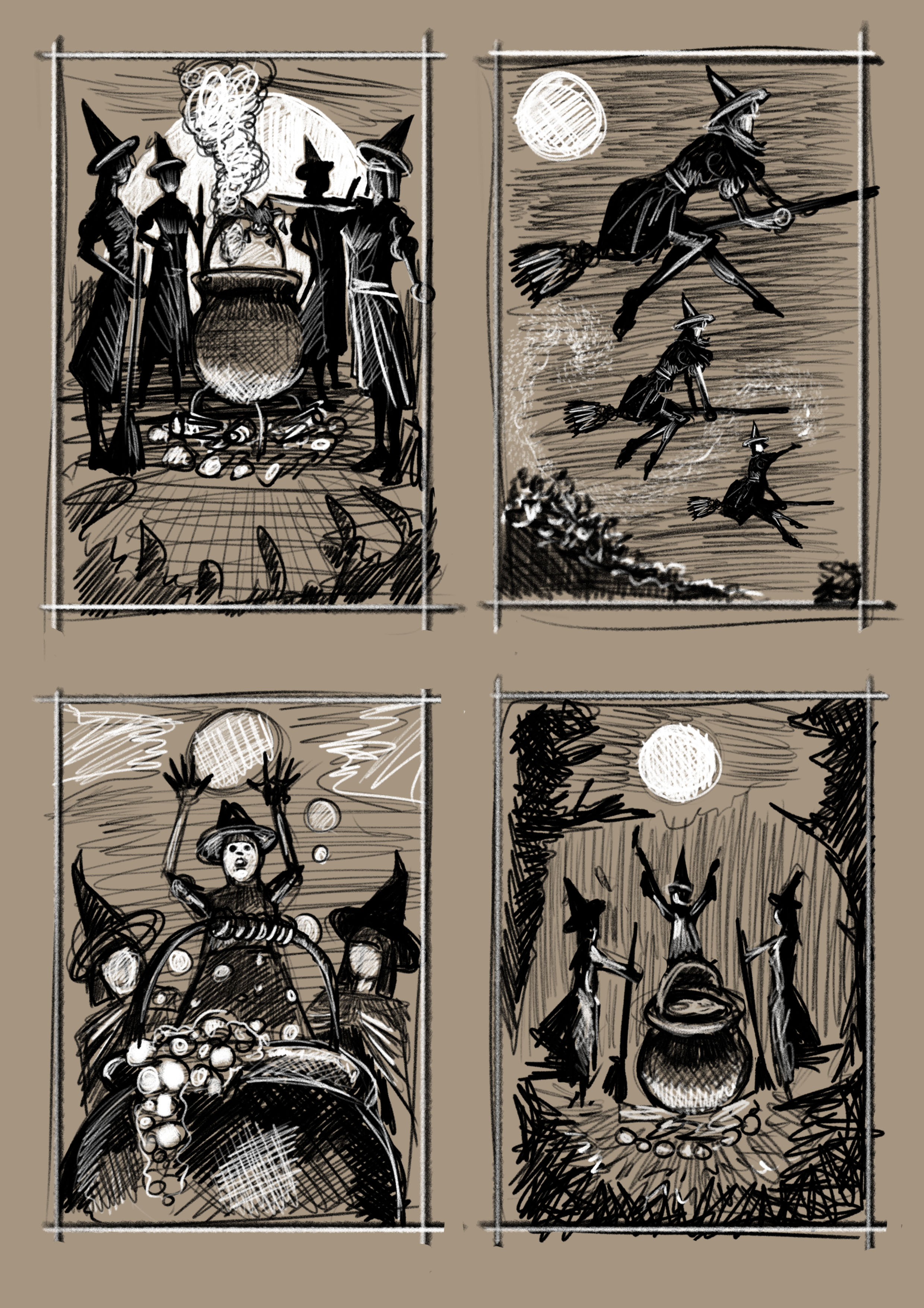
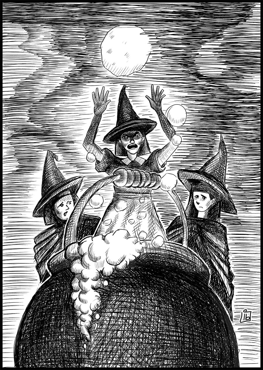
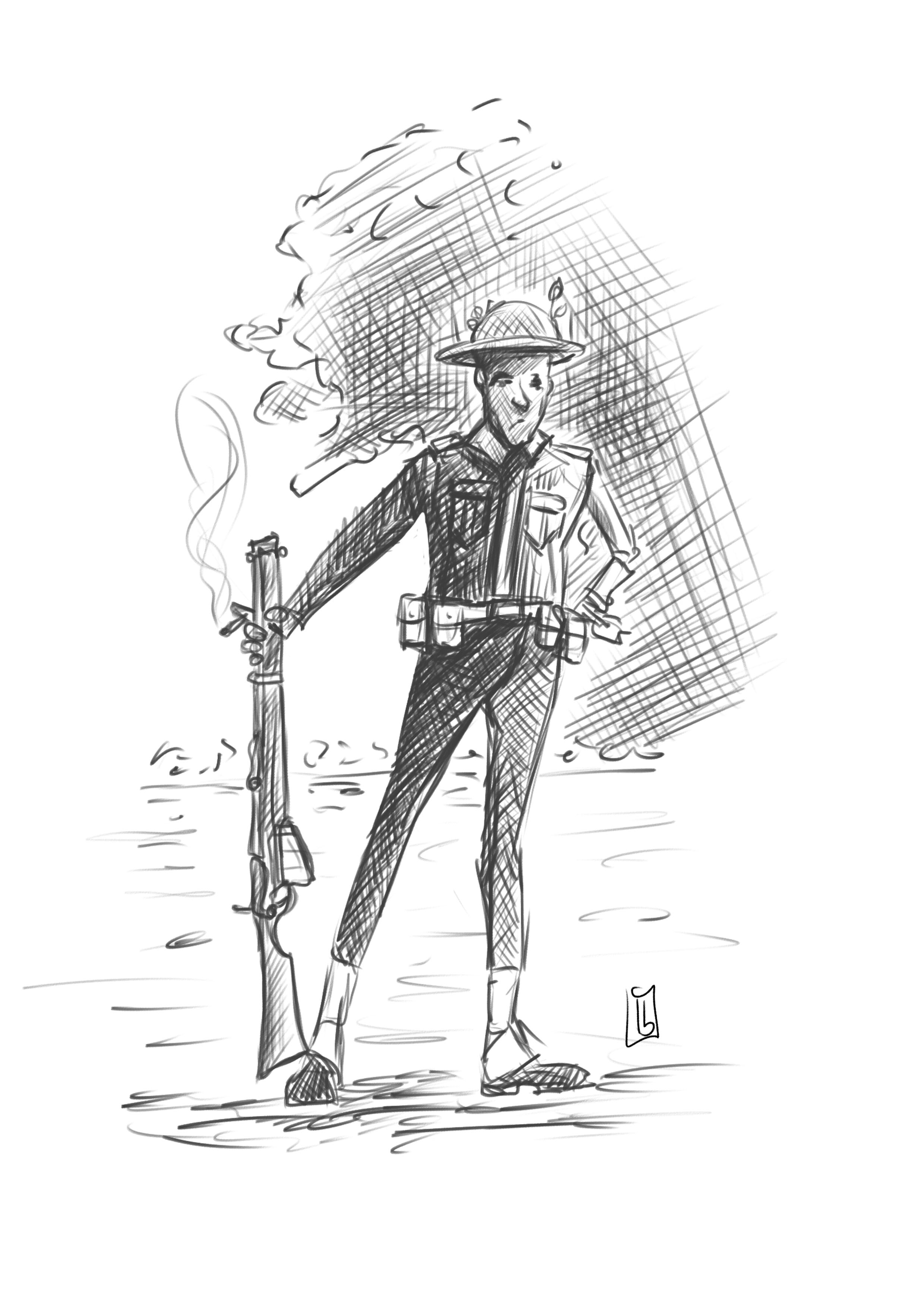
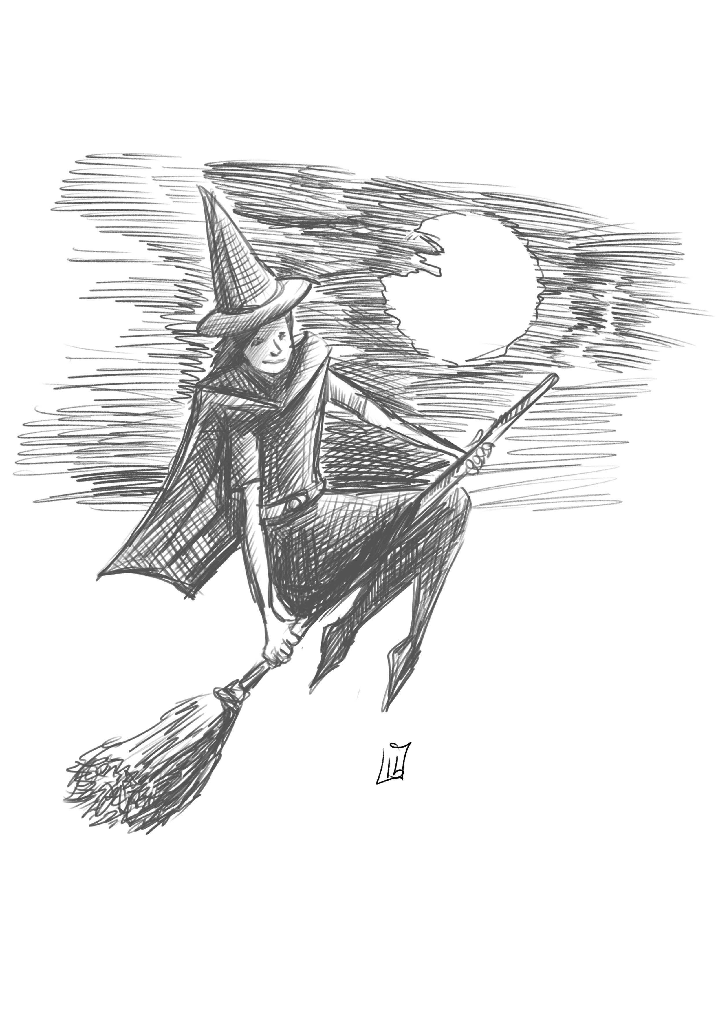
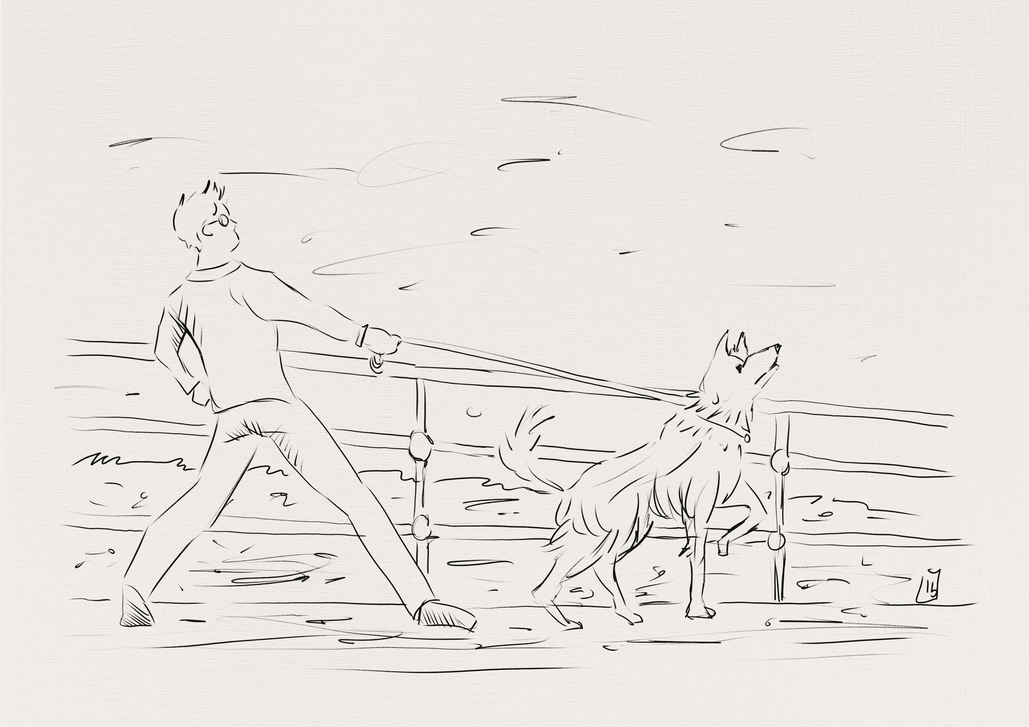
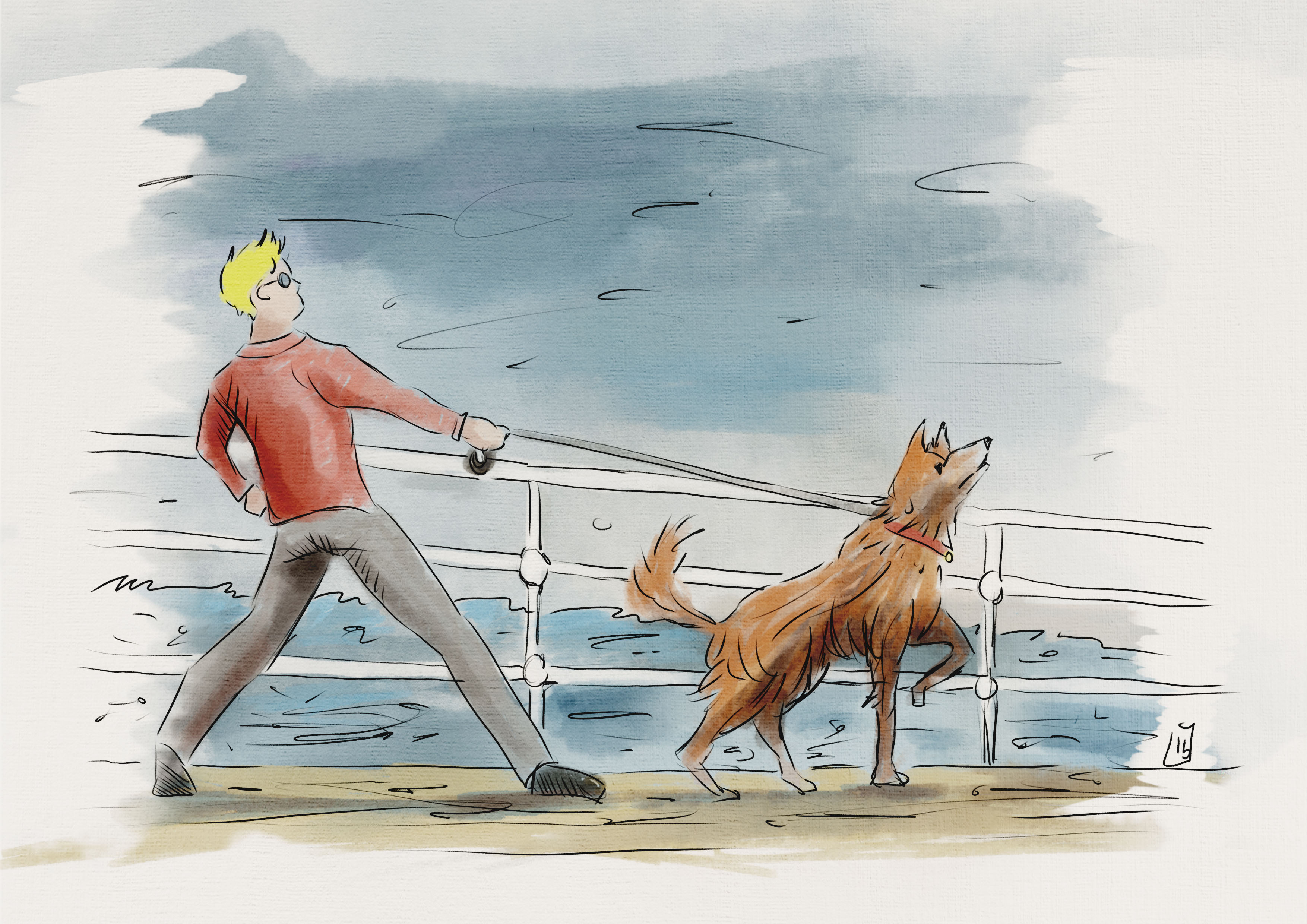
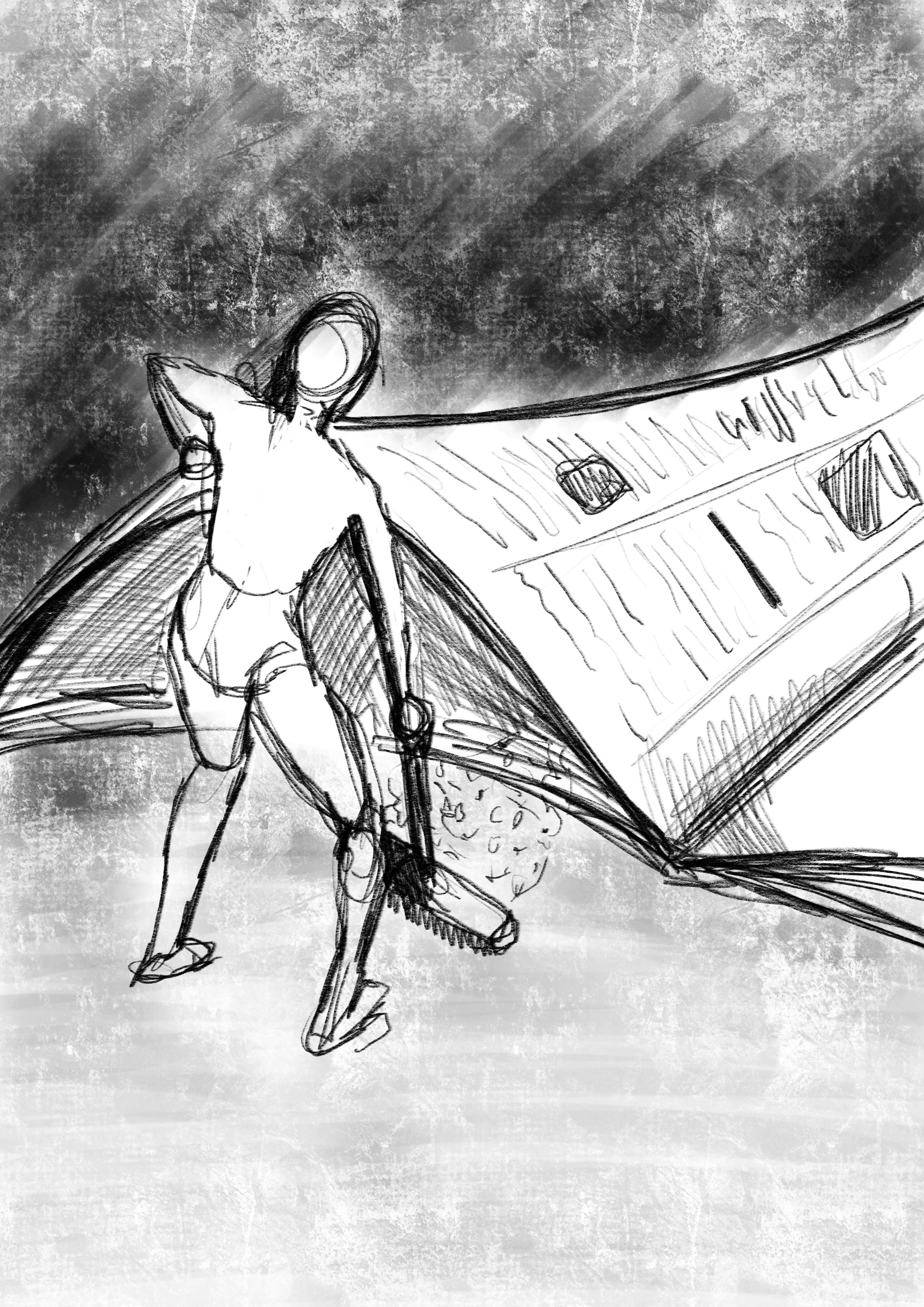
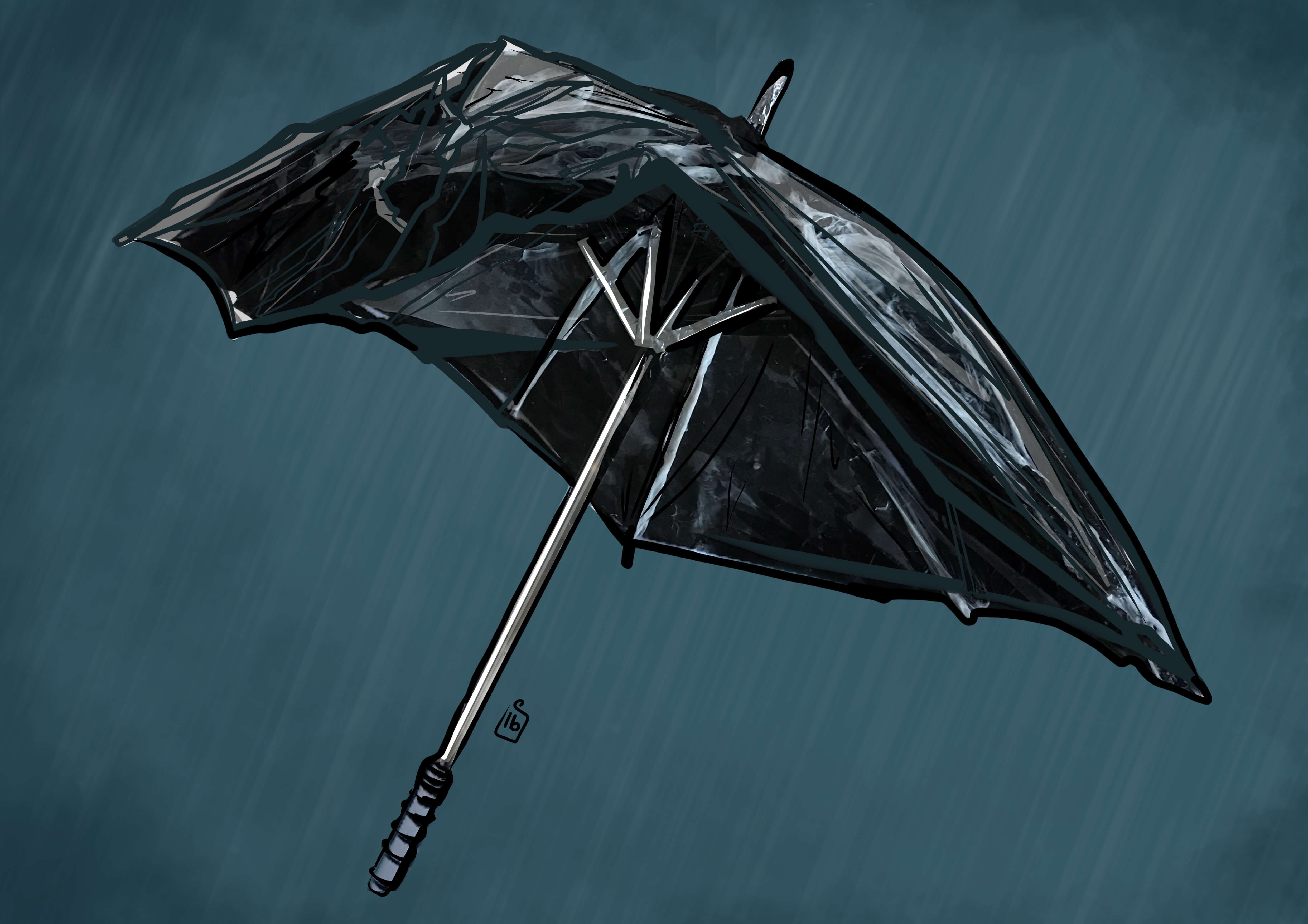
His work has a little bit of a Norman Rockwell feel, and like him he often frames his images with shapes. I thought I’d start with some sketches of film stills myself to get a feel for his style.

Kurt Russel
Kurt Russel from the movie the Hateful 8

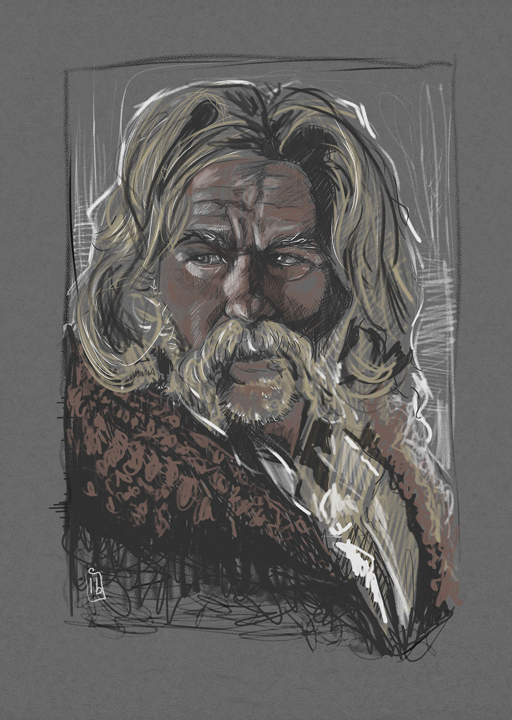
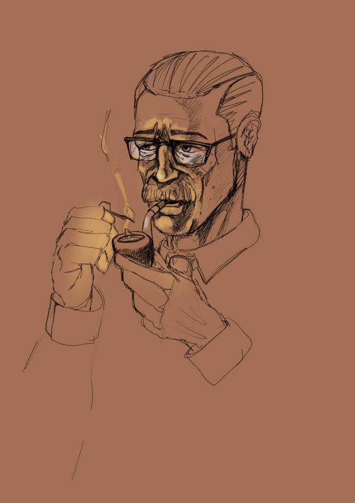
I kept it loose and used the same scratchy lines Drew Struzan favored, he will pick out a person facial contours by using line to “scuplt” the features, that’s what I tried to do, it didn’t have the same photo realism that Drew’s Images have.

Drew Struzan

When I was asked to pick a contemporary Illustrator one came to mind almost instantly. I have always loved films and enjoy looking at the cover art, unfortunately these days most film covers and promotional imagery are cheap poorly produced Photoshop montages and demonstrate little artistry or flair. Since the 70’s directors who wanted a timeless movie poster always called on Drew Struzan, I loved his work long before I even knew his name, his style is so distinct that you can always spot a Struzan piece.
As a complete opposite in style and technique of Edward Ardizzone I decided to study and attempt to emulate the work of Drew Struzan.

Drew Struzan

Edward Ardizzone: Final Piece

I put together some thumbnails, I decided to use the Witches as the subject and thought about a little scenario they may find themselves in as they went about their Witch business.

Witches thumbnails
I concentrated on getting suitable lighting and mood for the thumbnails

I thought the most successful thumbnail was  the three Witches around the cauldron , the main one I wanted looking maniacal and the other two looking worried or frightened. As I wanted to work more with hatching I kept colour out and decided to use hatching to create tones and dynamic light. Below is the Final Piece.

I’m pretty happy with the final piece, its not perfect but has given me a great insight into an Illustrator I would never have known unless I enrolled with the OCA. I thoroughly enjoyed exploring and analyzing Edward Ardizzone’s work.
I feel I succeeded in capturing the atmosphere I wanted and it certainly communicates the idea I was trying to convey. It reminded me of the image of the cat I included as reference which demonstrated the chaotic but structured lines I was trying to mimic.

Edward Ardizzone: Exploring the hatching technique

One of the things that i really liked about Edward Ardizzone was his work with hatching, I loved the texture it created and the way it creates quite dramatic lighting.  I particularly enjoyed his witch characters he used in his work, due to there nocturnal activities the strong one directional lighting suiting the subjects perfectly, that said all his work featured the same great use of lighting to bring the character and their form to life.

Even though Edward Ardizzone’s work dates from the late 1920’s I think his style would still have a place in contemporary children’s illustration, Its not too far flung from the works of Quentin Blake and Tony Ross In fact who all use a loose and lively style of line and washey color.

I set about creating some hatched works of my own, I used his subjects as a jumping off point.

WW2 Soldier
Using Edward Ardizzone’s Huckleberry Finn illustration as inspiration I created my own WW2 Tommie.

I wasn’t unhappy with my first attempt, the pose was pretty good he showed character and an a passive relaxed but still on guard attitude. I was aiming to capture the lighting I mentioned and this wasn’t a bad attempt, but something was lacking, I think it was a bit too messy.

It took a while to understand how best to approach hatching, while the references I had seemed to be quite chaotic there seemed to be some consistency to it, I attempted to tighten up the hatching and be more thoughtful in the placement of my lines.

Witch and her broom
Here I concentrated on tighter hatching and line.

I was much happier with this attempt, the lighting worked although it could have been a bit more dynamic and shown more contrast  . I was happy that i understood enough of his style and I could move on and start the final piece.


Edward Ardizzone: Analysis of his water colour style

I have tried to break down the characteristics of his line and wash pieces, they are all very economic with their lines, opting for simplicity over complexity, this is going to be a hard habit to break so I decided to get a some scraps of paper and mark make for a while before attempting anything.

I then turned to my computer to attempt an Edward Ardizzone inspired piece, I decided to depict his character Little Tim all grown up and walking a similar looking dog along a pier, I aimed to keep it as simple and loose as possible, not sure if I succeeded in selling the solidity of the character to the standard he did in his watercolour images, but I’m certainly more aware of the impact a realistically lighted figure has on an image, even one that is not necessarily a realistic depiction but a more stylized one.
I really like the way he lights his subjects so simply but effectively, its been a good observation and will surely influence my future efforts.

I used line sparingly, just enough to suggest shape and form the way Edward  Ardizzone did.  I used a similar line weight throughout.

I would have normally varied the line weight but to try to recreate the correct look I kept to loose thin strokes.

Once the colour was applied it started to break up the image, and gave it some atmosphere, the shadows helped to show the movement between Tim and the Dog.  The sea and sky I think worked well and added a narrative not seen in the black and white line work,  its clearly a windy unpleasant day, with rough seas and dull sky.
I was quite happy with the mood that was created, and I felt it was a successful exercise in visual storytelling.

Below is the final coloured version.

Little Tim all grown up!

This was a worthwhile exercise for me, it took quite a lot of discipline to stick to the characteristics I had observed from Edward Ardizzone’s coloured work.
I have noticed it has made me more analytical of the work of others and has made me think about how I can style my work to be a bit more defined and distinct.

Edward Ardizzone

From the list of Illustrators I decided to study Edward Ardizzone for several reasons, the main one was I really liked the way his marks depicted the form of his subjects, they are quite chaotic on close inspection but when viewed at a distance was amazingly descriptive.  His line work also interested me, he used a lot of unfinished and broken lines, simple gestures that seemed to define a lot.

He lived through WWII as an official wartime artist, when I first read this and i saw his work I thought he was a strange choice for this role.  I’d only seen a few images, all from children’s story’s etc, as his style is very lighthearted and I couldn’t imagine how his art would represent something so bleak, but when I saw his work it made sense why he had been chosen.  The war illustrations I saw didn’t have the gravity or severity of the situation they portrayed, they had a very positive attitude which would have been important to pacify the people fighting the war indirectly at home, keeping them hopeful of a short war a quick victory and safe return of loved ones, It seemed to me this was achieved whilst still being a chronicle of this period in history and would certainly have been one of his prime goals.

Photography at this time would have been too graphic and alarming and likely distasteful,  one of his Illustrations I found showed a soldier digging graves,  whilst the subject matter was morbid the image was not, I should imagine that people seeing his wartime illustrations would be hard pressed to be panicked or upset, and that’s why in the end he seemed a perfect choice for the task.
I tried to find out as much as I could about the techniques he used, it seemed to be mainly line and wash watercolour images and lithograph prints, his watercolour art was a lot more subtle and softer, while the lithograph relied heavily on the hatching technique, both disciplines demonstrated his great sense of rendering light and form, it was this observation which drew me (no pun intended) to learn more from this artist.


Exercise 13: Visual Metaphors


The bird seemed a very appropriate symbol, they communicate very loudly with their song. They are also a symbol of freedom, I put my newsprint bird in a cage, to symbolise he is no longer able to spread his songs of truth wherever he lands. He can only use his songs to an audience chosen by his captor.


With this image I wanted to show the characters falling out the bottom of the paper after the reader opens it, the letters falling out spelling the word truth, I maybe presented this a little too directly, I wasnt sure people would get it straight away if it wasn’t Immediately obvious.

This is an old adage, “sweeping it under the carpet”, in this case the newspaper is the carpet, although in reality they arent censcoring content out, rather neatly moving and managing the dirt or truth showing only what they want you to see.
This one was a play on the theme of white washing, covering up something that people dont want to see. In this case we see a tiny roller removing printed columns, leaving just the bits they want you to read.

Exercise 12: Choosing Content

This was a really interesting exercise, I found  it very mentally stimulating as I first had to “paint the picture” of the character in the scene I had just read before I could begin the portrait after reading the passage.

I concluded that the character wouldn’t be a happy man, he’d be quite calculated and a little weathered by his world around him. He is desperate for a positive change but slow and unable to act. He is trying to reach his goal, but after 15 years not too far from giving in, his mood is frustration and turning to an inward anger, He is older and I imagined him smoking a pipe, maybe as its a good prop for a reflecting man of the period.

The man would be dressed in a suit, as he is a police officer. Given the time period I imagined a dull colour such as brown.

War time Britain is below so the furniture would be strong and wooden, chairs would be tall and upholstered, maybe in leather or tweed, but it would be well worn.

The word I chose to sum him up was weathered.

I liked the idea of him being in a dark room, as it mentioned the sun going down, he would stay there thinking and frustrating himself about his inability to catch the girl’s kidnapper. I used the match to add atmospheric lighting to his face and bring out his aged features and defeated mood, the man in my head reminded me a little of Roy Schneider form Jaws, he also had scenes where he was tired and about to admit defeat. The character has a slight resemblance which wasn’t my initial intention, I’d like to think it was  a subconscious choice.

Exercise 11: Using Black & White

For this exercise I was asked to pick a word and draw an object associated with it, I brainstormed the word Sea, I decided to draw a Horse shoe crab, I chose this as it’s quite a strange sea creature and one that would afford some good interesting shape and detail.

I then photocopied the image several times, I then made further copies with the inverted option. After I made the copies I cut out the key shapes, and arranged black over white and vice versa.

It really made me think about what tones to put next to each other to best describe the shape,  as a fan of comic book art I’ve often marvelled at the choices made by the artist who ink the panels, they always put blocks of black in just the right places to bring depth and form to the pencils.

I knew i wanted to draw attention to the legs and have them appear from the hard shell of this ancient crab i cut out the dark shape and laid it on, I then did the same to the legs of the white photocopied image.

I found also that sometimes to draw attention or emphasise detail it was necessary to make surrounding pieces darker,  a good example of this is the bottom section of the crab where i added some blacks to break up the shapes.

This was a lot of work cutting out and making choices to serve the image, but I have to say well worth the effort and was a great exercise to learn the benefits of contrast in an image and how it can take a simple linear drawing into something much more descriptive.

Exercise 10: A Subjective Drawing

For this task I was required to choose a word from a list, the Idea here was to illustrate the qualities of the item rather than its function. I chose Umbrella, i created a mood board to try to recreate the qualities found in an umbrella, I used plastic bags among other things to try to recreate the look of a wet umbrella.

I then  found an old umbrella and photographed it. I produced a simple line drawing including some tone to render the creases and folds of the crumpled material.

I photocopied the drawing and cut out the parts to make a stencil, I used bin liners and pva glue to replicate the wet looking material then creased and stretched it tight in places and crumpled in others, I used silver foil to add in some struts and metal under frame.

If I could do this task again I would do this on a much larger scale, as it was small I struggled to get the control and detail needed to convey what was in my head, I  photographed and tried to add some structure back in the image  with my procreate software.
While I wasn’t 100% happy with the outcome I was mostly pleased with the effect It created.