Exercise 5: Giving Instructions

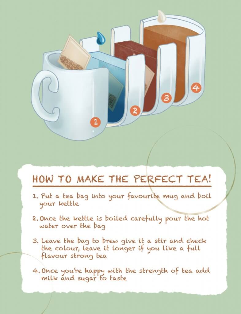
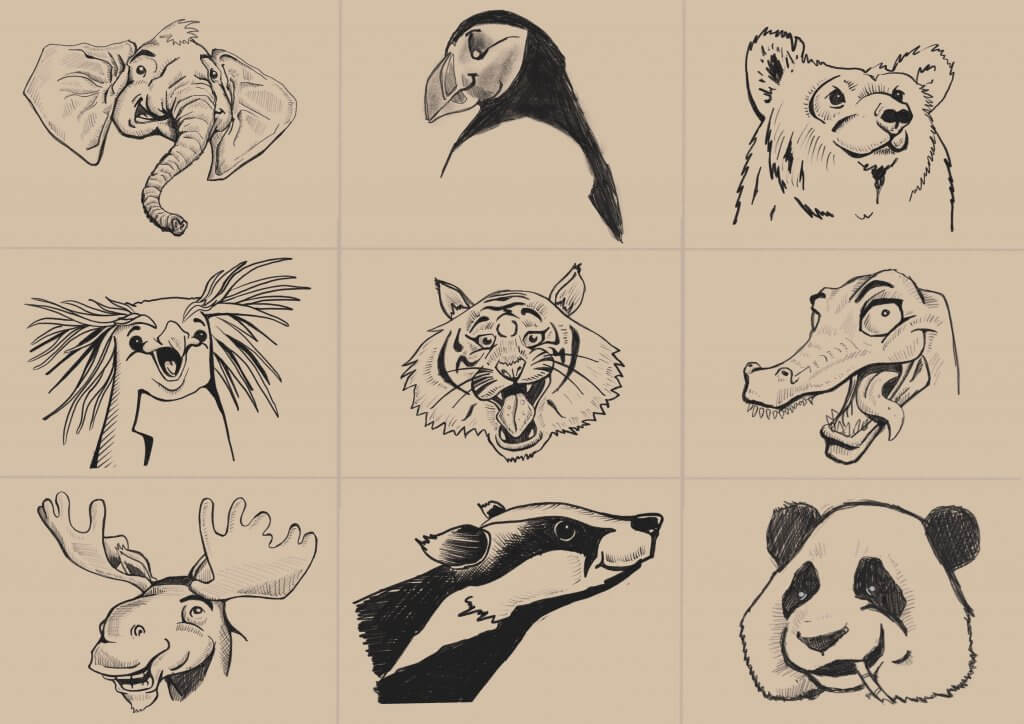
In this exercise I was asked to create a set of instructions accompanied by visuals, I thought making tea would be an interesting one, I also wanted to settle the age old argument about when the milk goes in, this will hopefully clear it up.

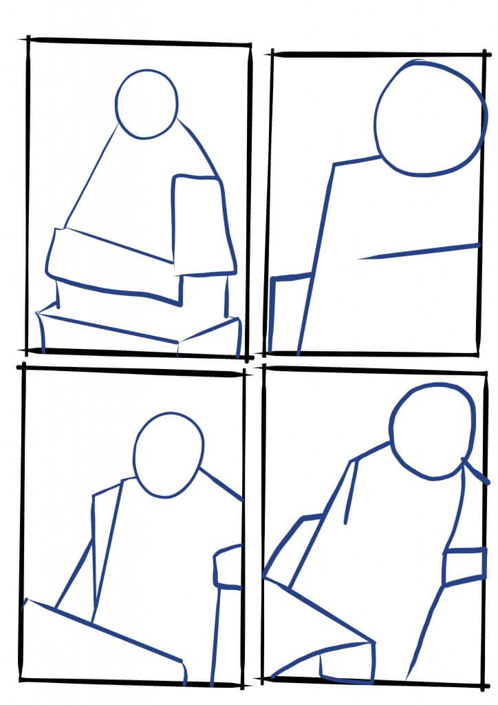
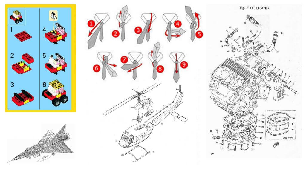
I wanted to use one image and split it up into incremental steps, using numbers and clear text boxes, after some experimental thumbnails I opted for an isometric view like lego instructions or an exploded diagram.

examples
Some Examples of Instructional images

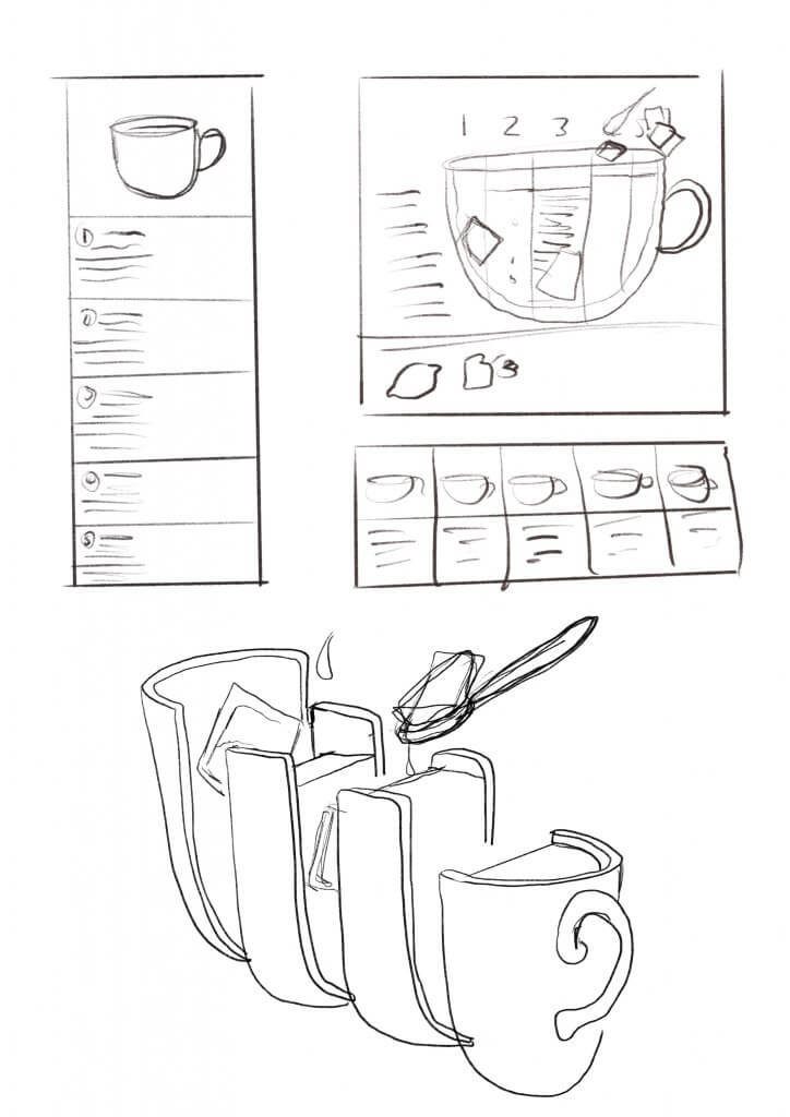
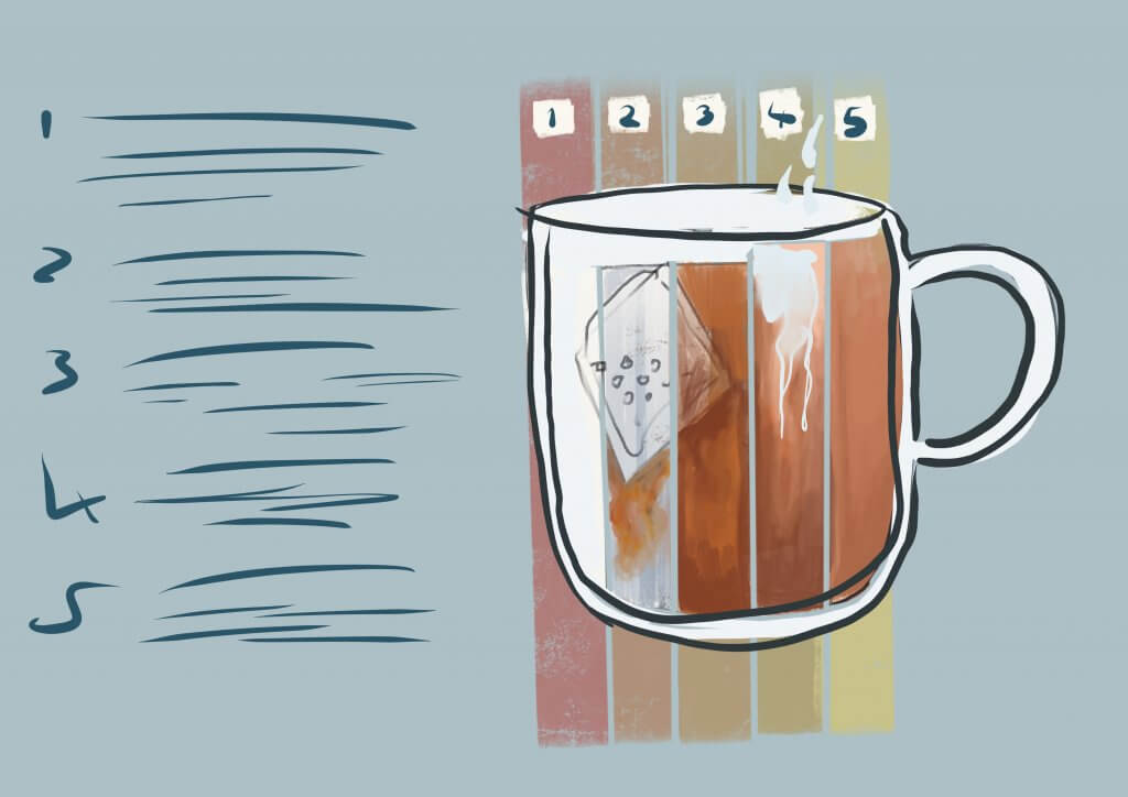
I broke it down into the simplest steps, I wanted it to be clear and easy to follow.

The top down and to the side view I chose did offer some challenges as the visuals while more interesting at this angle still needed to be descriptive, I had to consider the order I displayed the steps in so it was a functional diagram.

I used warm colours on the numbering to make sure they stood out from the diagram.

The style is playful, and not quite as clinical and detailed as a medical journal or Haynes manual, and not as CAD looking as a lego manual, which are colourful but offer little character beyond that. I feel the style I chose works in this context, its light and doesn’t patronise, my test group found it was straight forward and clear to follow.

I was thinking if I had picked playing an instrument or how to get to the house this would have called for a more direct no nonsense approach, I then considered who might be using it, a change in direction would have been led by my audience, if it was for children then this approach would have been intimidating to a youngster or too detailed to be able to focus on so the informal one would work.

Deciding on an audience wouldn’t be my decision to make, that would be a question to ask if it wasn’t clear in the brief, either way it certainly got me thinking about how to approach diagrams and was a good challenge that involved more communication than drawing.

perfect-tea

Exercise 7: Character Development

This task called for some research on different characters and producing my own original one.

I collected up some interesting groups using Pinterest boards, from there I decided on creating a space pirate type character.

*
*
*
*
*
*
*
*

I made a list of some pirate costume/characteristics;

  • Parrots
  • Eyepatches
  • Waistcoats
  • Long Coats
  • Boots
  • Guns
  • Swords
  • Tricorn Hats
  • Wooden Leg

The next thing was to try to give to a sci fi spin, on this list I had;

  • Space suit
  • Lasers
  • Hard Shell Flight Suit
  • Breathing Apparatus

Next I drew a blank figure from the front, side and back.

basic figures template


I worked up in layers, first was the hard shell structured pressurised suit, then the coat. I wanted some of the coat to be hard and some soft, the shoulder pads were to be hard and almost like armour. The pirate boots normally fold over, I tried to make that effect but shape it a little to make it more interesting, these would be hard shell too. The hair was covered in a hard helmet which echoed a bandana.

The pirate is nearly always depicted with a parrot on his shoulder. My parrot was a droid, and would act as a life support system and reconnaissance drone, I named it B.I.R.D, Biologically Integrated Reconnaissance Drone. This would eventually become a tricorn hat, the hat would generate a breathable atmosphere and also an augmented eyepiece, which would look like a pirate eye patch.

I was happy I had captured a pirate essence with a modern twist..

Here are the first designs.

concept
Space Pirate

And with the Tricorn/B.I.R.D hat.

More concepts

When it came to adding colours I didn’t want to look like the traditional dark colours of a pirate, black browns and reds, I wanted dark colours still as she was a pirate and therefore a bit of a rogue. I decided to use the opposite of red on the colour wheel as a jump off point. The old comics always used secondary and tertiary colours for the bad guys, to give them a less than heroic look. I like the way green works with purple, and to soften it up I used a blue, both these colours are used in the colour mix, so it seemed to be a good choice. I chose a lighter tint almost a blue grey. I was quite happy with these colours but thought I’d try some more colour ways.


colour ways
colour ways

I liked the green so I explored this further with some orange accents and then more of a yellow. After that I took the complementary colour of yellow and added purple. I partnered this with brown. I still preferred my original, I decided to move forward with a concept piece.

Final colour choices

For the next character I had to do something different, I kept in the same sci-fi genre, but decided on a robot character. I wanted him to be more like a deckhand or skivvy, his colours were to be dull. I saw this character as being part of a group of similar looking robots but if it was a story I would need a way of identifying him in a crowd. I decided to add a large number on the face, that way he was easily identifiable when being addressed and would be distinguishable from a distance, this would be sprayed/stencilled on. I also gave him some battle damage, a scarred face to make him stand out. This is something I noticed they do in movies, It could be a hat, a scar or a different coloured shoulder pad. I felt the stencilled number added to the “junk” nature.

Here is a coloured version.


And here is a concept.


Exercise 6: Visual Distortion

For this exercise I had to draw either a cat or a dog, the first image was to be drawn with some realism and accuracy, the second just with 5 lines, the third was to be a collage. Once they was complete I had to redraw the collage adding context and a background.

I chose a French Bulldog as they have a great expression and character. It was that I wanted to capture.

I found an image online, it was actually a toy or a sculpture but it had a nice pose and was looking up, showing off his jowls.

This was the first image.

The next part was the 5 lines, these could be joined. I’m not sure if I broke the rules here but I told myself if the pen wasn’t lifted it counted as one line no matter the complexity of the stroke. I drew the bare minimum that was needed to convey the shape and character of the dog (we named it Frank). I was pretty happy with this approach, it still looked like a dog and the same character was present despite a more economic approach to the line.

The next image was the collage, I really enjoyed this. I had been collecting magazines after reading about this section before I started, so I knew there was a collage coming up. I poured through the magazines for texture and did a separate pass for blocks of flat colour. I separated them into two piles and then divided the flat colour pile into different hues. I began by gluing the flat colour down the I tried to blend the colours so it went from red to orange to yellow. I then cut that out into a dog shape. Next I sorted through my texture pile and found some creases, these would serve me well in getting some body and depth to the dog shape such as his belly and legs.

This was the outcome.

Next I had to redraw the collage and add in a background, I decided to use the dogs angle and viewpoint as if he was looking at a bone to eat. Here was the final artwork.

frank
frank

Overall I’m happy with this, it was another project that made me think outside what I’d normally do. It restricted my choices and forced me to approach the exercise in a way I would not normally have done,  it did not hamper my creativity.


Exercise 4: A Menu Card

In my next exercise I was asked to provide artwork for a fish restaurant, the brief called for a modern bright contemporary design that depicted fresh ingredients and visually appetising food.

The image was to be shown at a small size but also with an option to use on a large scale on stationary and vans.

I didn’t like the idea of showing something you eat in its pre prepared/cooked form directly. It seemed a bit crude and doesn’t scream quality to me. A lot of the images I found were like this, actually depicting fish with eyes and mouths. I decided to use something more cerebral which suggested seafood. I worked up some ideas after gathering some examples of other logos, although in this case the reference seemed to steer me in the opposite direction rather than towards it.  I guess that’s still a viable use of reference .

*

I really liked the idea of using fish scales so I explored that theme. I was quite fond of the trident idea and the fork, the trident maybe was a little bit too masculine and the brief called for bright so I decided on the fork as it was more playful.

Ideas for the fish restaurant menu

I took the rough sketch and reproduced it in adobe illustrator. This gave me more control and accuracy over the shapes and drawing them with geometric precision. I drew half, copied it and flipped it to maintain symmetry.

final logo
final logo
How it may look on a van
How it may look on stationary

Overall I was happy with the outcome, although I would have liked to see what the trident looked like mocked up.

Exercise 5: A Tattoo

In this Exercise I had to design a tattoo for a friend inspired by his mother. The design also needs to work as a printed card for Mother’s Day.

I gathered up some reference images (included below) I quite liked the nautical look, it has a great style and is classic and niche enough to not date the same way most tattoos do.

*

I wanted a fair amount of detail in the image, but most importantly I wanted it to have a recognisable “stamp” when viewed from a distance.

tattoo ideas
Tattoo ideas

I definitely wanted to use an anchor, the anchor is a great piece of nautical imagery, but as most tattoos mean something to the wearer would also represent stability and solidarity. I liked the idea of a mother as a mermaid but in the end went for something a little more like a 50’s pin up image.

Tattoo pencils
Tattoo pencils

I wanted the anchor to look the same from a distance, I made that the darkest part. The banner cuts through the shape and helped to frame the main focus. I added some colour, I wanted to keep it warm and classic looking to keep with the theme. Here is the colour version.

Mother Tattoo
Mother Tattoo

I was happy with the results, I wanted a classic pin up Gil Elvgren or Rockwell theme to it, I came close enough.

Exercise 3: A Children’s Book Cover

This exercise was all about producing artwork for a children’s book, luckily for me I have a nine year old daughter so I asked her what sort of animals she’d like to see on a book cover, I went about designing them, simplifying them as much as I can and trying to keep a consistent look and feel amongst all the varied animals.

The characters needed to be easily identified as the animal but needed expressions, animals don’t possess the same bone structure and muscles as us humans, so they aren’t capable of the same expressions, some strategy was needed, for example a crocodiles hinged jaw is pretty flat at rest, I managed to add a curved line suggesting a smile, the Tigers stripes I managed to shape into eyebrows etc. This I enjoyed, it was nice to find creative solution to the problem

Puffin
Puffin
Tiger
Tiger
Panda
Panda
Moose
Moose
Elephant
Elephant
Crocodile
Crocodile
Bear
Bear
Badger
Badger
character sheet
character sheet

I created the client visuals to explore composition and get an idea for colour. As I wanted to use the Earth in the image, I went for an orange colour as it would compliment blue. I didn’t want to use a dark colour to represent space. Each animal would be in their own respective colours so I thought this would work well.

client-visuals
client-visuals

This was also another opportunity to use real media, a lot of children’s illustrators seem to use watercolours for their artwork, I drew the characters out on a sheet of hot pressed watercolour paper, I wanted some texture to it but still enough for smooth lines. Once happy with the under drawing I rubbed out the lines so I could barely see them. My plan was to use ink for the outlines but after testing a few pens they still ran a little. I opted to put some colour in the paper first then put the key lines back in after. A little backward to my normal approach but nonetheless it protected the ink lines.

I wanted the paper very wet, I managed to get the colours to bleed and blend into each other and I learnt to control the outcome fairly well. I was quite happy with the majority of the artwork. They all looked fairly consistent and worked pretty well together.

animals of the world watercolor artwork

The down side of working with natural media is it needs photographing, I set up some lights and photographed the image on my wall, this in itself is problematic especially as the paper had a slight sheen to it. I managed to get an image that was fairly well exposed but it did seem to be a little blurry in some places, not as sharp as id have liked. The colours also didn’t pop as much as they did on the paper. 

book cover mock
book cover mock

I added in some text and created a mock, My daughter actually saw the image as it was still fixed to the wall after I photographed it, she said “Dad are that the animals you had to draw?” I said “Yep, they’re the ones. Do you like them?” she said “yeah, my favourite is the elephant.” I think she liked all of the animals as she looked at it for a while, so maybe while I was very critical of the colours and effect as it was not quite what I had aimed for, it was still appealing to children. It would have been nice to try again digitally but unfortunately time didn’t permit further experiments. Maybe when I have some free time I’ll draw that elephant as a gift card and give it to her for her birthday.

Exercise 2: Museum Posters

In this exercise I was tasked with producing three A3 images to publicise some upcoming museum exhibits. The three posters had to appeal to three different age groups, children aged 5-9, teenagers 13-16 and a general adult audience. I visited the British museum to take photos for research and reference.

I picked three subjects, a statue of the monkey god Hanuman, a suit of samurai armour and a Buddha.

I wanted to present these in three separate ways, The monkey god reminded me of a Japanese cartoon character in his appearance, like Pokemon or Dragon Ball Z, I wanted to render him as if he was in a Pixar film or other modern cartoon. The samurai would certainly appeal to teenagers due to the cool factor. For this one I didn’t want it to look childlike or have too much of a realistic quality. I wanted to portray it with textures and a sense of liveliness a touch of aggression or even horror, I tried for a style more like like a comic book or “grown up” Japanese animated style. The third I would need to reproduce with some accuracy and approach it from the angle that the statue is full of detail and workmanship, I needed to conjure up a peaceful feeling also due to the nature of the subject. I have been encouraged by my tutor to use natural mediums. I thought some washes with Gouache might represent a softer side and create some nice textures, things didn’t go as smoothly as I had hoped!

I started out with the buddha, I thought as I was trying to paint with real medium I may need extra time, this was a good call. I used a warm coloured water soluble pencil on an A2 sheet of mixed media paper, I thought this may be best as the lines would be removed/ covered up when I applied the paint as I didn’t want any hard lines for this image, the warm tones that would mingle in with the paint would compliment the paint rather than muddy it. I added in my washes and started working in the shapes, I thought my initial drawing would serve the image, I did run into a few issues that normally I could fix with a digital process. I persevered but  I got to a point where I just wasn’t happy. I was ready to start again when I thought maybe I could photograph the artwork up to this point and complete the rest digitally, using the painted textures and fixing the issues. I was quite happy with the way this worked out, I felt it was the best of both, the textures of real medium and the versatility and edibility of digital. Unfortunately the experimental process had set me back, I will explore this further but maybe not on such an ambitious level.

Buddha
Buddha

buddha sketch
buddha sketch, ready for paint.


buddha
Mixed media, Gouache and digital art.

Next up was Hanuman. I wanted to render this golden statue like a digitally produced cartoon, I used soft brushes to render the shapes and brown/gold key lines to keep a cartoon feel but with a degree of subtlety. After I finished rendering light and shape I added some shine marks, which I thought really brought it to life, I’d even go as far to say it added some movement where I used different sized flares. Finally when I mocked up the artwork I added a background with some speed lines to add a bit more cartoon style action.

Hanuman
Hanuman

Hanuman
Hanuman

The next image was the samurai armour. I had taken reference photos but the suit was supported on a frame inside a glass case, it looked very noble and alert on display, but this didn’t really help me to get over a sense of action or the “cool factor” I transposed the information from my photographs into a more interesting 3/4 view, this was a very satisfactory exercise in itself, and while I used an eraser a lot it was something I was mostly happy with. I felt like I really used the reference as just that, something to refer to whilst creating something new. I used a  medium tight crop on the face to emphasise the eyes and demon mask. This led me on to the next obstacle.

samurai
samurai

samurai sketch
samurai sketch
samurai finished artwork

This exercise did highlight another aspect of producing illustrations for advertising and one I’m not sure I found the answer to. Once the artwork is delivered to the client they need to be able to use it. My artwork while A3 in size didn’t lend itself too well for positioning and text layout, maybe this would be agreed in a rough layout in advance with the designer of the poster, maybe a template would be provided or agreed on, it’s a little like the chicken and the egg, would they send me a template or would they work a new one on my artwork. I am a designer myself and I do work to briefs and guidelines with brands, Im sure in this case there would be a few amendments to layout if they didn’t have an existing set of boundaries to work to. I managed to mock up the artwork with a few tweaks and made a seemingly valuable observation in doing so.

Overall I’m happy with the results, the temptation here was to go very cliche, very cartoony for the kids, pop art for teenagers and photo realistic for the general adult audience I feel I kept a good enough distance from that. They all still describe the exhibits with a degree of realism and intrigue so I felt I satisfied the brief.

Museum Mock
Museum Mock